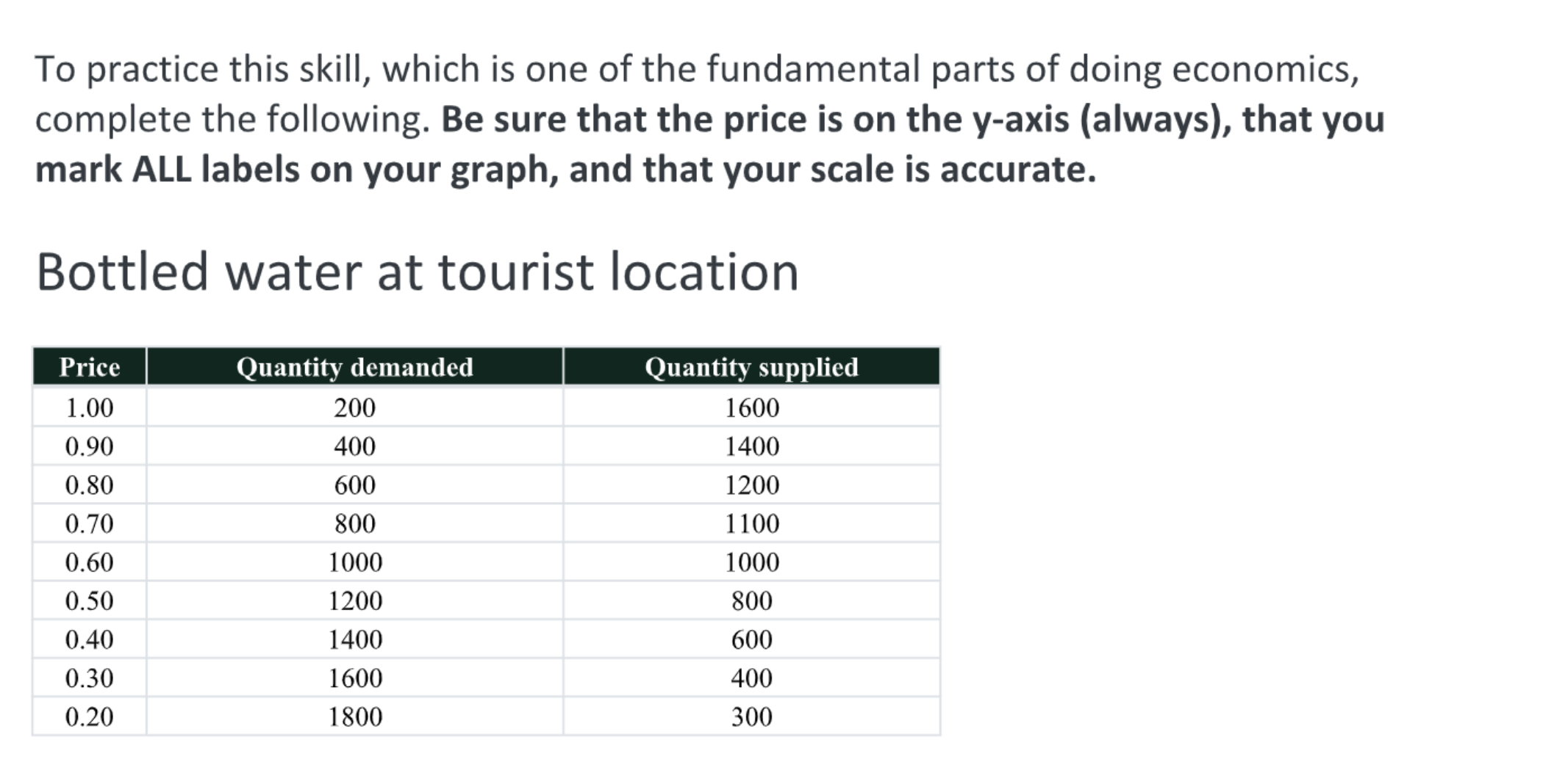
Complete the following. Be sure that the price is on the y-axis (always), that you mark ALL labels on your graph, and that your scale is accurate.

Understand the Problem
The question is asking to create a graph based on the provided data for bottled water, ensuring that the price is on the y-axis and all labels are marked accurately.
Answer
The graph will show price on the y-axis and quantity on the x-axis, with accurately plotted demand and supply curves, and the equilibrium point labeled.
Answer for screen readers
The graph should display price on the y-axis and quantity on the x-axis, showing accurately plotted demand and supply curves along with the equilibrium point. The equilibrium price can be determined from the intersection of demand and supply curves.
Steps to Solve
-
Set Up the Axes To create the graph, label the y-axis as "Price" and the x-axis as "Quantity."
-
Determine the Scale Choose an appropriate scale for both axes. For the price on the y-axis, you can use increments of $0.10 from $0.20 to $1.00. For quantity on the x-axis, use increments of 200, covering from 0 to 2000.
-
Plot the Data Points Using the data provided, plot points for both quantity demanded and quantity supplied. The points for quantity demanded are:
- At $1.00, quantity demanded is 200
- At $0.90, quantity demanded is 400
- At $0.80, quantity demanded is 600
- At $0.70, quantity demanded is 800
- At $0.60, quantity demanded is 1000
- At $0.50, quantity demanded is 1200
- At $0.40, quantity demanded is 1400
- At $0.30, quantity demanded is 1600
- At $0.20, quantity demanded is 1800
The points for quantity supplied are:
- At $1.00, quantity supplied is 1600
- At $0.90, quantity supplied is 1400
- At $0.80, quantity supplied is 1200
- At $0.70, quantity supplied is 1100
- At $0.60, quantity supplied is 1000
- At $0.50, quantity supplied is 800
- At $0.40, quantity supplied is 600
- At $0.30, quantity supplied is 400
- At $0.20, quantity supplied is 300
-
Draw the Demand and Supply Curves Connect the points for quantity demanded with a smooth line, and do the same for quantity supplied. The demand curve usually slopes downward from left to right, while the supply curve slopes upward.
-
Label the Equilibrium Point Identify where the demand and supply curves intersect. Label this point as "Equilibrium" and note the equilibrium price and quantity.
-
Add a Legend (if necessary) If your graph has both demand and supply lines, add a legend to differentiate between them (e.g., demand curve and supply curve).
The graph should display price on the y-axis and quantity on the x-axis, showing accurately plotted demand and supply curves along with the equilibrium point. The equilibrium price can be determined from the intersection of demand and supply curves.
More Information
The equilibrium point is significant in economics as it represents the price at which the quantity demanded equals the quantity supplied. Visualizing demand and supply curves allows for better understanding of market dynamics.
Tips
- Incorrect Axis Labels: Ensure that price is always on the y-axis and quantity on the x-axis.
- Scale Inaccuracy: Double-check that the scales are consistent and cover the range of data adequately.
- Omitting Labels: Make sure all axes are labeled correctly, and if there’s more than one line, use a legend to differentiate.
AI-generated content may contain errors. Please verify critical information