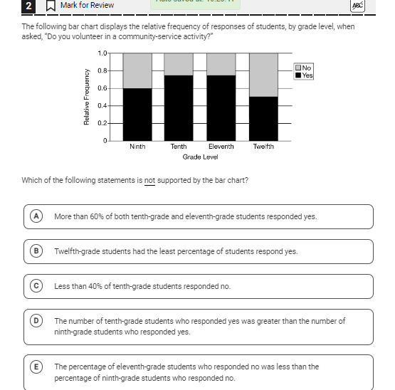
Which of the following statements is not supported by the bar chart?

Understand the Problem
The question is asking which statement regarding student responses to community service activity, as represented in the given bar chart, is not supported by the data. We need to analyze the data presented in the bar chart to determine the correct answer.
Answer
D
Answer for screen readers
The statement not supported by the bar chart is:
D. The number of tenth-grade students who responded yes was greater than the number of ninth-grade students who responded yes.
Steps to Solve
-
Analyze the Bar Chart Look at the bar chart and identify the relative frequencies (proportions) for each grade level that responded "Yes" and "No" to community service activity.
-
Extract Data for Each Statement Check if each statement can be supported by the data. Here’s a breakdown of each statement based on visual assessments:
- Statement A: Examine the heights of the "Yes" responses for tenth and eleventh graders. Look for whether each is above 60%.
- Statement B: Compare the heights of "Yes" responses for twelfth graders with other grades to see if it is indeed the least.
- Statement C: Check the height of the "No" response for tenth graders to ensure it is less than 40%.
- Statement D: Evaluate the number of tenth graders who said "Yes" compared to ninth graders to determine if the statement is true.
- Statement E: Compare the "Yes" responses of eleventh graders and ninth graders to confirm if eleventh is not less than ninth.
-
Determine the Unsupported Statement After evaluating each statement against the bar chart data, identify which statement cannot be supported by the chart.
The statement not supported by the bar chart is:
D. The number of tenth-grade students who responded yes was greater than the number of ninth-grade students who responded yes.
More Information
In bar charts, relative frequencies give a visual representation of data proportions. It's crucial to interpret these accurately by comparing bar heights, especially when evaluating various claims. Data can sometimes give an impression that differs from what is visualized.
Tips
- Misreading the bar heights can lead to incorrect conclusions.
- Failing to convert relative frequencies into clear percentage comparisons can mislead interpretations.
AI-generated content may contain errors. Please verify critical information