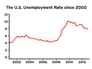
What does the graph of the U.S. unemployment rate since 2000 indicate?
Understand the Problem
The question is requesting an analysis or interpretation of the U.S. unemployment rate as shown in the provided graph, particularly how it has changed since 2000.
Answer
Unemployment peaked in 2010 and declined toward 2012.
The graph indicates a rise in unemployment from 2007 to 2009, peaking around 10%, followed by a gradual decline towards 2012.
Answer for screen readers
The graph indicates a rise in unemployment from 2007 to 2009, peaking around 10%, followed by a gradual decline towards 2012.
More Information
This period corresponds to the Great Recession, which significantly impacted employment rates.
Tips
When analyzing graphs, pay attention to trends, peaks, and troughs to understand the economic context.
Sources
- Unemployment in the United States - Wikipedia - en.wikipedia.org
- U.S. annual unemployment rate 1990-2023 - Statista - statista.com
AI-generated content may contain errors. Please verify critical information
Thank you for voting!