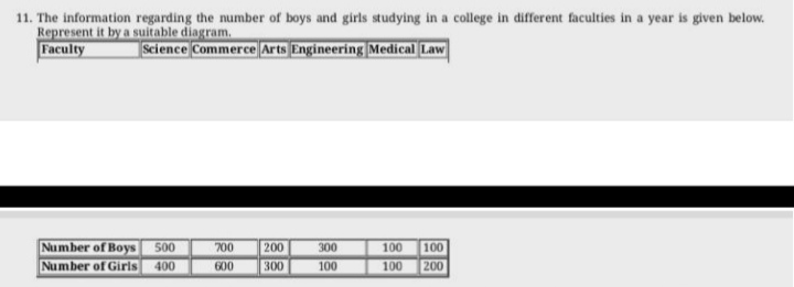
The information regarding the number of boys and girls studying in a college in different faculties is given below. Represent it by a suitable diagram.

Understand the Problem
The question is asking to represent the data regarding the number of boys and girls in different faculties using a suitable diagram. This typically involves creating a bar chart or another visual representation of the given numbers.
Answer
The data can be represented using a bar chart comparing boys and girls in different faculties.
Answer for screen readers
The suitable diagram to represent the data is a bar chart where each faculty has adjacent bars for boys and girls, according to their respective numbers.
Steps to Solve
- Collect the Data You have two sets of data: the number of boys and girls in different faculties. The data is as follows:
- Boys: Science (500), Commerce (700), Arts (200), Engineering (300), Medical (100), Law (100)
- Girls: Science (400), Commerce (600), Arts (300), Engineering (100), Medical (100), Law (200)
-
Prepare the Diagram To represent this data visually, we will use a bar chart. Each faculty will have two bars: one for boys and one for girls.
-
Label the Axes On the bar chart:
- The x-axis will represent the different faculties: Science, Commerce, Arts, Engineering, Medical, and Law.
- The y-axis will represent the number of students.
- Draw the Bars For each faculty, draw two adjacent bars:
- The first bar represents boys and should be colored (e.g., blue).
- The second bar represents girls and should be a different color (e.g., pink).
For example, for Science, the height of the boys' bar should go up to 500, and the girls' bar should go up to 400.
- Title the Chart Add a title to the chart, such as “Number of Boys and Girls in Different Faculties”.
The suitable diagram to represent the data is a bar chart where each faculty has adjacent bars for boys and girls, according to their respective numbers.
More Information
Bar charts are effective for comparing the sizes of different groups side by side. This visualization helps in easily analyzing gender distribution across various faculties.
Tips
- Mislabeling Axes: Ensure that both axes are clearly labeled to avoid confusion.
- Inconsistent Scales: Keep the scale on the y-axis consistent to accurately represent the numbers.
AI-generated content may contain errors. Please verify critical information