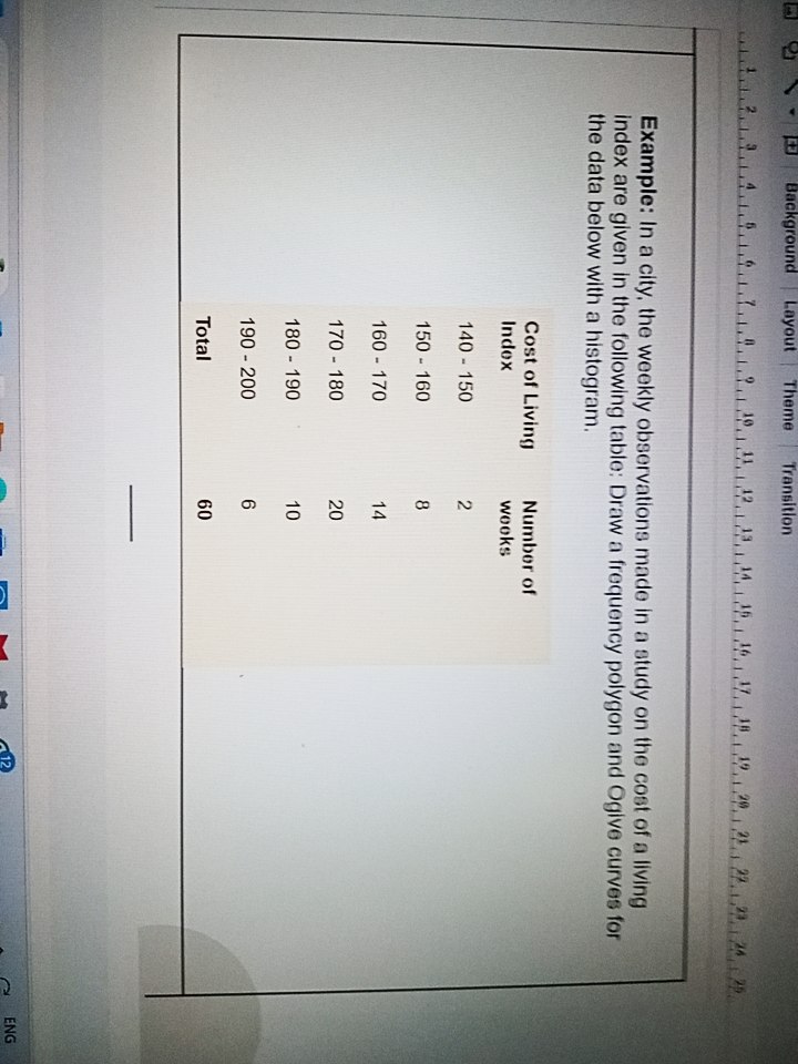
In a city, the weekly observations made in a study on the cost of a living index are given in the following table: Draw a frequency polygon and Ogive curves for the data below with... In a city, the weekly observations made in a study on the cost of a living index are given in the following table: Draw a frequency polygon and Ogive curves for the data below with a histogram.

Understand the Problem
The question is asking to draw a frequency polygon and Ogive curves based on the given data of the cost of living index and the number of weeks. It involves creating visual representations of this data through specific statistical methods.
Answer
Frequency polygon and Ogive curves represent the data visually, illustrating distribution via histograms, midpoints, and cumulative frequencies.
Answer for screen readers
The frequency polygon and Ogive curves can be drawn based on the data from the provided table, resulting in clear visual representations of the Cost of Living Index and the number of weeks observed.
Steps to Solve
-
Create the Histogram We first need to draw a histogram using the provided data. The frequency for each cost interval is plotted against the cost of living index.
- Cost Intervals: $140-150, 150-160, 160-170, 170-180, 180-190, 190-200$
- Frequencies: $2, 8, 14, 20, 10, 6$
The height of each bar will represent the frequency of weeks for each cost interval.
-
Calculate the Cumulative Frequencies Next, we will calculate the cumulative frequency for each class interval.
- Cumulative Frequency (CF) for each interval is calculated as follows:
- CF for $140-150 = 2$
- CF for $150-160 = 2 + 8 = 10$
- CF for $160-170 = 10 + 14 = 24$
- CF for $170-180 = 24 + 20 = 44$
- CF for $180-190 = 44 + 10 = 54$
- CF for $190-200 = 54 + 6 = 60$
- Cumulative Frequency (CF) for each interval is calculated as follows:
-
Draw the Ogive The Ogive is a cumulative frequency curve plotted on a graph.
- Plot the cumulative frequencies against the upper limits of each interval:
- $150 (2), 160 (10), 170 (24), 180 (44), 190 (54), 200 (60)$
- Connect the points with a smooth curve.
- Plot the cumulative frequencies against the upper limits of each interval:
-
Draw the Frequency Polygon The frequency polygon can be drawn by connecting the midpoints of each interval based on the histogram.
-
Calculate the midpoints:
- Midpoint for $140-150 = 145$
- Midpoint for $150-160 = 155$
- Midpoint for $160-170 = 165$
- Midpoint for $170-180 = 175$
- Midpoint for $180-190 = 185$
- Midpoint for $190-200 = 195$
-
Plot these midpoints against their corresponding frequencies.
-
-
Finalizing the Graphs Ensure all axes are labeled and the graphs are titled accordingly (e.g., "Histogram of Cost of Living Index" and "Ogive of Cumulative Frequency").
The frequency polygon and Ogive curves can be drawn based on the data from the provided table, resulting in clear visual representations of the Cost of Living Index and the number of weeks observed.
More Information
Frequency polygons and Ogive curves are useful tools in statistics for illustrating the distribution of data. A frequency polygon provides a sense of the shape of the distribution, while an Ogive helps in visualizing cumulative frequencies, making it easier to determine how many observations fall below a certain value.
Tips
- Forgetting to plot the midpoints accurately for the frequency polygon can misrepresent the data.
- Miscalculating the cumulative frequencies; ensure that each cumulative frequency is the sum of the previous frequencies plus the current one.
- Not labeling the axes and curves properly, which can lead to confusion when interpreting the graphs.
AI-generated content may contain errors. Please verify critical information