Podcast
Questions and Answers
Which type of graph should be used to illustrate the differences in percentages (or counts) between categories?
Which type of graph should be used to illustrate the differences in percentages (or counts) between categories?
- Scatter plot
- Histogram
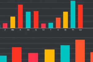
- Bar chart (correct)
- Line graph
What does a bar chart summarize?
What does a bar chart summarize?
- Categorical data (correct)
- Measurement data
- Continuous data
- Ordinal data
What type of data should a histogram be used for?
What type of data should a histogram be used for?
- Nominal data
- Categorical data
- Ordinal data
- Continuous data (correct)
What does the vertical axis of a bar chart represent?
What does the vertical axis of a bar chart represent?
What does the horizontal axis of a histogram represent?
What does the horizontal axis of a histogram represent?
Flashcards
Bar Chart
Bar Chart
A type of graph that compares categories using bars of different heights.
Categorical Data
Categorical Data
Data that falls into distinct categories.
Histogram
Histogram
A graph that displays the distribution of continuous data using bars.
Vertical Axis in a Bar Chart
Vertical Axis in a Bar Chart
Signup and view all the flashcards
Horizontal Axis in a Histogram
Horizontal Axis in a Histogram
Signup and view all the flashcards