Podcast
Questions and Answers
A bar chart is primarily used to represent numeric values for various levels of a categorical feature.
A bar chart is primarily used to represent numeric values for various levels of a categorical feature.
True (A)
Bar charts cannot be used to compare more than two categories at a time.
Bar charts cannot be used to compare more than two categories at a time.
False (B)
A bar chart is also referred to as a bar graph or column chart.
A bar chart is also referred to as a bar graph or column chart.
True (A)
Bar charts only represent qualitative data and not quantitative data.
Bar charts only represent qualitative data and not quantitative data.
Each bar in a bar chart corresponds to a different category of data.
Each bar in a bar chart corresponds to a different category of data.
The height of each bar in a bar chart is not related to the values of the categories it represents.
The height of each bar in a bar chart is not related to the values of the categories it represents.
Bar charts can effectively display data for categories such as age groups or geographical locations.
Bar charts can effectively display data for categories such as age groups or geographical locations.
A bar chart is effective for comparing numeric values across multiple categories.
A bar chart is effective for comparing numeric values across multiple categories.
Each bar in a bar chart can represent multiple categories at once.
Each bar in a bar chart can represent multiple categories at once.
Bar charts are designed exclusively for qualitative data and not suitable for numerical data.
Bar charts are designed exclusively for qualitative data and not suitable for numerical data.
Flashcards are hidden until you start studying
Study Notes
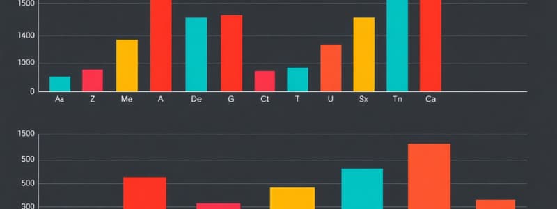
Bar Chart Overview
- A bar chart, also referred to as a bar graph or column chart, visually represents data using rectangular bars.
- Each bar’s length is proportional to the numeric value it represents, making it easier to compare different categories.
Uses of Bar Charts
- Effective for illustrating quantitative data across various categories, such as sales figures by product type or population counts by demographic group.
- Can display both discrete data (e.g., number of students in different classes) and categorical data (e.g., survey responses).
Features of Bar Charts
- The height or length of each bar indicates the value associated with each category, facilitating quick visual analysis.
- Bars can be oriented vertically or horizontally, depending on the data and presentation preference.
- Color coding and shading can differentiate between categories or highlight specific data points, enhancing readability and engagement.
Bar Chart Overview
- A bar chart is also referred to as a bar graph or column chart.
- It visually represents numeric values associated with distinct categories using bars.
Structure and Functionality
- Each bar corresponds to a particular category, making comparisons easy.
- The height of each bar reflects a specific aggregation of the values, such as their sum.
Applications
- Bar charts are effective in displaying data related to various categorical features, such as demographics (e.g., age groups) or geographic areas (e.g., countries or cities).
- Useful in analyzing trends and making comparisons across different categories.
Studying That Suits You
Use AI to generate personalized quizzes and flashcards to suit your learning preferences.
![[05/Rokel/04]](https://images.unsplash.com/photo-1634117622592-114e3024ff27?ixid=M3w0MjA4MDF8MHwxfHNlYXJjaHw3fHxtYXRoZW1hdGljcyUyMHN0YXRpc3RpY3MlMjBjYWxjdWxhdGlvbnxlbnwxfDB8fHwxNzA0MzU2MjQwfDA&ixlib=rb-4.0.3&w=300&fit=crop&h=200&q=75&fm=webp)