Podcast
Questions and Answers
What is the purpose of creating a frequency table?
What is the purpose of creating a frequency table?
- To display the frequency of various outcomes in a dataset (correct)
- To divide the range of values into intervals
- To determine the range of values in a dataset
- To create a graphical representation of the data
Which step is involved in constructing a frequency table?
Which step is involved in constructing a frequency table?
- Plotting the data points on a graph
- Determining the mean of the dataset
- Dividing the range into mutually exclusive and exhaustive intervals (correct)
- Calculating the standard deviation of the data
What is the purpose of creating a histogram?
What is the purpose of creating a histogram?
- To determine the range of values in a dataset
- To calculate the mean and standard deviation of the data
- To divide the range of values into intervals
- To provide a graphical representation of the frequency distribution (correct)
Which step is involved in creating a histogram?
Which step is involved in creating a histogram?
What property should the intervals in a frequency table and histogram possess?
What property should the intervals in a frequency table and histogram possess?
What is the purpose of labeling the y-axis with frequency or relative frequency in a histogram?
What is the purpose of labeling the y-axis with frequency or relative frequency in a histogram?
In a histogram, what does a bar's height represent?
In a histogram, what does a bar's height represent?
Why is it important to identify outliers in a dataset?
Why is it important to identify outliers in a dataset?
What does assessing the variability of data in a histogram involve?
What does assessing the variability of data in a histogram involve?
Which characteristic of a histogram involves analyzing if it is symmetric, skewed, or multimodal?
Which characteristic of a histogram involves analyzing if it is symmetric, skewed, or multimodal?
Study Notes
Introduction to Frequency Tables and Histograms
- Frequency tables and histograms are essential tools in statistics to organize and represent data.
- They provide a visual and numerical summary of the distribution of a dataset.
Constructing Frequency Tables
- A frequency table displays the frequency of various outcomes in a dataset.
- Steps to construct a frequency table:
- Identify the range of values in the dataset.
- Divide the range into mutually exclusive and exhaustive intervals.
- Count the number of data points falling within each interval.
- Create a table with columns for intervals and their corresponding frequencies.
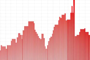
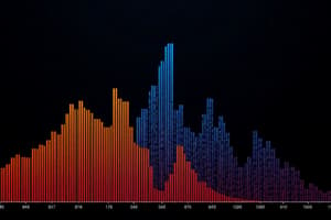
Creating Histograms
- A histogram is a graphical representation of the frequency distribution of a dataset.
- Steps to create a histogram:
- Determine the number of intervals based on the dataset's range and desired level of detail.
- Draw the x-axis with the intervals from the frequency table.
- Draw the y-axis with the frequency or relative frequency.
- Plot the bars for each interval, with the height corresponding to the frequency.
- Add a title and labels to the histogram.
Interpreting Data from Frequency Tables and Histograms
- Identify trends or patterns in the data, including intervals with significantly higher or lower frequencies.
- Determine measures of central tendency: mean, median, and mode.
- Assess variability by examining the spread of the histogram.
- Identify outliers, which are data points significantly different from the rest of the dataset.
- Analyze the shape of the histogram: symmetric, skewed, or multimodal.
- Critically interpret the data, considering trends, central tendency, variability, outliers, and distribution shape.
Studying That Suits You
Use AI to generate personalized quizzes and flashcards to suit your learning preferences.
Description
Learn about constructing frequency tables and histograms to organize and represent data effectively. This quiz covers how to create frequency tables, generate histograms, and interpret the data they display.