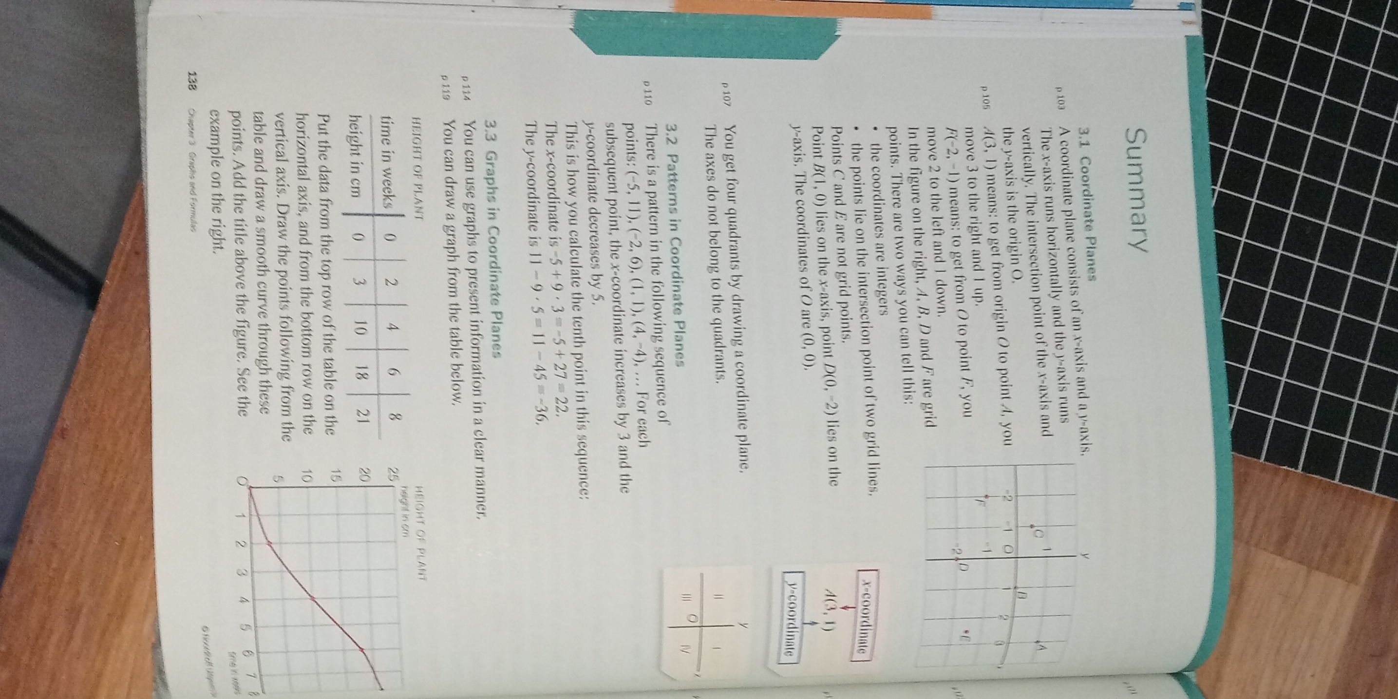
You can draw a graph from the table below: time in weeks and height in cm. Put the data from the top row of the table on the horizontal axis and from the bottom row on the vertical... You can draw a graph from the table below: time in weeks and height in cm. Put the data from the top row of the table on the horizontal axis and from the bottom row on the vertical axis. Draw the points from the table.
Understand the Problem
The question is asking how to draw a graph based on the provided data in the table, which includes the height of a plant over time in weeks. The user is expected to plot the points according to the table and possibly interpret the results.
Answer
The graph shows plant height increasing over time with plotted points at \( (0, 3) \), \( (2, 10) \), \( (4, 18) \), \( (6, 20) \), and \( (8, 21) \).
Answer for screen readers
The graph will show the height of the plant increasing over time, with plotted points at ((0, 3)), ((2, 10)), ((4, 18)), ((6, 20)), and ((8, 21)).
Steps to Solve
-
Understanding the Data The table gives two sets of values: Time (in weeks) and Height (in cm). The time values are (0, 2, 4, 6, 8) weeks and the corresponding heights are (3, 10, 18, 20, 21) cm.
-
Setting Up the Axes Draw a coordinate plane. Label the horizontal axis (x-axis) as "Time in Weeks" and the vertical axis (y-axis) as "Height in cm".
-
Plotting Points For each pair of values from the table, plot points on the graph:
- Week (0): Height (3) → point ((0, 3))
- Week (2): Height (10) → point ((2, 10))
- Week (4): Height (18) → point ((4, 18))
- Week (6): Height (20) → point ((6, 20))
- Week (8): Height (21) → point ((8, 21))
-
Connecting the Points Once all points are plotted, you may connect them with a smooth line to show the trend over time.
-
Interpreting the Graph Observe the shape of the graph (increasing trend) and what it signifies about plant growth over the weeks.
The graph will show the height of the plant increasing over time, with plotted points at ((0, 3)), ((2, 10)), ((4, 18)), ((6, 20)), and ((8, 21)).
More Information
This type of graph is known as a line graph, commonly used to display data trends over time. The increasing height suggests that the plant is growing more rapidly in the earlier weeks and then starts to level off as it matures.
Tips
- Skipping points: Ensure that all points from the table are plotted accurately.
- Incorrect labeling: Make sure the axes are properly labeled according to the data.
- Forgetting to connect the points can result in a disjointed representation.
AI-generated content may contain errors. Please verify critical information