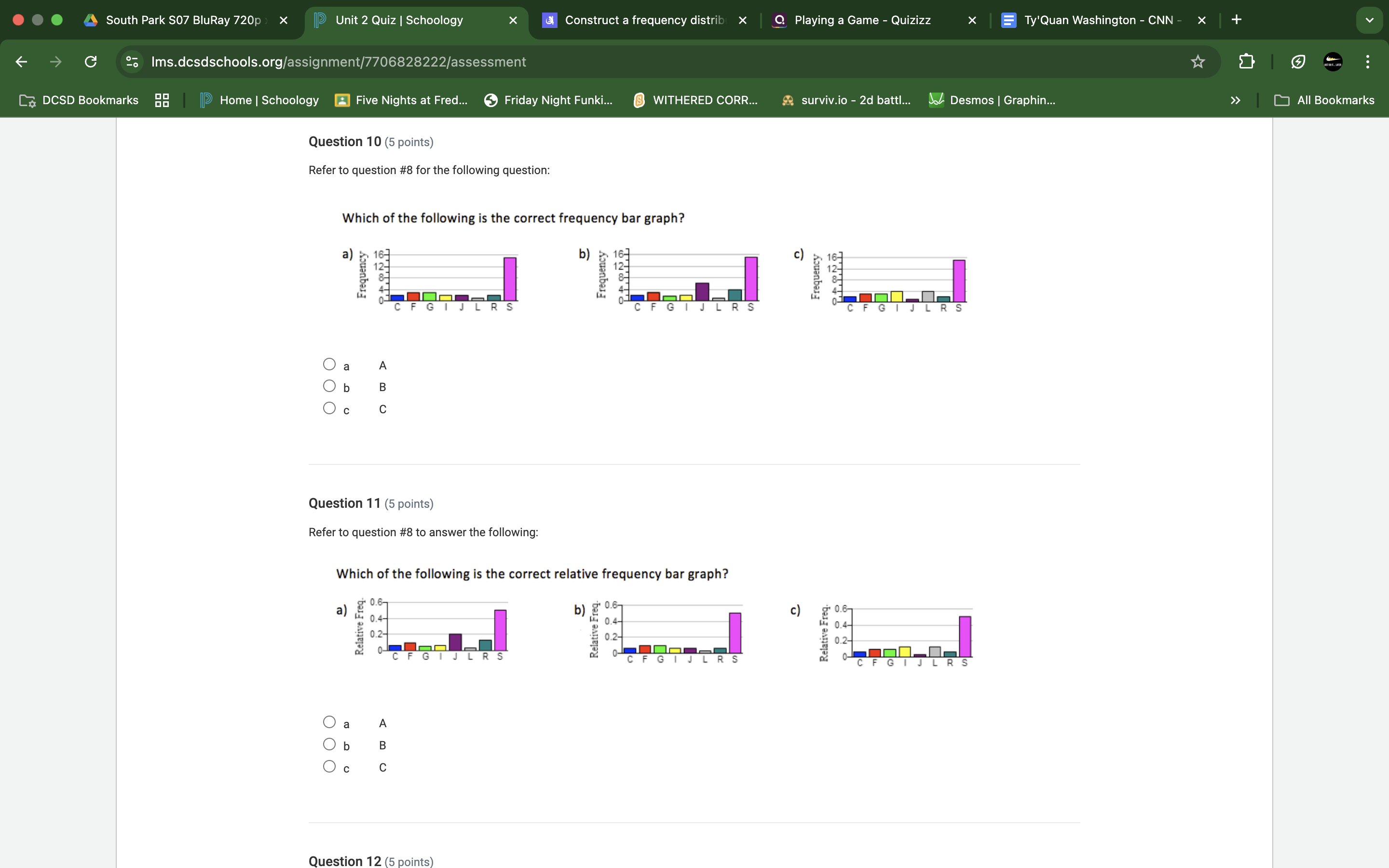
Which of the following is the correct frequency bar graph? Which of the following is the correct relative frequency bar graph?
Understand the Problem
The question is asking to identify the correct frequency and relative frequency bar graphs from the options provided. This involves interpreting visual data and comparing it to the information given in question #8.
Answer
- Question 10: \(B\) - Question 11: \(B\)
Answer for screen readers
- For question 10, the correct frequency bar graph is option (B).
- For question 11, the correct relative frequency bar graph is option (B).
Steps to Solve
- Identify Data from Question 8
Review the information provided in question #8 to understand the frequency counts for each category (C, F, G, I, J, L, R, S). The total frequencies need to be summed up to validate whether the graphs correspond accurately.
- Examine Each Option
Look at each frequency bar graph (a, b, c) and note the height of the bars for each category. Make sure to compare these with the counts derived from question #8.
- Check for Frequency Values
Ensure that the bars reach the frequency values indicated in question #8. Pay close attention to the maximum and minimum heights of each bar in the options provided.
- Identify Relative Frequency Option
To find the relative frequency graph, divide each frequency by the total number of data points. For instance, if the total is $N$, the relative frequency for a category would be $frequency / N$. Analyze each option for the heights compared to these calculated relative frequencies.
- Review the Relative Frequencies
Just like the previous step, check which relative frequency graph is represented correctly by comparing the calculated relative frequencies to the heights of each bar in options provided for question 11.
- For question 10, the correct frequency bar graph is option (B).
- For question 11, the correct relative frequency bar graph is option (B).
More Information
Frequency bar graphs show the number of occurrences of each category, while relative frequency graphs indicate the proportion of each category compared to the total. Understanding the difference is essential for interpreting data accurately.
Tips
- Confusing frequency with relative frequency; always check if you are looking at raw counts or proportions.
- Misreading the heights of the bars; take a moment to ensure accurate assessment.
AI-generated content may contain errors. Please verify critical information