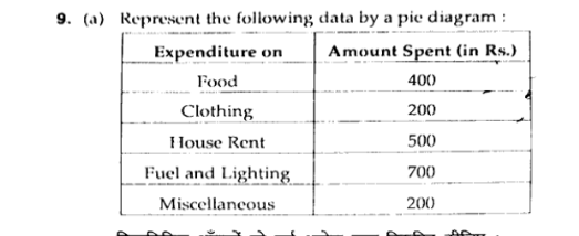
Represent the following data by a pie diagram: Expenditure on Food: 400, Clothing: 200, House Rent: 500, Fuel and Lighting: 700, Miscellaneous: 200.

Understand the Problem
The question is asking to create a pie diagram representing the given data on expenditures for different categories. This involves calculating the angles for each category based on their amounts spent.
Answer
Food: $72^\circ$, Clothing: $36^\circ$, House Rent: $90^\circ$, Fuel and Lighting: $126^\circ$, Miscellaneous: $36^\circ$.
Answer for screen readers
The angles for the pie chart are as follows:
- Food: $72^\circ$
- Clothing: $36^\circ$
- House Rent: $90^\circ$
- Fuel and Lighting: $126^\circ$
- Miscellaneous: $36^\circ$
Steps to Solve
- Calculate the Total Expenditure First, find the total expenditure by adding all the amounts spent in different categories.
Total Expenditure = $400 + 200 + 500 + 700 + 200 = 2000$ Rs.
- Calculate the Angle for Each Category Next, determine the angle for each category using the formula:
$$ \text{Angle} = \left( \frac{\text{Amount Spent}}{\text{Total Expenditure}} \right) \times 360^\circ $$
- Calculate Angles:
-
Food: $$ \left( \frac{400}{2000} \right) \times 360 = 72^\circ $$
-
Clothing: $$ \left( \frac{200}{2000} \right) \times 360 = 36^\circ $$
-
House Rent: $$ \left( \frac{500}{2000} \right) \times 360 = 90^\circ $$
-
Fuel and Lighting: $$ \left( \frac{700}{2000} \right) \times 360 = 126^\circ $$
-
Miscellaneous: $$ \left( \frac{200}{2000} \right) \times 360 = 36^\circ $$
- Summarize the Angle Calculations The angles for each expenditure category are:
- Food: $72^\circ$
- Clothing: $36^\circ$
- House Rent: $90^\circ$
- Fuel and Lighting: $126^\circ$
- Miscellaneous: $36^\circ$
- Draw the Pie Chart Finally, represent these angles on a pie chart using a compass or pie chart software, ensuring that each angle is correctly represented in proportion to the total.
The angles for the pie chart are as follows:
- Food: $72^\circ$
- Clothing: $36^\circ$
- House Rent: $90^\circ$
- Fuel and Lighting: $126^\circ$
- Miscellaneous: $36^\circ$
More Information
A pie chart helps visualize the proportion of different categories in a dataset. Each slice of the pie represents a category's contribution to the total expenditure, making it easier to compare.
Tips
- Forgetting to find the total expenditure before calculating the angles.
- Miscalculating the angles by not applying the formula correctly.
- Adding an angle over 360° when all angles should sum up to 360°.
AI-generated content may contain errors. Please verify critical information