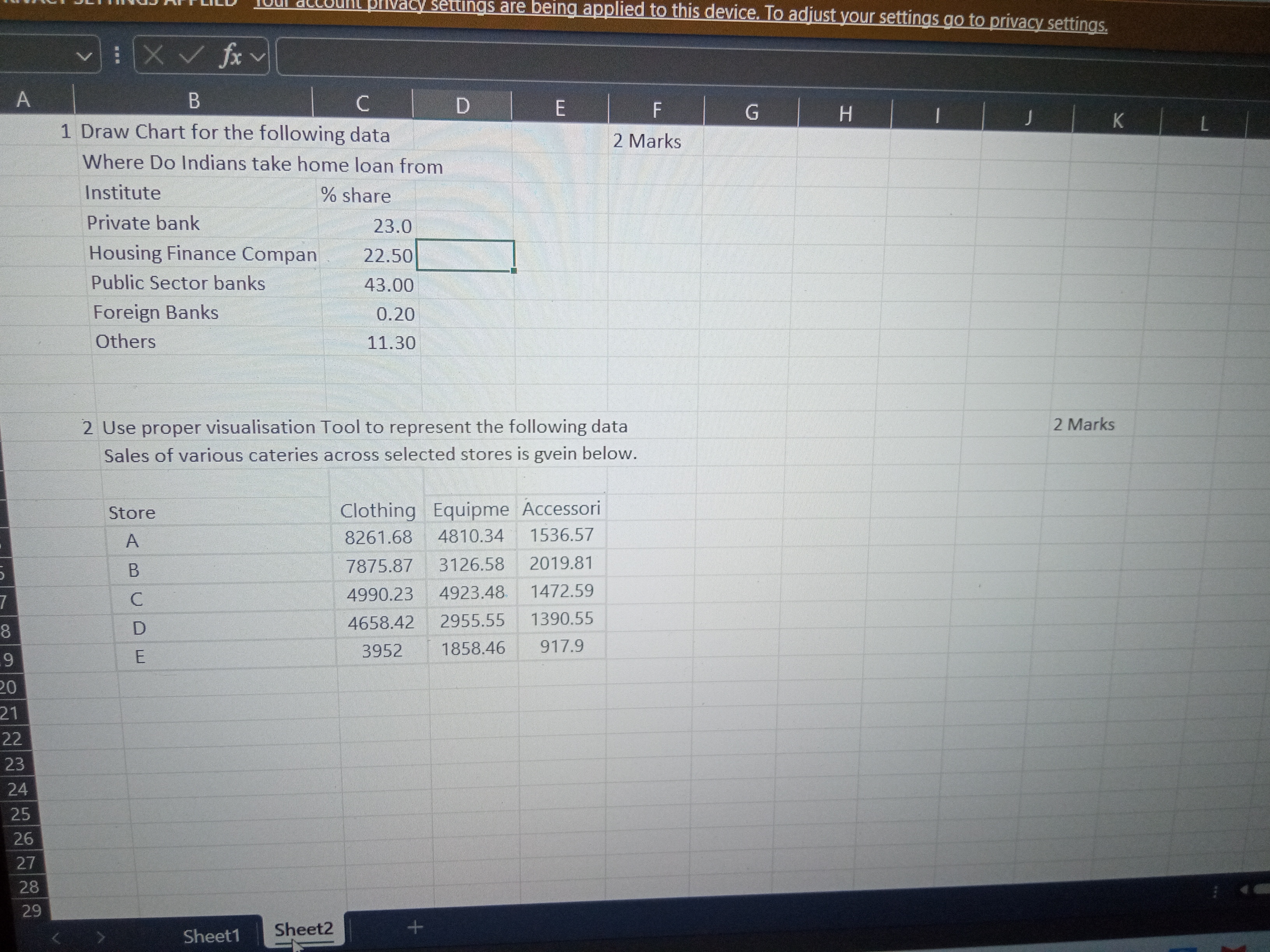
Draw a chart for the following data: Where do Indians take home loans from? Institute and % share: Private bank 23.0, Housing Finance Company 22.50, Public Sector banks 43.00, Fore... Draw a chart for the following data: Where do Indians take home loans from? Institute and % share: Private bank 23.0, Housing Finance Company 22.50, Public Sector banks 43.00, Foreign Banks 0.20, Others 11.30. Use a proper visualization tool to represent the following data: Sales of various categories across selected stores – Store A: Clothing 8261.68, Equipment 4810.34, Accessory 1536.57; Store B: Clothing 7875.87, Equipment 3126.58, Accessory 2019.81; Store C: Clothing 4990.23, Equipment 4923.48, Accessory 1472.59; Store D: Clothing 4658.42, Equipment 2955.55, Accessory 1390.55; Store E: Clothing 3952, Equipment 1884.46, Accessory 917.9.

Understand the Problem
The question is asking for the creation of a chart based on a given dataset regarding loan sources in India, and also to visualize sales data from different stores using an appropriate visualization tool.
Answer
A Pie Chart for loan sources and a Clustered Bar Chart for sales data.
Answer for screen readers
- A Pie Chart for loan source distribution.
- A Clustered Bar Chart or Stacked Column Chart for sales data comparison.
Steps to Solve
- Draw the Chart for Loan Sources
You need to create a chart based on the given dataset about where Indians take home loans from.
- Input the data into a spreadsheet tool (like Excel or Google Sheets).
- Enter the following data:
| Institute | % Share |
|---|---|
| Private bank | 23.0 |
| Housing Finance Company | 22.5 |
| Public Sector banks | 43.0 |
| Foreign Banks | 0.20 |
| Others | 11.30 |
- Highlight the data and insert a Pie Chart or Bar Chart to visualize the loan sources.
- Using Visualization Tool for Sales Data
Next, represent the sales data across different stores.
- Use the following sales data to input into the same or another spreadsheet:
| Store | Clothing | Equipment | Accessory |
|---|---|---|---|
| A | 8261.68 | 4810.34 | 1536.57 |
| B | 7875.87 | 3126.58 | 2019.81 |
| C | 4990.23 | 4923.48 | 1472.59 |
| D | 4658.42 | 2955.55 | 1390.55 |
| E | 3952.12 | 1886.46 | 917.9 |
- Use a Clustered Bar Chart or a Stacked Column Chart to visualize the sales data.
- Select Proper Visualization Tool
Make sure you choose appropriate chart types.
- A Pie Chart is best for showing parts of a whole, which is suited for loan sources.
- A Bar Chart is effective for comparing different categories over stores in sales data.
- A Pie Chart for loan source distribution.
- A Clustered Bar Chart or Stacked Column Chart for sales data comparison.
More Information
Visualizations are crucial for interpreting data quickly and effectively. Pie charts help to see percentage shares at a glance, while bar charts enable comparisons across multiple categories.
Tips
- Not labeling the charts clearly, which can confuse the interpretation.
- Using inappropriate chart types (e.g., pie charts for sales comparisons).
- Forgetting to include legends or titles, which are essential for understanding the charts.
AI-generated content may contain errors. Please verify critical information