Podcast
Questions and Answers
Which of the following is NOT an advantage of using bar charts?
Which of the following is NOT an advantage of using bar charts?
- Highly effective for continuous data (correct)
- Excellent for comparing different categories
- Clear visualization of differences
- Easy to understand
What is a potential risk associated with using bar charts?
What is a potential risk associated with using bar charts?
- They require too much data for visualization
- They can visually emphasize differences incorrectly (correct)
- They are suitable for all dataset sizes
- They always require a standard scale
Which statement best represents a best practice for creating bar charts?
Which statement best represents a best practice for creating bar charts?
- Utilize an arbitrary scale for comparison
- Provide minimal context for clarity
- Use diverse colors to distract from inaccuracies
- Ensure accuracy in representing the data (correct)
In what scenario might bar charts be less effective?
In what scenario might bar charts be less effective?
To create a bar chart that is visually appealing, which practice should be followed?
To create a bar chart that is visually appealing, which practice should be followed?
What is the purpose of a bar chart?
What is the purpose of a bar chart?
Which axis represents categories in a bar chart?
Which axis represents categories in a bar chart?
What type of bar chart compares multiple sets of data for the same categories?
What type of bar chart compares multiple sets of data for the same categories?
What should a bar chart title achieve?
What should a bar chart title achieve?
Which of the following is NOT a key element of a bar chart?
Which of the following is NOT a key element of a bar chart?
In a stacked bar chart, what do the segments of the bar represent?
In a stacked bar chart, what do the segments of the bar represent?
What does the legend in a bar chart provide?
What does the legend in a bar chart provide?
Which of the following actions is NOT recommended when creating a bar chart?
Which of the following actions is NOT recommended when creating a bar chart?
Flashcards
Bar Chart
Bar Chart
A diagram that uses bars of different lengths to visually represent data.
Categories (Bar Chart)
Categories (Bar Chart)
The categories being compared on a bar chart.
Values (Bar Chart)
Values (Bar Chart)
The numerical values represented by the bars on a bar chart.
Simple Bar Chart
Simple Bar Chart
Signup and view all the flashcards
Grouped Bar Chart
Grouped Bar Chart
Signup and view all the flashcards
Stacked Bar Chart
Stacked Bar Chart
Signup and view all the flashcards
Horizontal Bar Chart
Horizontal Bar Chart
Signup and view all the flashcards
Data Collection (Bar Charts)
Data Collection (Bar Charts)
Signup and view all the flashcards
Easy to Understand
Easy to Understand
Signup and view all the flashcards
Comparison
Comparison
Signup and view all the flashcards
Clear Visualization
Clear Visualization
Signup and view all the flashcards
Effective Communication
Effective Communication
Signup and view all the flashcards
Limited for Large Datasets
Limited for Large Datasets
Signup and view all the flashcards
Study Notes
Introduction to Bar Charts
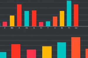
- A bar chart is a graphical representation of data using bars of different heights or lengths.
- It displays categorical data, showing the comparisons between the different categories.
- The height or length of each bar corresponds to the value of the variable for that category.
- Useful for visualizing the distribution of data across different groups or categories.
Key Elements of a Bar Chart
- Categories: The categories are represented on the horizontal axis (x-axis).
- Values: The values (data) are represented on the vertical axis (y-axis).
- Bars: Each bar represents a specific category and its corresponding value.
- Labels: Clear labels are crucial for understanding the categories and values. Labels should be concise and informative, avoiding ambiguity.
- Title: A concise and descriptive title summarizing the data presented in the chart.
- Legend (optional): If there are multiple sets of data, a legend provides a key to differentiate between them.
Types of Bar Charts
- Simple Bar Chart: Displays a single set of data across different categories.
- Grouped Bar Chart: Compares multiple sets of data for the same categories, typically using different colors or patterns for each set.
- Stacked Bar Chart: Shows the contribution of different components to a whole, stacked on top of each other.
- Horizontal Bar Chart: A bar chart where categories are on the y-axis and values are on the x-axis, often preferred for categories with long names.
Creating a Bar Chart
- Data Collection: Data needs to be collected and prepared for visualization.
- Category Selection: Identify the relevant categories for comparison.
- Value Assignment: Assign numerical values to each category.
- Choosing the Chart Type: Select the appropriate chart type based on the data and the message you intend to convey.
- Axis Labeling: Label both the x-axis (categories) and the y-axis (values) clearly.
- Title: Create a descriptive title for the chart.
- Visualization: Construct the bar chart, ensuring bars accurately reflect the data.
- Visual Appearance: Use appropriate colors, labels, and fonts to create a visually appealing and easily understandable chart.
- Presentation: Present the chart in a way that clearly conveys the message to the audience.
Advantages of Bar Charts
- Easy to Understand: Bar charts are simple and straightforward to interpret, making data accessible to a wide audience.
- Comparison: Excellent for comparing data across different categories.
- Clear Visualization: Visually emphasizes differences and similarities between categories.
- Effective Communication: Conveys information effectively to support analysis and decisions.
Limitations of Bar Charts
- Limited for Large Datasets: May not be the best choice for displaying extremely large datasets since categories can become unwieldy.
- Not Suitable for Continuous Data: Bar charts are not used for data that varies continuously (e.g., temperature readings).
- Potential for Misinterpretation: Inaccurate or misleading scales can unintentionally distort the message or comparison.
Best Practices for Creating Bar Charts
- Clear and Concise: Use clear labels, titles, and a concise scale.
- Accuracy: Ensure accuracy in representing the data.
- Appropriate Scale: Select a scale that properly reflects the range of data values to avoid distortion.
- Visual Appeal: Use appropriate color choices and design elements to improve clarity and readability.
- Contextualization: Provide context to the data displayed, such as relevant background information and details about data collection methods.
Studying That Suits You
Use AI to generate personalized quizzes and flashcards to suit your learning preferences.