Podcast
Questions and Answers
Which type of graph is generally considered the best for displaying the distribution of categorical data?
Which type of graph is generally considered the best for displaying the distribution of categorical data?
- Bar chart (correct)
- Pie chart
- Box plot
- Scatter plot
Ranking categories by height is generally recommended for bar charts displaying nominal data.
Ranking categories by height is generally recommended for bar charts displaying nominal data.
True (A)
What type of graph is commonly used alongside histograms to describe the distribution of a single metric variable?
What type of graph is commonly used alongside histograms to describe the distribution of a single metric variable?
box plot
In a box plot, the ______ indicates the spread of the middle 50% of the data.
In a box plot, the ______ indicates the spread of the middle 50% of the data.
Match the following graph types with their primary data type:
Match the following graph types with their primary data type:
Which of the following best describes the purpose of 'whiskers' in a boxplot?
Which of the following best describes the purpose of 'whiskers' in a boxplot?
A positive skew in a distribution means the longer tail is below the mean.
A positive skew in a distribution means the longer tail is below the mean.
What does kurtosis measure about a distribution?
What does kurtosis measure about a distribution?
When categories are nominal, a good way to represent them visually is to rank the bars in a chart by ______.
When categories are nominal, a good way to represent them visually is to rank the bars in a chart by ______.
In the context of data visualization for social research, what is one reason pie charts might be used less often than bar charts?
In the context of data visualization for social research, what is one reason pie charts might be used less often than bar charts?
Histograms are best suited for visualizing categorical data.
Histograms are best suited for visualizing categorical data.
What is often fitted to a histogram to better understand the distribution's shape?
What is often fitted to a histogram to better understand the distribution's shape?
A bar chart showing the mean of a metric variable across categories of a categorical variable is an example of a ______ graphic.
A bar chart showing the mean of a metric variable across categories of a categorical variable is an example of a ______ graphic.
What does a negative kurtosis indicate about the shape of a distribution?
What does a negative kurtosis indicate about the shape of a distribution?
Adding complexities to graphs is always beneficial, as it provides more detailed information.
Adding complexities to graphs is always beneficial, as it provides more detailed information.
What is the primary purpose of a histogram?
What is the primary purpose of a histogram?
Skewness and ______ are about how the shape of the distribution compares to the normal distribution.
Skewness and ______ are about how the shape of the distribution compares to the normal distribution.
Match skewness and kurtosis with their graphical effects on distribution:
Match skewness and kurtosis with their graphical effects on distribution:
What type of variables are best represented using bar charts?
What type of variables are best represented using bar charts?
In smaller datasets, histograms and bar charts convey very different information.
In smaller datasets, histograms and bar charts convey very different information.
Flashcards
Categorical variable graphs
Categorical variable graphs
Visual representations, like bar charts, that display data organized by categories.
Bar chart
Bar chart
A graph that represents categorical data with rectangular bars. The height of each bar is proportional to the value it represents.
Infographics
Infographics
Graphs like pie charts, offer visually striking ways to present univariate or multivariate statistics.
Graphs for Metric Variables
Graphs for Metric Variables
Signup and view all the flashcards
Histogram
Histogram
Signup and view all the flashcards
Boxplot
Boxplot
Signup and view all the flashcards
Skew
Skew
Signup and view all the flashcards
Kurtosis
Kurtosis
Signup and view all the flashcards
Study Notes
- Univariate descriptions with graphs are used to display graphs for categorical variables.
Graphs for Categorical Variables
- Bar charts are typically the best way to show the distribution of categories.
- Social research outputs often show data using pie charts and niche visualization graphics.
- Complexities, like confidence intervals and multivariate comparisons, can be added to graphs.
- When categories are nominal, ranking bars by height in bar charts is good practice.
- Many users modify colors, labels, etc.
Pie Charts and Infographics
- There are many options for generating striking images using univariate/multivariate stats
- There is often a trade-off between a striking image and a useful graphic.
Graphs for Metric Variables
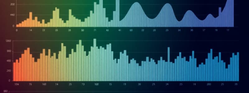
- Histograms and box plots are used to describe the distribution of a single variable.
- Curves are often fit to histograms - e.g., the best-fitting normal curve or some other line plot.
- Graphics use metric measures with other variables (e.g., a bar chart showing the mean of a metric variable across categories of a categorical variable).
- In a small dataset, a histogram is the same as a bar chart, in larger datasets it smooths the distribution.
- A box and whiskers plot indicate the spread of values of the metric variables
- Skew and kurtosis are about how the shape of the distribution compares to the normal distribution
- Positive Skew: Indicates a longer tail above the mean
- Negative Skew: Indicates a longer tail below the mean
- Positive Kurtosis: More peaked than the normal curve
- Negative Kurtosis: Less peaked than the normal curve
Studying That Suits You
Use AI to generate personalized quizzes and flashcards to suit your learning preferences.


