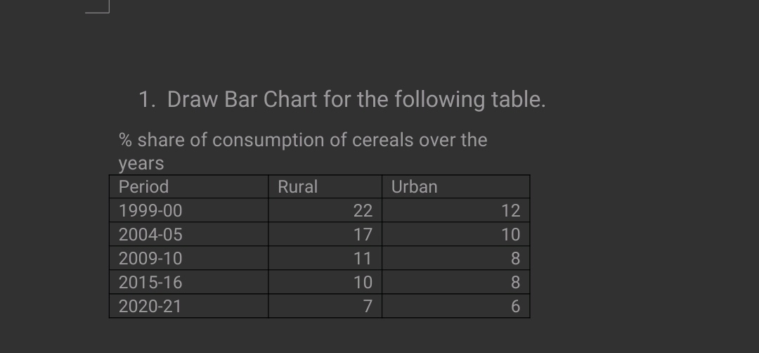
Draw a bar chart for the following table: % share of consumption of cereals over the years

Understand the Problem
The question is asking to create a bar chart based on the given data regarding the percentage share of cereal consumption in rural and urban areas over the specified years.
Answer
A bar chart displaying the percentage share of cereal consumption in rural and urban areas over the years from 1999-00 to 2020-21 has been created.
Answer for screen readers
The bar chart visually represents the percentage share of cereal consumption in rural and urban areas over the years from 1999-00 to 2020-21.
Steps to Solve
- Set Up the Data First, gather the data provided in the question for the years 1999-00 to 2020-21 for both rural and urban cereal consumption percentages:
| Period | Rural | Urban |
|---|---|---|
| 1999-00 | 22 | 12 |
| 2004-05 | 17 | 10 |
| 2009-10 | 11 | 8 |
| 2015-16 | 10 | 8 |
| 2020-21 | 7 | 6 |
-
Choose a Software or Tool Use a bar chart creation tool such as Excel, Google Sheets, or any graphing software (e.g., Matplotlib if you are using Python).
-
Create the Bar Chart
- Open your chosen tool and input the data into a table format.
- Select the data range that includes the periods and percentages for both rural and urban.
- Insert the Bar Chart
- In Excel or Google Sheets, go to "Insert" and select "Bar Chart."
- Choose the type of bar chart you prefer (e.g., clustered bar chart).
- Customize the Chart
- Add chart titles, axis labels (e.g., Period on the X-axis and % Share on the Y-axis).
- Differentiate the bars for rural and urban using colors.
- Review and Finalize Ensure the chart accurately reflects the data, and make any necessary adjustments to improve clarity and presentation.
The bar chart visually represents the percentage share of cereal consumption in rural and urban areas over the years from 1999-00 to 2020-21.
More Information
This bar chart allows us to quickly compare cereal consumption between rural and urban areas across different years. Notably, rural consumption has decreased significantly over the years compared to urban consumption.
Tips
- Not labeling axes or providing a title.
- Using the wrong chart type (e.g., line graph instead of a bar chart).
- Misrepresenting data by using inconsistent scales on the Y-axis.
AI-generated content may contain errors. Please verify critical information