Analyze provided stock chart
Understand the Problem
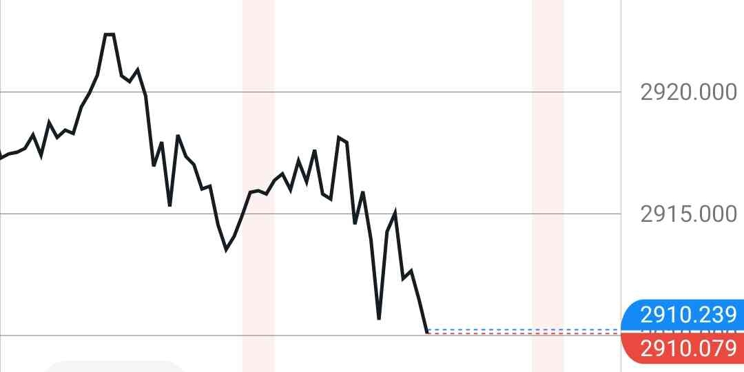
The image shows a stock price chart with values plotted over time. The user likely wants to extract or understand the information presented in the chart, such as price trends or specific data points. This is a knowledge-based question, since one might search the web to understand the image.
Answer
The stock price starts around 2918.000, peaks above 2920.000, and declines to approximately 2910.000.
The stock chart starts at approximately 2918.000, rises to just above 2920.000, then falls to around 2910.000.
Answer for screen readers
The stock chart starts at approximately 2918.000, rises to just above 2920.000, then falls to around 2910.000.
More Information
Stock charts are used to show the changes in price of a stock over time. Technicians use these charts to identify patterns in the price movement, and make decisions on whether to buy or sell the stock.
Tips
Be careful to properly read the axes of the chart, to understand which values are being portrayed.
Sources
- How to Read Stock Charts and Trading Patterns - Charles Schwab - schwab.com
- How to Read Stock Charts: Quick-Start Guide - NerdWallet - nerdwallet.com
- How to Analyse Stock Charts | RoboMarkets Blog - robomarkets.com
AI-generated content may contain errors. Please verify critical information