Podcast
Questions and Answers
Which type of font has additional strokes or tapers on letters?
Which type of font has additional strokes or tapers on letters?
- Script Fonts
- Display Fonts
- San Serif Fonts
- Serif Fonts (correct)
Gestalt Principles focus on how individual elements are perceived independently, separate from their surroundings.
Gestalt Principles focus on how individual elements are perceived independently, separate from their surroundings.
False (B)
What is the name given to the vertical space between lines of text?
What is the name given to the vertical space between lines of text?
Leading
The Gestalt Principle of ______ suggests that objects that are close together are perceived as a group.
The Gestalt Principle of ______ suggests that objects that are close together are perceived as a group.
Match the following Gestalt Principles with their descriptions:
Match the following Gestalt Principles with their descriptions:
Flashcards
Typography
Typography
Arrangement of type for legibility, readability, and aesthetics.
Typeface
Typeface
A set of characters with the same design.
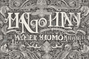
Serif Fonts
Serif Fonts
Fonts with additional strokes or embellishments.
Kerning
Kerning
Signup and view all the flashcards
Gestalt Principles
Gestalt Principles
Signup and view all the flashcards
Study Notes
Typography
- Typography is the arrangement of text to make written language clear, easy to read, and visually appealing.
Anatomy of Typography
- Character: Letters, numbers, punctuation, and symbols.
- Typeface: A set of characters with the same design.
- Font: A specific size and style of a typeface.
- Serif fonts: Include small strokes (tails) at the ends of characters.
- Sans-serif fonts: Do not have these small strokes.
- Kerning: The space between individual letters.
- Leading: The vertical space between lines of text.
- Legibility: The ability to distinguish letters.
- Script fonts: Elegant typefaces resembling handwriting.
- Display fonts: Bold, noticeable typefaces used to draw attention.
Gestalt Principles
- Gestalt principles explain how we group and perceive objects to form a complete image.
Types of Gestalt Principles
- Similarity: Elements that share similar visual characteristics (color, shape) are grouped together.
- Continuity: The eye tends to follow the smoothest path through elements.
- Closure: The mind fills in missing parts of an image to create a complete form.
- Proximity: Objects that are close together are perceived as a group.
- Figure/Ground: The perception of object (figure) against its background (ground).
- Anomaly: Elements that differ significantly from others are highlighted and stand out.
Studying That Suits You
Use AI to generate personalized quizzes and flashcards to suit your learning preferences.