Podcast
Questions and Answers
Which of these options correctly describes a frequency polygon?
Which of these options correctly describes a frequency polygon?
- A frequency polygon has a horizontal axis labeled 'Number of Children' from -4 to 21.
- A frequency polygon has a horizontal axis labeled 'Number of Children' from 0 to 21.
- A frequency polygon has a horizontal axis labeled 'Number of Children' from -3 to 19. (correct)
- A frequency polygon has a horizontal axis labeled 'Number of Children' from -2 to 20.
If you put $7,150 in the ATM each day, what percent of the days in a month should you expect to run out of cash?
If you put $7,150 in the ATM each day, what percent of the days in a month should you expect to run out of cash?
16.7%
If you are willing to run out of cash for 10% of the days, how much cash should you put in the ATM each day?
If you are willing to run out of cash for 10% of the days, how much cash should you put in the ATM each day?
$7,500
Which of these histograms correctly represents the daily withdrawals for a bank ATM?
Which of these histograms correctly represents the daily withdrawals for a bank ATM?
The data show that most of the 43 world leaders had fewer than 6 children.
The data show that most of the 43 world leaders had fewer than 6 children.
What are some benefits of representing data sets using frequency distributions? (Select all that apply)
What are some benefits of representing data sets using frequency distributions? (Select all that apply)
What are some benefits of using graphs of frequency distributions? (Select all that apply)
What are some benefits of using graphs of frequency distributions? (Select all that apply)
Why should the number of classes in a frequency distribution be between 5 and 20?
Why should the number of classes in a frequency distribution be between 5 and 20?
What is the difference between class limits and class boundaries?
What is the difference between class limits and class boundaries?
The class width is _____. (Type answer as a whole number)
The class width is _____. (Type answer as a whole number)
The lower class limits are _____. (Type answers as whole numbers, separate with commas)
The lower class limits are _____. (Type answers as whole numbers, separate with commas)
The upper class limits are _____. (Type answers as whole numbers, separate with commas)
The upper class limits are _____. (Type answers as whole numbers, separate with commas)
The class width is _____. (Type answer as a whole number)
The class width is _____. (Type answer as a whole number)
Choose the correct lower class limits below.
Choose the correct lower class limits below.
Choose the correct upper class limits below.
Choose the correct upper class limits below.
The class width is _____. (Type answer as a whole number)
The class width is _____. (Type answer as a whole number)
Choose the correct lower class limits below.
Choose the correct lower class limits below.
Choose the correct upper class limits below.
Choose the correct upper class limits below.
What are the boundaries of the class with the greatest frequency?
What are the boundaries of the class with the greatest frequency?
What are the boundaries of the class with the least frequency?
What are the boundaries of the class with the least frequency?
The approximate number in the sample is _____.
The approximate number in the sample is _____.
Choose the correct location of the greatest increase in frequency below.
Choose the correct location of the greatest increase in frequency below.
The class with the greatest frequency is from ____ to ____.
The class with the greatest frequency is from ____ to ____.
The class with the least frequency is from ____ to ____.
The class with the least frequency is from ____ to ____.
Flashcards are hidden until you start studying
Study Notes
Benefits of Frequency Distributions
- Organizing data into frequency distributions enhances clarity and facilitates graphical representation.
- Patterns within data sets become more apparent when structured as frequency distributions.
- Identifying minimum and maximum values is easier with frequency distributions.
Graphs of Frequency Distributions
- Graphical representations aid in recognizing data patterns quickly.
- They allow for the assessment of relative frequencies among classes.
- Graphs help determine class boundaries effortlessly.
- Total number of observations can be inferred through graphical analyses.
Class Limits and Boundaries
- Class limits represent the lowest and highest values within a class, while class boundaries are the values that separate classes without gaps.
- For integer data, class limits and boundaries have a difference of 0.5 units.
Determining Class Width
- The optimal number of classes for frequency distributions ranges from 5 to 20 for effective pattern detection.
- Insufficient or excessive classes may obscure data patterns.
Class Width Calculation and Limits
- Class width can be computed by dividing the range of data by the number of classes.
- Lower and upper class limits can be established based on determined width, starting from the minimum data entry.
Constructing Frequency Distributions
- Frequency distributions summarize data by specifying class limits, frequencies, midpoints, relative frequencies, and cumulative frequencies for each class.
Frequency Distribution Patterns
- The class with the greatest frequency indicates where data is most concentrated, while the class with the least frequency shows sparse data distribution.
Frequency Histograms and Polygons
- Frequency histograms visualize the distribution with specified class intervals and corresponding frequencies.
- Frequency polygons connect midpoints of classes with lines, offering a clear graphical representation of frequency distribution.
Interpretation of Data Visualization
- Identifying the classes with the greatest and least frequency helps in understanding distribution trends and variances in data sets.
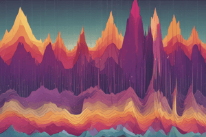
- Describing patterns in data provides insights into the overall behavior and characteristics of the population being studied.### Frequency Polygons
- Horizontal axis labeled "Number of Children": range from -3 to 19, increments of 2.
- Vertical axis labeled "Frequency": range from 0 to 22, increments of 2.
- First dataset plotted points:
- (-2, 0)
- (1, 19.8)
- (4, 10)
- (7, 4.8)
- (10, 2.4)
- (13, 1.1)
- (16, 3)
- (19, 0)
- Second dataset plotted points:
- (-2, 0)
- (1, 10)
- (4, 18)
- (7, 3)
- (10, 1)
- (13, 8)
- (16, 3)
- (19, 0)
- Observed patterns indicate that most of the 43 world leaders had fewer than 6 children.
ATM Cash Recommendations
- Daily cash withdrawals data in hundreds of dollars over 30 days: 52, 80, 65, 57, 61, 70, 69, 81, 79, 64, 69, 66, 57, 61, 66, 62, 61, 68, 63, 73, 60, 65, 63, 66, 69, 64, 71, 58, 75, 67.
- Recommended amount of cash to avoid security issues and customer discontent.
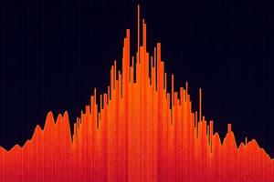
Histogram Classifications
- A histogram with 8 classes based on daily withdrawals data.
- Horizontal axis ranges:
- 48 to 84 and 50 to 86 with vertical bars representing frequency distributions.
- Relative frequency for daily withdrawal amounts:
- Found heights for classes, showing distribution peaking at around 60-68.
Expected Cash Run Out Percentage
- If placing $7,150 in the ATM, approximately 16.7% chance of running out of cash based on previous data.
Cash Amount for Desired Outage Percentage
- To allow for cash running out only 10% of the days, recommend putting in $7,500 each day.
Frequency Histograms Creation
- A dataset provided: 2, 8, 3, 1, 11, 2, 14, 9, 5, 10, 11, 12, 9, 6, 10, 10, 1, 2, 11, 6, 6, 4, 3, 8, 15.
- Histogram with 5 classes:
- Selected correct histogram showed approximate heights peaking at different class ranges.
- Histogram with 10 classes also demonstrated frequency variation among lower and upper data values.
- Additional histograms with 20 classes presented more granular data distributions, illustrating usage frequency for values in intervals.
Conclusion
- Effectively display and analyze data for demographics concerning family size and cash management for ATMs can influence strategic decision-making in both social and financial contexts.
Studying That Suits You
Use AI to generate personalized quizzes and flashcards to suit your learning preferences.