Podcast
Questions and Answers
Which of the following is the most appropriate use of a scatterplot?
Which of the following is the most appropriate use of a scatterplot?
- Displaying the distribution of a single categorical variable.
- Comparing the means of several groups.
- Showing the changes in a variable over time.
- Visualizing the association between two quantitative variables. (correct)
Correlation can be used to accurately measure the strength of any association, linear or non-linear, between two variables.
Correlation can be used to accurately measure the strength of any association, linear or non-linear, between two variables.
False (B)
List the three conditions that must be checked before one can use correlation to measure the association between two variables.
List the three conditions that must be checked before one can use correlation to measure the association between two variables.
- Quantitative Variables Condition
- Linearity Condition
- Outlier Condition
An observation that lies far away from the other data points in a scatterplot is called an ______, and can significantly distort the correlation.
An observation that lies far away from the other data points in a scatterplot is called an ______, and can significantly distort the correlation.
Match each scenario with the type of relationship (positive, negative, or no association) you would expect to see in a scatterplot:
Match each scenario with the type of relationship (positive, negative, or no association) you would expect to see in a scatterplot:
Which of the following is NOT a condition that must be checked before using correlation to measure the strength of association between two quantitative variables?
Which of the following is NOT a condition that must be checked before using correlation to measure the strength of association between two quantitative variables?
A scatterplot is an effective way to display the relationship between two categorical variables.
A scatterplot is an effective way to display the relationship between two categorical variables.
Define 'association' in the context of analyzing the relationship between two variables using a scatterplot.
Define 'association' in the context of analyzing the relationship between two variables using a scatterplot.
If higher values of one variable tend to occur with higher values of another variable, there is a _________ association.
If higher values of one variable tend to occur with higher values of another variable, there is a _________ association.
Match the variable pairs with the most suitable visualization method to analyze their association.
Match the variable pairs with the most suitable visualization method to analyze their association.
Which of the following best describes a scatterplot?
Which of the following best describes a scatterplot?
Which of the following situations is best visualized using a scatterplot?
Which of the following situations is best visualized using a scatterplot?
How do scatterplots help in data analysis?
How do scatterplots help in data analysis?
An association between two variables exists when...
An association between two variables exists when...
Match each variable pair with the type of association you would expect in a scatterplot:
Match each variable pair with the type of association you would expect in a scatterplot:
Which of the following is NOT a condition that must be checked before using correlation to measure association?
Which of the following is NOT a condition that must be checked before using correlation to measure association?
Which of the following statements about correlation is TRUE?
Which of the following statements about correlation is TRUE?
Which of the following correlation values suggests the strongest linear association?
Which of the following correlation values suggests the strongest linear association?
If a dataset has an outlier, how will it affect correlation?
If a dataset has an outlier, how will it affect correlation?
Correlation tells us...
Correlation tells us...
An observation that lies far away from the other data points in a scatterplot is called a(n) ________, and it can significantly distort the correlation.
An observation that lies far away from the other data points in a scatterplot is called a(n) ________, and it can significantly distort the correlation.
Which of the following is a possible effect of outliers in a dataset?
Which of the following is a possible effect of outliers in a dataset?
Linear regression is used to...
Linear regression is used to...
Which of the following best describes the role of the least squares regression line?
Which of the following best describes the role of the least squares regression line?
Which of the following is a limitation of correlation and linear regression?
Which of the following is a limitation of correlation and linear regression?
When interpreting a regression equation, what does the slope represent?
When interpreting a regression equation, what does the slope represent?
Which of the following situations would be best analyzed using linear regression?
Which of the following situations would be best analyzed using linear regression?
Which of the following visualizations is most appropriate for displaying the relationship between two categorical variables?
Which of the following visualizations is most appropriate for displaying the relationship between two categorical variables?
Which of the following best describes extrapolation in regression analysis?
Which of the following best describes extrapolation in regression analysis?
What does a residual represent in regression analysis?
What does a residual represent in regression analysis?
Which of the following best describes an association between two variables?
Which of the following best describes an association between two variables?
Which of the following is NOT a characteristic of a scatterplot?
Which of the following is NOT a characteristic of a scatterplot?
Which of the following best describes a strong correlation?
Which of the following best describes a strong correlation?
If the correlation coefficient (r) is close to 0, what does it indicate?
If the correlation coefficient (r) is close to 0, what does it indicate?
Which of the following best describes the impact of outliers on correlation?
Which of the following best describes the impact of outliers on correlation?
What does the y-intercept of a regression line represent?
What does the y-intercept of a regression line represent?
Which of the following best describes the least squares regression line?
Which of the following best describes the least squares regression line?
What does the slope of a regression line tell us?
What does the slope of a regression line tell us?
What is extrapolation in regression analysis?
What is extrapolation in regression analysis?
What does a residual represent in regression analysis?
What does a residual represent in regression analysis?
Flashcards
Scatterplot
Scatterplot
A visual representation that plots one quantitative variable against another to display data.
Association
Association
Indicates if a change in one variable is related to a change in another.
Correlation
Correlation
Measures the strength of the linear relationship between two quantitative variables.
Quantitative Variables Condition
Quantitative Variables Condition
Signup and view all the flashcards
Linearity Condition
Linearity Condition
Signup and view all the flashcards
What is a scatterplot?
What is a scatterplot?
Signup and view all the flashcards
What does association mean?
What does association mean?
Signup and view all the flashcards
Quantitative data check?
Quantitative data check?
Signup and view all the flashcards
Outlier Effect?
Outlier Effect?
Signup and view all the flashcards
Study Notes
Tangerine Promotions
- Tangerine offers promotions on new money transferred to savings accounts, featuring high interest rates for the first few months.
- Questions arise regarding how much new money is attracted by promotional interest rates, such as 1% or 2% higher than the base rate, and how to visualize this relationship.
Scatterplots Explained
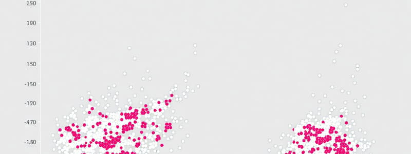
- Scatterplots plot one quantitative variable against another, offering an effective way to visualize data.
- They are the ideal way to picture associations between two quantitative variables
Correlation vs Causation
- Two variables may be correlated without implying a cause-and-effect relationship.
- A third, unseen "lurking" variable may influence both variables.
- Correlation, therefore, does not equate to causation.
Correlation Properties
- The standard deviation of the residuals (Se) assesses the spread of points around the regression line.
- Estimating the standard deviation of residuals is done by using Se = √Σe² / n-2
Simple Regression Results
- The formula y=bo+b,x is the equation for simple regression
- When interpreting the graph, S is 3049.50
- R-Sq is 15.3%
Regression to the Mean
- When analyzing data or sets, use this equation to determine each predicted value ŷ
- It indicates closeness to the mean 2y/2x
- Each value should be as close to the mean as possible.
Studying That Suits You
Use AI to generate personalized quizzes and flashcards to suit your learning preferences.