Podcast
Questions and Answers
In qualitative research reports, which section provides a condensed overview highlighting the key findings and the scope of the research?
In qualitative research reports, which section provides a condensed overview highlighting the key findings and the scope of the research?
- Introduction
- Method
- Abstract (correct)
- Discussion
Which component of the discussion section in a qualitative report involves interpreting the deeper meaning of identified patterns?
Which component of the discussion section in a qualitative report involves interpreting the deeper meaning of identified patterns?
- Interpretation of Themes and Patterns (correct)
- Comparison with Existing Literature
- Theoretical and Philosophical Implications
- Summary of Findings
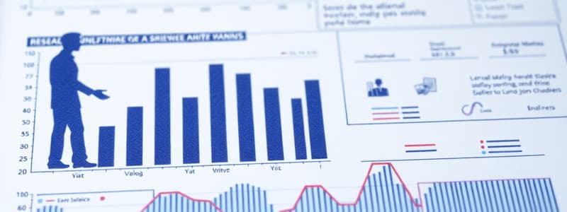
When presenting data in quantitative research, what is the primary purpose of using figures, graphs, and tables?
When presenting data in quantitative research, what is the primary purpose of using figures, graphs, and tables?
- To provide a visual break in the text
- To clearly and easily present data sets and results of statistical analysis (correct)
- To make the report appear more professional
- To highlight the researcher's personal opinions
Which type of graph is most suitable for illustrating the proportion of funding provided by each level of government to an organization?
Which type of graph is most suitable for illustrating the proportion of funding provided by each level of government to an organization?
In graph design, what role do colors play in effectively conveying information?
In graph design, what role do colors play in effectively conveying information?
When should a researcher consider using data labels on a graph?
When should a researcher consider using data labels on a graph?
What is the primary focus of a graph's title in data presentation?
What is the primary focus of a graph's title in data presentation?
Why is it recommended to use text labels directly on a graph instead of relying on a legend?
Why is it recommended to use text labels directly on a graph instead of relying on a legend?
Besides the title, what are the key elements of a table used for presenting data?
Besides the title, what are the key elements of a table used for presenting data?
When writing the introduction to a qualitative research project, what critical discussion should the author include beyond a review of relevant literature?
When writing the introduction to a qualitative research project, what critical discussion should the author include beyond a review of relevant literature?
Flashcards
Abstract
Abstract
A condensed summary of completed research, giving a compendium of the work done.
Method section
Method section
Presents the qualitative methodology used in the study.
Data Analysis and Interpretation
Data Analysis and Interpretation
Analyzes results through identified themes.
Area Graph
Area Graph
Signup and view all the flashcards
Column Graph
Column Graph
Signup and view all the flashcards
Pie Graph
Pie Graph
Signup and view all the flashcards
Data Labels
Data Labels
Signup and view all the flashcards
Graph Title
Graph Title
Signup and view all the flashcards
Tables
Tables
Signup and view all the flashcards
Bar Graph
Bar Graph
Signup and view all the flashcards
Study Notes
- The abstract is a condensed summary of completed research
- It gives a compendium of the work done in research
Introduction
- The introduction of a qualitative project should include a review of relevant literature, similar to the introduction of a quantitative study
- The author should discuss why a qualitative methodological approach was selected
Method
- The method explains the qualitative methodology used in the study
Data Analysis and Interpretation
- This analyzes results through themes
Conclusion
- The final section of a qualitative report may be labeled "Discussion," "Conclusion," "Implications," "Recommendations," or "Applications"
- The label depends on the research nature, audience, and purpose
Discussion
- Discussions and explanations of results should give a more logical and empirical basis for the conclusion after data analysis and interpretation
- Transcripts and personal narration of events act as proof of themes and categories and are mentioned verbatim
- The results of the investigation are compared and contrasted with reviewed literature and studies
- Researchers highlight the essence of lived experiences of respondents
Key Components of the Discussion Section
- Findings are briefly restated, highlighting themes from participant experiences.
- The study maintains a central focus on the essence of the phenomenon in the discussion and ensures the essence of the phenomenon remains central to the discussion
- Interpretation of themes and patterns explores what the themes reveal beyond surface-level descriptions
- Participant quotes are used as evidence, interwoven with the researcher's analysis
Comparison with Existing Literature
- The study discusses similarities and differences between current findings and previous research
- The study is situated within the broader context of phenomenological and related fields
Theoretical and Philosophical Implications
- The findings contribute to the use of phenomenology as a research approach
Presentation of Data
- Common tools for data presentation in quantitative research include figures, graphs, and tables
- These tools present one or more data series clearly and allow readers to see results from data analysis through statistical methods
Graphs
- Shows relations, comparisons, and distributions in a data set using absolute values, percentages, or index numbers
- Lines should be clean, simple, and avoid extraneous details
- Information should be presented on the horizontal and vertical axes clearly and systematically
- Facts can be shown in ascending or descending order
- A set of related data is called a data series
Types of Graphs
- Area graphs show the relationship of different parts to a whole over time
- They handle four to six data series
- Enrollment statistics over five years, or regional sales for a year are examples
- Column graphs show the differences in individual values vertically between different time periods or groupings
- They work best with one to three data series
- Total monthly phone calls or orders received by method each month are examples
- Bar graphs show the differences in individual values horizontally
- This graph is suitable for showing results from one or two data series, but not for different time periods
- An example would be indicating the popularity of the top survey answers
- Line graphs feature values at different points in time, using equal time intervals along the horizontal axis
- Effective for displaying four to six data series
- Example: Trends in monthly customer service calls handled
- Pie graphs show the proportions of each segment of a whole
- This graph handles only one data series
- An example would be the proportion of funding provided from each level of government in the past year
Graph Elements
- Colors should have enough contrast between the background and each data series for clear visibility and match the slide's color scheme
- Depth indicates whether the graph is 2D or 3D and is an aesthetic choice
- All graph types except pie graphs have two axes, for data values and for time scale or data separation
- Set the axes to suit the data, with legible labels
- Unclear axes can lead to misinterpretation
Data Labels
- Data labels are used when the data value in a graph needs to be more clearly indicated
- It's a text box that contains the actual data value
- Should be placed close to the graphical representation of the datapoint
- Text should be legible and have sufficient contrast with the color underneath
Title
- The title should focus on interpreting the data, not on the data itself
- The title helps the audience interpret the graph properly
- Instead of "Sales 1996-2001," use "Sales Up 42% from 1996 to 2001"
Legend
- If there are more than one data series on a graph, text labels should indicate each series instead of using a legend on the graph
- Explanatory text should be placed using text boxes
Tables
- Tables provide exact values and illustrate results efficiently
- They allow researchers to present a large amount of data in a small amount of space
Elements of a Table
- Title
- Rows
- Columns
- Column labels or titles
- Data
Studying That Suits You
Use AI to generate personalized quizzes and flashcards to suit your learning preferences.