Podcast
Questions and Answers
Which type of chart is best suited for representing the fluctuation of stock prices over time, including high, low, and closing points for a specific day?
Which type of chart is best suited for representing the fluctuation of stock prices over time, including high, low, and closing points for a specific day?
- Stock Chart (correct)
- Column Chart
- Line Chart
- Pie Chart
What type of chart is most effective for showing the breakdown of a budget into different categories as proportions of the whole?
What type of chart is most effective for showing the breakdown of a budget into different categories as proportions of the whole?
- Pie Chart (correct)
- Line Chart
- Bar Chart
- Area Chart
A company wants to present its sales figures for different product lines over a period of five years. Which chart type would be the most suitable for visualizing the sales trend of each product line?
A company wants to present its sales figures for different product lines over a period of five years. Which chart type would be the most suitable for visualizing the sales trend of each product line?
- Scatter Chart
- Bar Chart
- Column Chart
- Line Chart (correct)
Which chart type is used to illustrate the relationship between two sets of data, often used for correlation analysis?
Which chart type is used to illustrate the relationship between two sets of data, often used for correlation analysis?
You need to compare the average monthly expenses of three different households. Which chart type would be the most effective?
You need to compare the average monthly expenses of three different households. Which chart type would be the most effective?
Which chart is best for demonstrating the evolution of a company's profits over a period of five years?
Which chart is best for demonstrating the evolution of a company's profits over a period of five years?
You want to visualize the different components of a project budget, representing them as a percentage of the total budget. Which chart type would be most appropriate?
You want to visualize the different components of a project budget, representing them as a percentage of the total budget. Which chart type would be most appropriate?
Which chart type excels at depicting trends over time, especially when visualizing multiple datasets simultaneously?
Which chart type excels at depicting trends over time, especially when visualizing multiple datasets simultaneously?
What is the primary purpose of a Surface Chart?
What is the primary purpose of a Surface Chart?
What distinguishes a Donut Chart from a standard Pie Chart?
What distinguishes a Donut Chart from a standard Pie Chart?
What is the primary purpose of a Box and Whisker Chart?
What is the primary purpose of a Box and Whisker Chart?
Which chart type uses circles to represent data points, where the size of the circle indicates a third data set?
Which chart type uses circles to represent data points, where the size of the circle indicates a third data set?
Which type of chart is useful for understanding the impact of a series of positive and negative values on an initial value?
Which type of chart is useful for understanding the impact of a series of positive and negative values on an initial value?
Which chart is ideal for displaying hierarchical data, where each level is represented by a ring?
Which chart is ideal for displaying hierarchical data, where each level is represented by a ring?
What is the main function of a Map Chart?
What is the main function of a Map Chart?
What should you click to add a title to a chart in Excel?
What should you click to add a title to a chart in Excel?
Which step is NOT necessary when changing the chart type?
Which step is NOT necessary when changing the chart type?
What type of chart represents the distribution of a numeric variable's values as a series of bars?
What type of chart represents the distribution of a numeric variable's values as a series of bars?
How can you adjust the legend's position in a chart?
How can you adjust the legend's position in a chart?
Which of the following best describes a Combo Chart?
Which of the following best describes a Combo Chart?
What does a Treemap Chart represent?
What does a Treemap Chart represent?
Which of the following steps is involved in switching the row and column display on a chart?
Which of the following steps is involved in switching the row and column display on a chart?
Data labels in a chart are used primarily to enhance the focus on:
Data labels in a chart are used primarily to enhance the focus on:
What does the source data in a chart refer to?
What does the source data in a chart refer to?
Flashcards
Charts and Graphs
Charts and Graphs
Visual tools for presenting and analyzing data.
Data Visualization
Data Visualization
Transforming raw data into visual graphics for understanding.
Column Charts
Column Charts
Charts that compare values vertically using bars.
Line Charts
Line Charts
Signup and view all the flashcards
Pie Charts
Pie Charts
Signup and view all the flashcards
Bar Charts
Bar Charts
Signup and view all the flashcards
Area Charts
Area Charts
Signup and view all the flashcards
Scatter Charts
Scatter Charts
Signup and view all the flashcards
Box and Whisker Chart
Box and Whisker Chart
Signup and view all the flashcards
Waterfall Chart
Waterfall Chart
Signup and view all the flashcards
Funnel Chart
Funnel Chart
Signup and view all the flashcards
Creating a Line Chart
Creating a Line Chart
Signup and view all the flashcards
Change Chart Type
Change Chart Type
Signup and view all the flashcards
Switch Row/Column
Switch Row/Column
Signup and view all the flashcards
Legend Position
Legend Position
Signup and view all the flashcards
Data Labels
Data Labels
Signup and view all the flashcards
Surface Chart
Surface Chart
Signup and view all the flashcards
Radar Chart
Radar Chart
Signup and view all the flashcards
Combo Chart
Combo Chart
Signup and view all the flashcards
Map Chart
Map Chart
Signup and view all the flashcards
Donut Chart
Donut Chart
Signup and view all the flashcards
Bubble Chart
Bubble Chart
Signup and view all the flashcards
Treemap Chart
Treemap Chart
Signup and view all the flashcards
Sunburst Chart
Sunburst Chart
Signup and view all the flashcards
Study Notes
MS Excel Charts
- Charts and graphs visually represent data, making trends, patterns, and comparisons easier to identify.
- Numerical data is converted to visual formats for clear and effective communication of complex information.
Advantages of Charts and Graphs
- Data Visualization: Transforming raw data into visually appealing graphics.
- Comparison: Easily comparing different datasets.
- Trend Analysis: Identifying trends and patterns over time.
- Clarity: Making data insights more accessible and understandable.
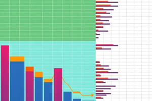
Chart Types in Excel
- Column Charts: Useful for comparing different values side-by-side. Values are represented by vertical bars; different series are color-coded.
- Line Charts: Illustrate trends over time. Values are plotted as points and connected by lines; multiple items are shown using different lines.
- Pie Charts: Useful for displaying percentage values of a whole. Each item's value is represented by a slice of the pie with different colors; limited to eight sections.
- Bar Charts: Similar to column charts except that information is presented in horizontal bars instead of vertical columns.
- Area Charts: Similar to line charts, but the areas beneath the lines are filled with color.
- Scatter Charts: Used to plot clusters of values using single points; multiple items can be shown with different colored points or symbols, useful for visualizing relationships.
- Stock Charts: Display stock price fluctuations, including high, low, and closing points for a day.
- Surface Charts: Useful for finding optimal combinations between two sets of data. Colors and patterns highlight similar ranges.
- Radar Charts: Comparing aggregate values of multiple data series.
- Combo Charts: Combining two or more charts to highlight different types of information.
- Map Charts: Employ geographical maps to display data points or statistical information related to specific locations.
- Donut Charts: A type of pie chart with a central hole; present categories as arcs instead of slices.
- Bubble Charts: Like scatter plots, but a third data set is shown by the size of the bubble or circle.
- Treemap Charts: Represent hierarchical data using a tree-like diagram; data is organized into branches and sub-branches.
- Sunburst Charts: Ideal for hierarchical data; each level represented by a ring or circle, with the innermost representing the top of the hierarchy.
- Histogram Charts: Show the distribution of a numeric variable's values as a series of bars.
- Box and Whisker Charts (Box Plots): Visualize data distribution to compare data sets and identify outliers.
- Waterfall Charts: Illustrate a running total as values are added or subtracted providing a detailed view of how starting values are affected by positive and negative changes.
- Funnel Charts: Show a series of steps and the completion rate for each step within a process.
Creating a Line Chart in Excel
- Step 1: Selection: Select the data range (e.g., A1:D7).
- Step 2: Chart Insertion: Click the "Insert" tab and select the line chart symbol within the "Charts" group.
- Step 3: Line Style: Choose a line style from the chart options.
- Step 4: Chart Title and Data Labels: Add a meaningful title and data labels as needed.
Changing Chart Type
- Select the chart.
- Go to the "Chart Design" tab.
- Click "Change Chart Type" in the "Type" group.
- Choose a new chart type.
Legend Position
- Select the chart.
- Click the "+" button on the right side of the chart.
- Click the arrow next to "Legend," and choose "Right."
Data Labels
- Select the chart.
- Select a data series.
- Click the "check box" for "Data Labels."
Chart Elements
- Source data: The data range used by the chart, which updates automatically.
- Title: A brief description of the chart's content.
- Legend: The chart key, showing how the colors represent different data series.
- Axis: The vertical (Y-axis) and horizontal (X-axis) parts of a chart, showing values or units.
- Data Series: The data points or values within the chart.
- Value axis: The axis reflecting the values or units of data.
- Category axis: The identification of each data series.
Studying That Suits You
Use AI to generate personalized quizzes and flashcards to suit your learning preferences.