Podcast
Questions and Answers
What is a more suitable graph type for plotting composition?
What is a more suitable graph type for plotting composition?
- Bar chart (correct)
- Line graph
- Pie chart
- Scatter plot
When is a line graph ideal for use?
When is a line graph ideal for use?
- When plotting distribution of ages within a population
- When plotting relationship between two variables
- When showing changes in values over time or across different categories (correct)
- When comparing parts to a whole
What is an important consideration when plotting a line graph?
What is an important consideration when plotting a line graph?
- Using a consistent scale on both axes (correct)
- Using a 3D graph
- Using a different color for each axis
- Including a picture in the background
What is the purpose of a legend in a line graph?
What is the purpose of a legend in a line graph?
What is the main purpose of a line graph?
What is the main purpose of a line graph?
What is the primary source of water vapor in the atmosphere?
What is the primary source of water vapor in the atmosphere?
What is the result of water vapor cooling and changing back into a liquid state?
What is the result of water vapor cooling and changing back into a liquid state?
What is the process by which water moves from the land back into bodies of water?
What is the process by which water moves from the land back into bodies of water?
What is the process by which plants release water vapor into the air?
What is the process by which plants release water vapor into the air?
What is the end result of the condensation process in the atmosphere?
What is the end result of the condensation process in the atmosphere?
What is the primary mechanism by which water droplets in clouds fall to the ground?
What is the primary mechanism by which water droplets in clouds fall to the ground?
What is the term used to describe the process of water flowing over the Earth's surface after precipitation?
What is the term used to describe the process of water flowing over the Earth's surface after precipitation?
What is the primary role of precipitation in the water cycle?
What is the primary role of precipitation in the water cycle?
Where do plants absorb water from during the process of transpiration?
Where do plants absorb water from during the process of transpiration?
What is the ultimate destination of runoff water?
What is the ultimate destination of runoff water?
Flashcards are hidden until you start studying
Study Notes
Line Graphs and Plotting
Line graphs are a popular type of visualization for quantitative data, especially when the data involves time-series or trends. They are often used to represent continuous data sets and are suitable for showing changes in a single variable over time. Here, we will discuss line graphs in detail, focusing on their plotting and the subtopics of relationship, distribution, composition, and comparison.
Understanding Line Graphs
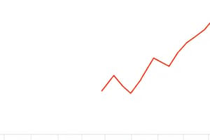
A line graph is a two-dimensional chart that uses lines to connect individual data points. It consists of two axes: the X-axis and the Y-axis. The X-axis represents the time or the independent variable, while the Y-axis represents the values of the dependent variable. The line connects the data points plotted on the graph.
Plotting Line Graphs - Subtopics
Plotting Relationships
Line graphs are ideal for showing the relationship between two variables, especially when one of the variables is time. They can help identify trends, patterns, and correlations between the variables. For example, a line graph can be used to show the relationship between the price of a stock and the overall market trend.
Plotting Distribution
Distribution refers to the frequency or probability of an event occurring within a determined range. Line graphs can be used to plot distribution, showing the frequency or probability of events within a specific range of values. For instance, a line graph can be used to represent the distribution of ages within a population.
Plotting Composition
Line graphs are not typically used for plotting composition, as other types of graphs, like pie charts or bar charts, are more suitable for this purpose. Composition is about comparing parts to a whole, usually in percentages.
Plotting Comparison
Line graphs can be used to compare multiple variables or categories within a single variable. They are ideal for showing changes in values over time or across different categories. For example, a line graph can be used to compare the sales of different products over a period of time or to illustrate the performance of different stocks in the same industry.
Plotting Tips and Best Practices
-
Choose the right type of line graph: Line graphs are suitable for plotting trends, relationships, and comparisons. However, other types of graphs, such as scatter plots or histograms, may be more appropriate for certain types of data.
-
Label your axes: Clearly label the X and Y axes to make the graph easy to interpret.
-
Use a consistent scale: Ensure the scale on both axes is consistent and covers the entire range of values to avoid distortion.
-
Color-code data series: Use different colors or markers to distinguish between different data series or trends.
-
Include a legend: Add a legend to the graph to explain what each color or marker represents.
-
Consider adding a title: Provide a brief title that summarizes the main purpose of the graph.
In conclusion, line graphs are versatile tools for visualizing data, particularly when it comes to showing changes in quantitative values over time. By understanding the subtopics of relationship, distribution, composition, and comparison, and following best practices for plotting, you can create informative and insightful line graphs that effectively communicate complex data to your audience.
Studying That Suits You
Use AI to generate personalized quizzes and flashcards to suit your learning preferences.