Podcast
Questions and Answers
What is the primary use of a pie chart?
What is the primary use of a pie chart?
- To show relationships between two variables
- To display trends over time
- To analyze data distribution
- To visualize how different categories contribute to a total (correct)
A scatter plot can show whether two variables are correlated.
A scatter plot can show whether two variables are correlated.
True (A)
What should you drag to the 'Rows' shelf to create a pie chart?
What should you drag to the 'Rows' shelf to create a pie chart?
Measure (e.g., Sales or Profit)
A scatter plot is best for showing the relationship between _______ variables.
A scatter plot is best for showing the relationship between _______ variables.
What does a heatmap primarily help visualize?
What does a heatmap primarily help visualize?
When constructing a line graph, which field should be placed on the 'Columns' shelf?
When constructing a line graph, which field should be placed on the 'Columns' shelf?
Too many slices in a pie chart can enhance clarity.
Too many slices in a pie chart can enhance clarity.
A box-and-whisker plot can only display one dataset at a time.
A box-and-whisker plot can only display one dataset at a time.
Match the following visualization types with their primary purposes:
Match the following visualization types with their primary purposes:
What are the four main components of a box-plot?
What are the four main components of a box-plot?
In heatmaps, _____ colors typically represent higher values.
In heatmaps, _____ colors typically represent higher values.
What is an example of a measure you might use in a scatter plot?
What is an example of a measure you might use in a scatter plot?
Which of the following is NOT an advantage of using a box-plot?
Which of the following is NOT an advantage of using a box-plot?
Match the following visualizations with their main uses:
Match the following visualizations with their main uses:
What is the purpose of adding labels in a heatmap?
What is the purpose of adding labels in a heatmap?
Box-plots help in identifying the central tendency of a dataset.
Box-plots help in identifying the central tendency of a dataset.
What are the axes created when creating a scatter plot with Profit and Sales in Tableau?
What are the axes created when creating a scatter plot with Profit and Sales in Tableau?
In Tableau, measures are placed to the right of dimensions when creating a scatter plot.
In Tableau, measures are placed to the right of dimensions when creating a scatter plot.
What type of mark is used by default in Tableau scatter plots?
What type of mark is used by default in Tableau scatter plots?
When comparing data with scatter plots, the resulting chart is analogous to a ______ chart with x and y coordinates.
When comparing data with scatter plots, the resulting chart is analogous to a ______ chart with x and y coordinates.
Match the following Tableau components with their functions in scatter plots:
Match the following Tableau components with their functions in scatter plots:
Which step is necessary to separate data into different marks by dimension in a scatter plot?
Which step is necessary to separate data into different marks by dimension in a scatter plot?
Adding the Region dimension to Detail on the Marks card reduces the number of marks shown in the scatter plot.
Adding the Region dimension to Detail on the Marks card reduces the number of marks shown in the scatter plot.
What does dragging the Profit measure to the Columns shelf do in Tableau?
What does dragging the Profit measure to the Columns shelf do in Tableau?
Flashcards are hidden until you start studying
Study Notes
Creating Scatter Plots
- Scatter plots are created by placing measures on the Columns and Rows shelves in Tableau.
- Measures are always placed to the right of any dimensions on these shelves.
- Scatter plots can use different mark types like circle, square, and shape.
Creating a Scatter Plot with Sales and Profit
- Drag the Profit measure onto the Columns shelf.
- Drag the Sales measure onto the Rows shelf.
- This creates a scatter plot with Sales on the Y-axis and Profit on the X-axis.
- Drag the Category dimension onto the Color mark to create separate marks for each category and differentiate them by color.
- Drag the Region dimension onto the Detail mark to show multiple marks for each region.
Heatmaps
- Heatmaps are scatter plots that use color to show data distribution or relationships.
- They are useful for highlighting patterns and correlations between categories, especially in large datasets.
- To create a Heatmap, drag dimensions to the Columns and Rows shelves and a measure to the Color mark.
Box Plots
- Box plots are used to visually summarize data distribution, identify outliers, and show data spread.
- They also enable comparison of multiple datasets side-by-side.
- Components of a box plot include Minimum, Lower Quartile (Q1), Median (Q2), Upper Quartile (Q3), and Maximum.
Line Graphs
- Line graphs are useful for visualizing trends and changes over time, such as sales over years or website traffic over months.
- To create a line graph, drag a date field to the Columns shelf and a measure to the Rows shelf.
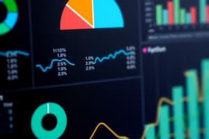
Pie Charts
- Pie charts are used to show proportions or percentages of a whole, representing how different categories contribute to a total.
- They are best for visualizing relative proportions with a few categories.
- To create a pie chart, drag a dimension to the Columns shelf, a measure to the Rows shelf, and select the Pie Chart option from the Marks menu.
Scatter Plots for Relationships
- Scatter plots are used to show the relationship or correlation between two variables.
- They help identify positive, negative, or no correlation by visually representing the relationship between the variables.
- To create a scatter plot for relationships, drag one measure to the Columns shelf, another measure to the Rows shelf, change the Marks type to Circle, and drag a dimension to Color for differentiation.
Studying That Suits You
Use AI to generate personalized quizzes and flashcards to suit your learning preferences.