Podcast
Questions and Answers
What type of graph is most suitable for showing changes in data over a short time span?
What type of graph is most suitable for showing changes in data over a short time span?
- Line graph
- Bar graph (correct)
- Pie chart
- Column graph
Which type of diagram is best used to represent the breakdown of a whole into its components?
Which type of diagram is best used to represent the breakdown of a whole into its components?
- Line graph
- Bar graph
- Pie chart (correct)
- Frequency distribution table
What is the primary purpose of using a frequency distribution table?
What is the primary purpose of using a frequency distribution table?
- To illustrate data changes over time
- To compare long-term data trends
- To show data arranged into classes and their frequencies (correct)
- To depict the relationship between two or more data series
What characteristic distinguishes line graphs from bar graphs?
What characteristic distinguishes line graphs from bar graphs?
In the context of class limits, what does the term 'lower class limits' refer to?
In the context of class limits, what does the term 'lower class limits' refer to?
What does the stem-and-leaf plot primarily involve?
What does the stem-and-leaf plot primarily involve?
Which statement correctly summarizes the performance of the students in the Statistics test?
Which statement correctly summarizes the performance of the students in the Statistics test?
What is one advantage of tabular presentation over textual presentation?
What is one advantage of tabular presentation over textual presentation?
In the context of the data presentation, what is a significant characteristic of the highest data value mentioned?
In the context of the data presentation, what is a significant characteristic of the highest data value mentioned?
What is the role of the 'stem' in a two-digit number when presented in a stem-and-leaf plot?
What is the role of the 'stem' in a two-digit number when presented in a stem-and-leaf plot?
Why is it important to arrange data from lowest to highest when interpreting statistics?
Why is it important to arrange data from lowest to highest when interpreting statistics?
What does tabulation specifically aim to do with data?
What does tabulation specifically aim to do with data?
Which of the following elements is NOT typically included in a textual data presentation?
Which of the following elements is NOT typically included in a textual data presentation?
What is a frequency distribution table primarily used for?
What is a frequency distribution table primarily used for?
Which of the following describes the class width in a frequency distribution table?
Which of the following describes the class width in a frequency distribution table?
What is the purpose of class boundaries in a frequency distribution table?
What is the purpose of class boundaries in a frequency distribution table?
What is the primary purpose of a line graph?
What is the primary purpose of a line graph?
In which scenario would you use a cumulative frequency table?
In which scenario would you use a cumulative frequency table?
In a pie chart, what does each slice represent?
In a pie chart, what does each slice represent?
How is relative frequency calculated?
How is relative frequency calculated?
What is essential when selecting data for a graph in MS Excel?
What is essential when selecting data for a graph in MS Excel?
What is the primary advantage of using a column graph?
What is the primary advantage of using a column graph?
What does the class mark represent in a frequency distribution table?
What does the class mark represent in a frequency distribution table?
When creating a chart, what is the initial step to represent the data?
When creating a chart, what is the initial step to represent the data?
In which scenario is a bar graph more appropriate than a column graph?
In which scenario is a bar graph more appropriate than a column graph?
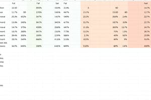
How is net income calculated according to the information provided?
How is net income calculated according to the information provided?
Which of the following components is not typically included in a frequency distribution table?
Which of the following components is not typically included in a frequency distribution table?
What key feature distinguishes pie charts from line graphs?
What key feature distinguishes pie charts from line graphs?
What do the heights of rectangles in a column graph signify?
What do the heights of rectangles in a column graph signify?
What is the key feature that differentiates a bar graph from a column graph?
What is the key feature that differentiates a bar graph from a column graph?
What does adding all expenses together before calculating percentages in a pie chart achieve?
What does adding all expenses together before calculating percentages in a pie chart achieve?
Which data presentation is most effective for time series data?
Which data presentation is most effective for time series data?
When constructing a line graph for Company C's sales and net income from 2011-2015, which data should be used?
When constructing a line graph for Company C's sales and net income from 2011-2015, which data should be used?
What is the first step in creating a chart in MS Excel?
What is the first step in creating a chart in MS Excel?
When should a column graph be utilized over other types of graphs?
When should a column graph be utilized over other types of graphs?
What types of data can be effectively displayed using a bar graph?
What types of data can be effectively displayed using a bar graph?
Which aspect is NOT typically highlighted when using graphical presentation of data?
Which aspect is NOT typically highlighted when using graphical presentation of data?
How do you determine the class width in a frequency distribution?
How do you determine the class width in a frequency distribution?
What does a cumulative histogram, also known as an ogive, help to determine?
What does a cumulative histogram, also known as an ogive, help to determine?
What is the primary goal of a Pareto diagram?
What is the primary goal of a Pareto diagram?
When plotting points for an ogive, where should the dots be placed?
When plotting points for an ogive, where should the dots be placed?
According to the Pareto principle, what percentage of variation is typically explained by 20 percent of the causes?
According to the Pareto principle, what percentage of variation is typically explained by 20 percent of the causes?
What is the first step in creating a Pareto diagram?
What is the first step in creating a Pareto diagram?
For a frequency distribution, which interval has the highest frequency in the provided data?
For a frequency distribution, which interval has the highest frequency in the provided data?
In the context of the cumulative frequency calculation, what is the first step?
In the context of the cumulative frequency calculation, what is the first step?
Flashcards
Stem-and-Leaf Plot
Stem-and-Leaf Plot
A way to display data by separating each data point into a stem (tens digit) and a leaf (ones digit).
Column Graph
Column Graph
A graph using vertical rectangles (columns) to represent data, where the height of each column shows the value.
Column Graph Axis
Column Graph Axis
The horizontal (x) and vertical (y) lines that form the framework of a column graph, using to measure and represent data.
Time-Series Data
Time-Series Data
Signup and view all the flashcards
Bar Graph
Bar Graph
Signup and view all the flashcards
Bar Graph-y Axis
Bar Graph-y Axis
Signup and view all the flashcards
Graphic Presentation
Graphic Presentation
Signup and view all the flashcards
Frequency Distribution
Frequency Distribution
Signup and view all the flashcards
Data Presentation Methods
Data Presentation Methods
Signup and view all the flashcards
Textual Data Presentation
Textual Data Presentation
Signup and view all the flashcards
Tabular Presentation
Tabular Presentation
Signup and view all the flashcards
Stem
Stem
Signup and view all the flashcards
Leaf
Leaf
Signup and view all the flashcards
Data Condensing
Data Condensing
Signup and view all the flashcards
Data Classification
Data Classification
Signup and view all the flashcards
Line graphs
Line graphs
Signup and view all the flashcards
Pie chart
Pie chart
Signup and view all the flashcards
Frequency distribution table
Frequency distribution table
Signup and view all the flashcards
Data Series
Data Series
Signup and view all the flashcards
Data Trend
Data Trend
Signup and view all the flashcards
MS Excel
MS Excel
Signup and view all the flashcards
Selecting Data (Excel)
Selecting Data (Excel)
Signup and view all the flashcards
Net Income
Net Income
Signup and view all the flashcards
Data Composition
Data Composition
Signup and view all the flashcards
Class Limits
Class Limits
Signup and view all the flashcards
Class Boundaries
Class Boundaries
Signup and view all the flashcards
Class Mark
Class Mark
Signup and view all the flashcards
Class Width
Class Width
Signup and view all the flashcards
Relative Frequency
Relative Frequency
Signup and view all the flashcards
Cumulative Frequency
Cumulative Frequency
Signup and view all the flashcards
Chart Creation
Chart Creation
Signup and view all the flashcards
Ogive
Ogive
Signup and view all the flashcards
Pareto Diagram
Pareto Diagram
Signup and view all the flashcards
Class Intervals
Class Intervals
Signup and view all the flashcards
Tally
Tally
Signup and view all the flashcards
Cumulative Percent
Cumulative Percent
Signup and view all the flashcards
Study Notes
Course Outcome Bulletin
- Course: Business Mathematics (MATH02)
- School Year: 2022-2023
- Quarter: 02
- Objective: Using appropriate data presentation tools.
- Subject Matter: Includes lessons on presentation of data (textual, tabular, and graphical), application in MS Excel, frequency distribution tables, histograms, ogives, and Pareto diagrams.
Learning Competencies
- Presenting data in three different ways
- Presenting data using MS Excel
- Constructing frequency distribution tables, histograms, ogives, and Pareto diagrams.
Evaluation
- Performance Task: Blackboard Exam (Week 12)
- Written Work: Blackboard Exam (Week 12)
Lesson 10: Presentation of Data
- Ungrouped Data: Data that is not organized, or arranged from highest to lowest or vice versa.
- Grouped Data: Data organized into classes or categories.
- Tabulation: Concise process of classifying data and arranging it in a table.
- Tabular Presentation: More concise than a textual presentation.
- Stem-and-Leaf Plot: A table that sorts data in a pattern. Stem is the first digit number, leaf is the last digit number.
- Column Graph: Data presented in rectangles along a baseline (y-axis), heights represent the amounts.
- Bar Graph: Similar to a column graph, but bars are horizontal.
- Line Graph: Connects data points with lines.
- Textual Form: Presenting data in paragraph form.
- Tabular Form: Presenting data in rows and columns.
- Graphical Form: Presenting data visually.
Lesson 10.1: Textual Presentation
- Example: Presenting student performance in a statistics test, including characteristics of data (highest, lowest, average).
Lesson 10.2: Tabular Presentation
- Parts of a table: Table number, table title, column headers, row classifier, body, source notes.
- Stem-and-leaf plot: Separates numbers (two digits, three digits etc.) into stem (first digit) and leaf (last digit).
Lesson 10.3: Graphical Presentation
- Types of graphs: Column graphs, bar graphs, line graphs (time series and frequency distributions).
- Examples: Presenting Company sales data, Company B sales vs. net income, and Company A, B, and C net income.
- Analyzing graphical presentation using the data given in an example.
Lesson 10.4: Application in MS Excel
- Steps for Creating Charts:
- Selecting data, ensuring appropriate data ranges
- Using the Insert Tab.
- Creating the actual chart type(s)
Lesson 10.5: Frequency Distribution Table
- Ungrouped Frequency Distribution: Presents data without grouping into classes.
- Grouped Frequency Distribution: Groups data into specific intervals or classes to show the distribution and frequency.
- Lower Class Limits: Smallest numbers that can belong to the different classes.
- Upper Class Limits: Largest numbers that can belong to the different classes.
- Class Boundaries: Numbers used to separate classes without gaps.
- Class Midpoint: Average of class limits.
- Class Width: Difference between consecutive class boundaries or limits.
Lesson 10.6: Histogram
- Shows the frequencies of data in different intervals.
- Similar to a vertical bar graph, but no gaps between bars.
Lesson 10.7: Ogive
- Cumulative histogram.
- Useful for finding how many data values are above or below a particular value.
Lesson 10.8: Pareto Diagram
- Used for prioritizing problems or causes of problems.
- Presents data in decreasing order relative to an effect.
- Shows the relative importance of different factors.
10.9-10.10 Data Presentation: Excel Application and Additional Topics
- Creating Charts in Excel (column charts, line charts, pie charts)
- Detailed instruction on selecting data ranges for graph creation and how to make graphs.
Studying That Suits You
Use AI to generate personalized quizzes and flashcards to suit your learning preferences.