Podcast
Questions and Answers
When analyzing two sets of data to determine if their averages differ significantly, which graphical method is most suitable for initially exploring the data and identifying potential outliers?
When analyzing two sets of data to determine if their averages differ significantly, which graphical method is most suitable for initially exploring the data and identifying potential outliers?
- Histogram
- Scatterplot
- Stem and leaf plot (correct)
- Box plot
In a scatterplot, what does a line of best fit that is nearly horizontal indicate about the correlation between the two variables?
In a scatterplot, what does a line of best fit that is nearly horizontal indicate about the correlation between the two variables?
- Strong positive correlation
- Perfect positive correlation
- Weak or no correlation (correct)
- Strong negative correlation
You're analyzing the relationship between study hours and exam scores using a scatterplot. The line of best fit slopes upwards. What can you conclude?
You're analyzing the relationship between study hours and exam scores using a scatterplot. The line of best fit slopes upwards. What can you conclude?
- Increased study hours cause lower exam scores.
- Exam scores determine study hours.
- There is no correlation between study hours and exam scores.
- Increased study hours are associated with higher exam scores. (correct)
Which of the following characteristics of data points on a scatterplot indicates a weak correlation?
Which of the following characteristics of data points on a scatterplot indicates a weak correlation?
In the context of data analysis, what is the primary purpose of constructing a stem and leaf plot?
In the context of data analysis, what is the primary purpose of constructing a stem and leaf plot?
Flashcards
Comparison Analysis
Comparison Analysis
A type of data analysis that checks for differences in central tendencies between two or more datasets.
Scatterplot
Scatterplot
A graph showing data points to visually represent the relationship between two variables and assess correlation.
Line of Best Fit
Line of Best Fit
A line drawn on a scatterplot that best represents the trend of the data.
Positive Correlation
Positive Correlation
Signup and view all the flashcards
Negative Correlation
Negative Correlation
Signup and view all the flashcards
Study Notes
- Data is analyzed through comparisons and correlations
Comparison Data
- Comparison data analysis seeks to determine if the median or average differs between two data sets
- Stem and leaf plots help find the median of a data set
- Stem and leaf plots help identify outliers, which are data points significantly different from the rest
Correlation Data
- Correlation data analysis investigates whether one factor influences another
- Scatterplots visually represent correlation data by plotting data points on a graph
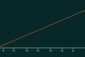
- A line of best fit is drawn on a scatterplot to represent the general trend of the data
- An upward-sloping line indicates a positive correlation, where one variable increases as the other increases
- A downward-sloping line indicates a negative correlation, where one variable decreases as the other increases
- The steepness of the line indicates the strength of the correlation
- A steep line shows a strong correlation
- A shallow line suggests a weak correlation
- A horizontal or vertical line indicates a weak correlation
- Data points far from the line of best fit also indicate a weak correlation
Studying That Suits You
Use AI to generate personalized quizzes and flashcards to suit your learning preferences.