Podcast
Play an AI-generated podcast conversation about this lesson
Download our mobile app to listen on the go
Get App
Questions and Answers
What is a scatter plot?
What is a scatter plot?
- A plot that displays the relationship between two sets of numerical data (correct)
- A plot showing a single set of data
- A type of bar graph
- A line graph showing trends over time
What does a trend line indicate in a scatter plot?
What does a trend line indicate in a scatter plot?
The correlation or association between two sets of data.
What is correlation in data analysis?
What is correlation in data analysis?
Association between two sets of data.
Flashcards are hidden until you start studying
Study Notes
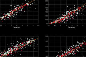
Scatter Plots and Trend Lines
- A scatter plot is utilized to visualize relationships between two numerical data sets.
- The scatter plot can indicate trends, clustering, or outliers within the data.
- Each point on the scatter plot represents a pair of values from the two data sets.
Trend Lines
- A trend line is a graphical representation added to a scatter plot to highlight correlation.
- It helps to summarize the data and make predictions based on the visualized trend.
- The slope of the trend line indicates the direction and strength of the relationship.
Correlation
- Correlation defines the degree to which two variables are associated or related.
- Positive correlation implies that as one variable increases, the other does too, while negative correlation indicates an inverse relationship.
- Correlation does not imply causation; it only indicates that a relationship exists between the data sets.
Studying That Suits You
Use AI to generate personalized quizzes and flashcards to suit your learning preferences.