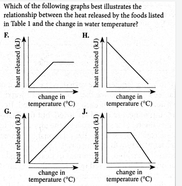
Which of the following graphs best illustrates the relationship between the heat released by the foods listed in Table 1 and the change in water temperature?
Understand the Problem
The question asks to identify which graph best illustrates the relationship between the heat released by foods and the resulting change in water temperature, based on data from Table 1 (not provided).
Answer
The answer is G, showing a direct, positive correlation between heat released and water temperature change.
The graph that best illustrates the relationship between the heat released by the foods and the change in water temperature is G. This is because as the heat released increases, the change in water temperature also increases, showing a direct, positive correlation.
Answer for screen readers
The graph that best illustrates the relationship between the heat released by the foods and the change in water temperature is G. This is because as the heat released increases, the change in water temperature also increases, showing a direct, positive correlation.
More Information
A direct relationship indicates that as one variable increases, the other variable also increases. In this scenario, the more heat released by the food, the greater the change in the water temperature will be, resulting in a consistently upward-sloping line.
Tips
A common mistake is confusing direct and inverse relationships. Remember, direct relationships show a positive correlation (both variables increase together), while inverse relationships show a negative correlation (as one variable increases, the other decreases).
Sources
- Question 21 Answer and Explanation _ACT January 2006 Form 61C ... - exam.actexam.net
- Interpreting Trends in ACT Science: Relationships Between Data ... - blog.prepscholar.com
AI-generated content may contain errors. Please verify critical information