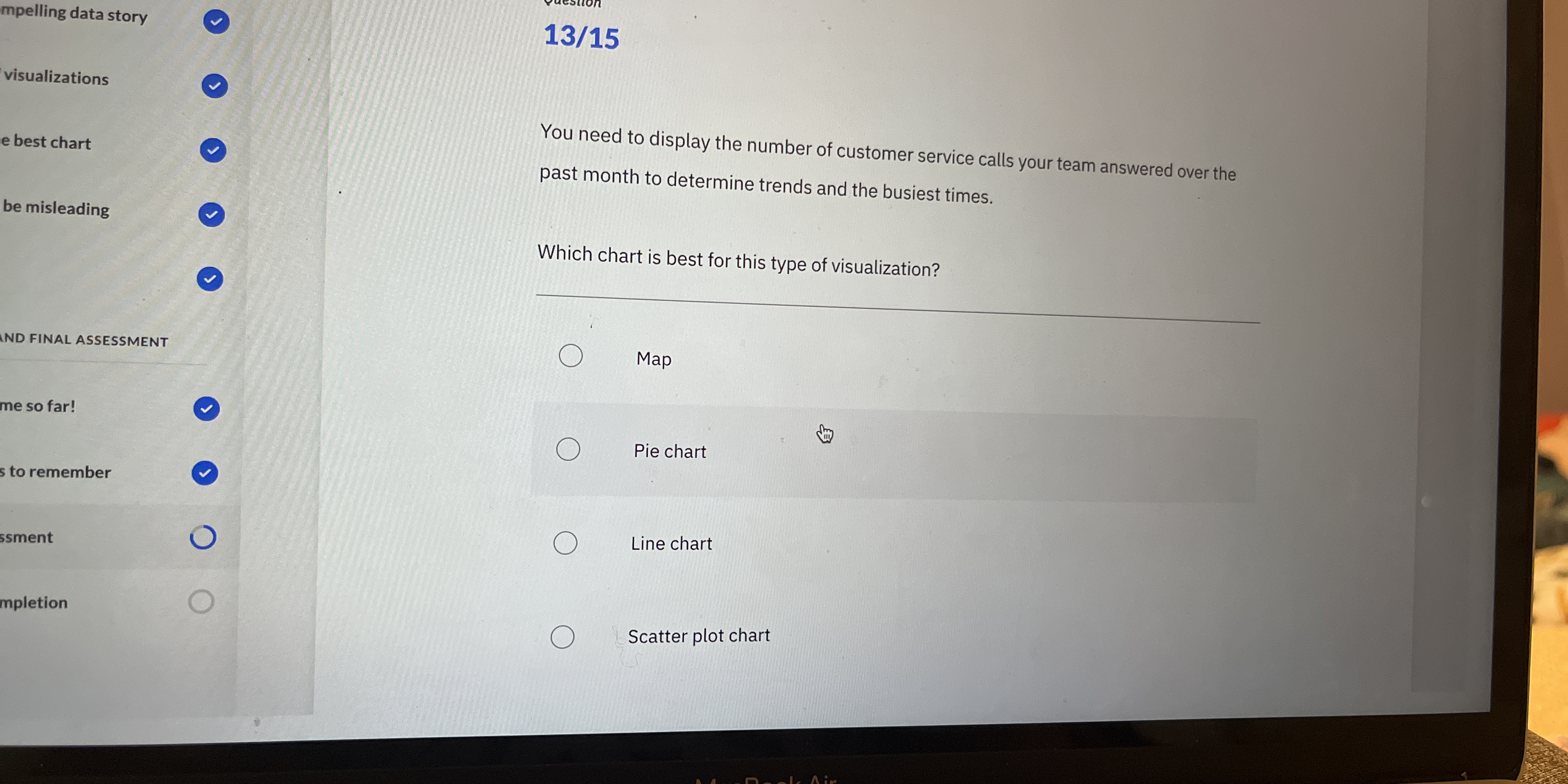
Which chart is best for this type of visualization?
Understand the Problem
The question is asking which type of chart is most suitable for visualizing the number of customer service calls over the past month, with the goal to identify trends and busier times. The user needs to choose from the provided options.
Answer
Line chart
The best chart to display the number of customer service calls over time to determine trends and the busiest times is a line chart.
Answer for screen readers
The best chart to display the number of customer service calls over time to determine trends and the busiest times is a line chart.
More Information
Line charts are excellent for displaying data trends over time, making them suitable for identifying patterns in customer service call volume.
Tips
A common mistake is choosing a pie chart for time series data, which can't effectively show trends.
Sources
- How To Choose the Best Chart Type To Visualize Your Data - gooddata.com
- Data Visualization: Choosing a Chart Type - guides.lib.berkeley.edu
AI-generated content may contain errors. Please verify critical information