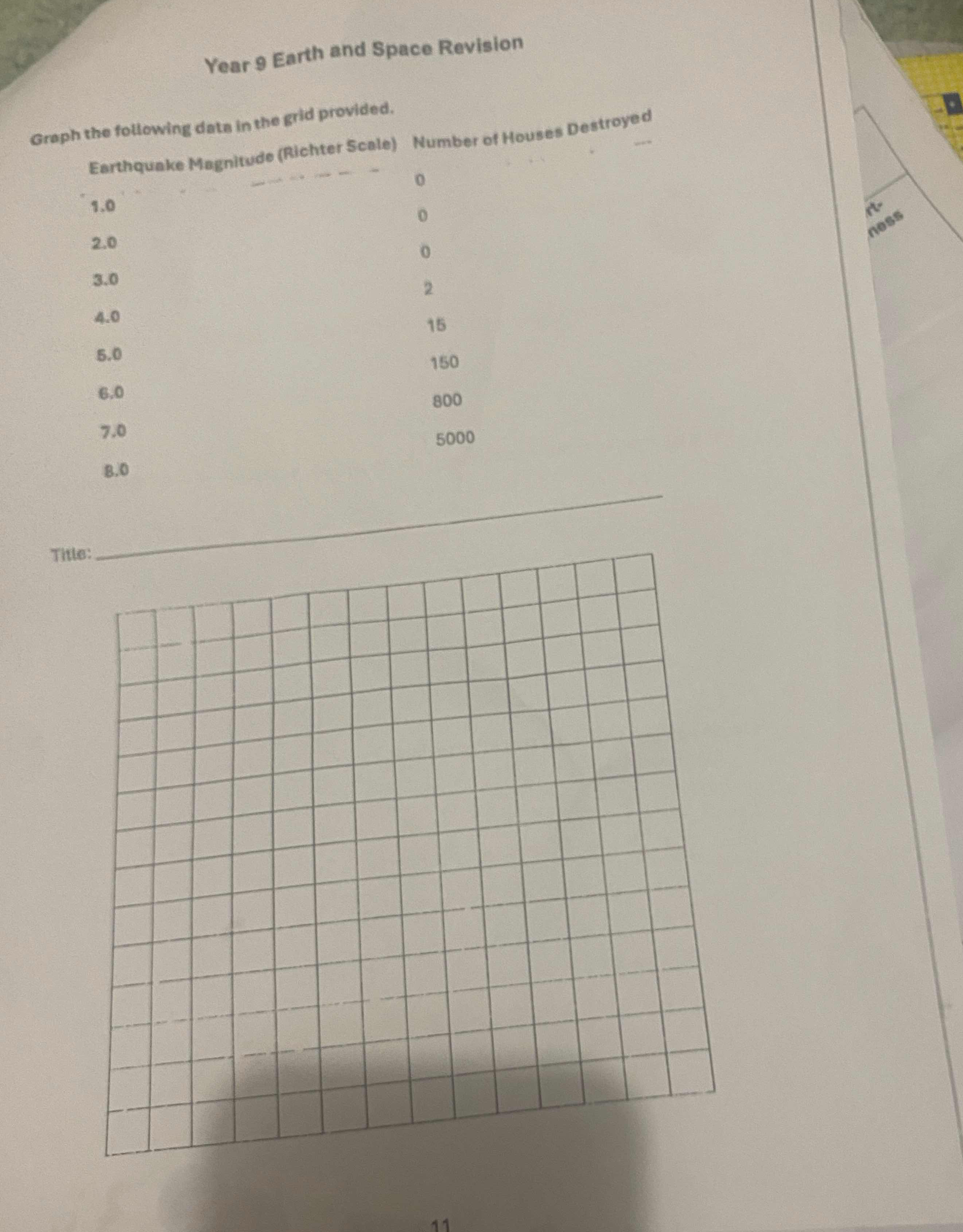
Graph the following data in the grid provided: Earthquake Magnitude (Richter Scale) 1.0 - 0, 2.0 - 0, 3.0 - 0, 4.0 - 2, 5.0 - 15, 6.0 - 150, 7.0 - 800, 8.0 - 5000.

Understand the Problem
The question is asking to graph the given data about earthquake magnitudes and the corresponding number of houses destroyed on a grid. The goal is to visually represent the relationship between earthquake magnitude (Richter Scale) and the number of houses destroyed.
Answer
The data points have been plotted to show the relationship between earthquake magnitudes and the number of houses destroyed.
Answer for screen readers
The data points representing the relationship between earthquake magnitudes and houses destroyed have been successfully plotted on a graph titled "Effect of Earthquake Magnitude on Houses Destroyed".
Steps to Solve
-
Set Up the Axes Label the horizontal axis (x-axis) as "Earthquake Magnitude (Richter Scale)" and the vertical axis (y-axis) as "Number of Houses Destroyed".
-
Determine the Scale for the Axes Decide an appropriate scale for each axis. For the x-axis (magnitude), you can use increments of 1. For the y-axis (houses destroyed), since the maximum is 5000, you might use increments of 500 or 1000.
-
Plot the Data Points Using the table provided, plot the following points on the graph:
- (1.0, 0)
- (2.0, 0)
- (3.0, 0)
- (4.0, 2)
- (5.0, 15)
- (6.0, 150)
- (7.0, 800)
- (8.0, 5000)
-
Draw the Graph After plotting the points, connect them with a line if you wish to indicate a trend, or you can leave them as individual points for clarity.
-
Title the Graph Add a title to your graph, such as "Effect of Earthquake Magnitude on Houses Destroyed".
The data points representing the relationship between earthquake magnitudes and houses destroyed have been successfully plotted on a graph titled "Effect of Earthquake Magnitude on Houses Destroyed".
More Information
Graphing this data shows a clear increase in the number of houses destroyed as the earthquake's magnitude increases. This visual representation helps convey the potentially devastating effects of stronger earthquakes.
Tips
- Incorrect Scaling: Ensure that the scales on both axes are correctly determined so that the graph accurately reflects the data.
- Misplacing Points: Double-check the coordinates when plotting each point to avoid inaccurate representations.
- Title and Labels Missing: Always include clear labels and a title to ensure the graph is understandable.
AI-generated content may contain errors. Please verify critical information