Choose your monthly income.

Understand the Problem
The question is analyzing a pie chart that summarizes responses about monthly income. It seeks to understand the distribution of monthly incomes based on categories from nil to above 50k, as indicated by the chart percentages.
Answer
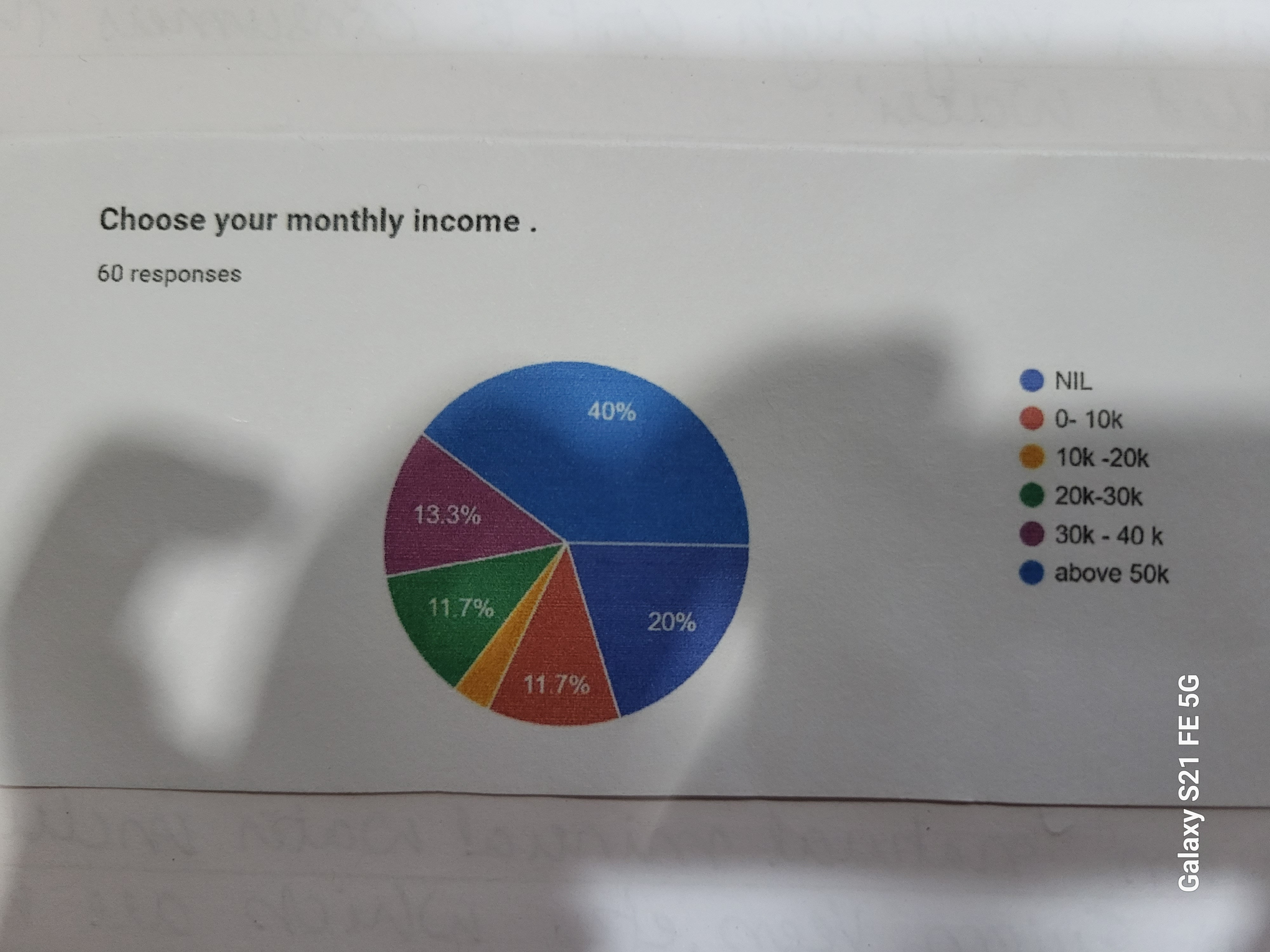
Income categories: NIL (40%), 0-10k (20%), 10k-20k (13.3%), 20k-30k (11.7%), 30k-40k (11.7%), above 50k (3.3%).
The pie chart shows the distribution of monthly income among survey respondents. The segments represent the following categories: NIL (40%), 0-10k (20%), 10k-20k (13.3%), 20k-30k (11.7%), 30k-40k (11.7%), and above 50k (3.3%).
Answer for screen readers
The pie chart shows the distribution of monthly income among survey respondents. The segments represent the following categories: NIL (40%), 0-10k (20%), 10k-20k (13.3%), 20k-30k (11.7%), 30k-40k (11.7%), and above 50k (3.3%).
More Information
The pie chart provides a visual representation of how a group of 60 respondents chose their monthly income category. The 'NIL' category is the largest, suggesting that a significant portion of respondents reported no income.
Tips
A common mistake is misinterpreting the color coding or not matching percentage values accurately.
AI-generated content may contain errors. Please verify critical information