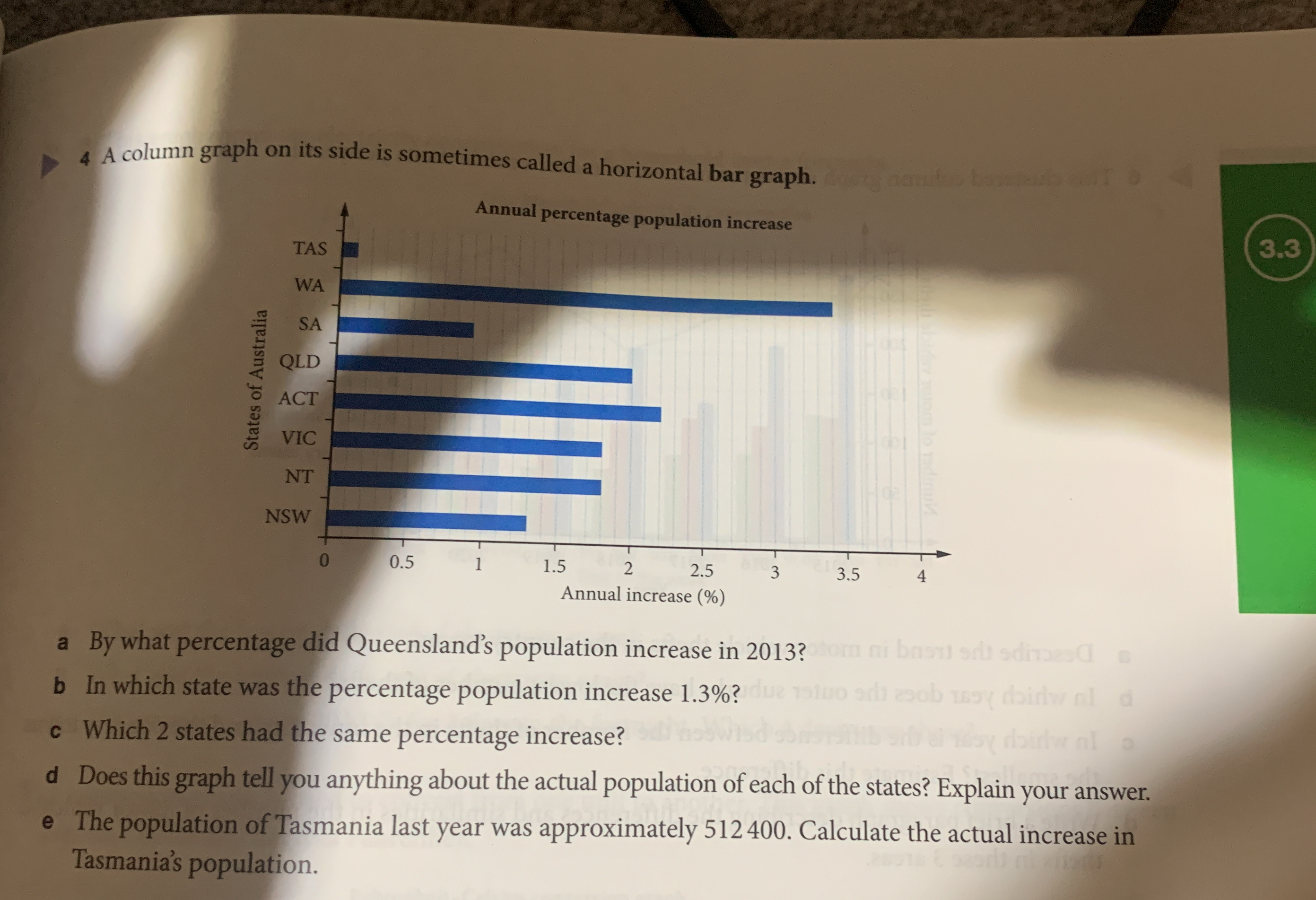
Based on the provided graph answer the following questions: a. By what percentage did Queensland's population increase in 2013? b. In which state was the percentage population incr... Based on the provided graph answer the following questions: a. By what percentage did Queensland's population increase in 2013? b. In which state was the percentage population increase 1.3%? c. Which 2 states had the same percentage increase? d. Does this graph tell you anything about the actual population of each of the states? Explain your answer. e. The population of Tasmania last year was approximately 512400. Calculate the actual increase in Tasmania's population.
Understand the Problem
The image presents a horizontal bar graph showing the annual percentage population increase for different states in Australia. The questions require interpreting the graph to find specific percentage increases, identify states with particular increases, and perform a calculation based on the graph's data related to Tasmania's population.
Answer
a) $2.1\%$ b) NSW c) VIC and NT d) No, the graph only shows percentage increases e) $2050$
Answer for screen readers
a) Queensland's population increased by approximately $2.1%$. b) New South Wales (NSW) had a percentage population increase of approximately $1.3%$. c) Victoria (VIC) and Northern Territory (NT) had the same percentage increase. d) No, the graph does not tell us anything about the actual population of each of the states. It only shows the percentage increase. e) The actual increase in Tasmania's population is approximately $2050$ people.
Steps to Solve
- Find Queensland's percentage increase
Locate "QLD" on the graph and estimate the corresponding percentage increase from the horizontal axis. Queensland's population increase is approximately $2.1%$.
- Identify the state with a 1.3% increase
Scan the graph to find which state's bar extends to approximately 1.3% on the horizontal axis. The state with approximately $1.3%$ increase is NSW.
- Identify two states with the same percentage increase
Check each state's bar length and look for two that are equal. Victoria (VIC) and Northern Territory (NT) appear to have the same bar length, which corresponds to approximately $1.8%$.
- Determine if the graph indicates population size
Consider what the graph represents. The graph provides percentage increases, not the actual population numbers. Therefore, it does not tell us anything about the actual population of each state.
- Calculate the population increase in Tasmania
Find Tasmania's (TAS) percentage population increase on the graph which is approximately $0.4%$. Multiply the percentage increase by the previous year's population to find the actual increase:
$Increase = Percentage \times Population$
$Increase = 0.004 \times 512400 = 2049.6$ Round to the nearest whole number, so the increase is approximately $2050$.
a) Queensland's population increased by approximately $2.1%$. b) New South Wales (NSW) had a percentage population increase of approximately $1.3%$. c) Victoria (VIC) and Northern Territory (NT) had the same percentage increase. d) No, the graph does not tell us anything about the actual population of each of the states. It only shows the percentage increase. e) The actual increase in Tasmania's population is approximately $2050$ people.
More Information
Percentage increase is calculated as: $$Percentage\ Increase = \frac{New\ Population - Old\ Population}{Old\ Population} \times 100$$ In this case, we need to calculate the population increase using the % increase indicated in the graph.
Tips
- Misreading the graph scale and incorrectly estimating the percentage increases.
- Confusing percentage increase with actual population numbers.
- Making calculation errors when finding the actual population increase in Tasmania. Remember to convert the percentage to a decimal before multiplying.
AI-generated content may contain errors. Please verify critical information