![[05/Rokel/58]](https://images.unsplash.com/photo-1522071820081-009f0129c71c?ixid=M3w0MjA4MDF8MHwxfHNlYXJjaHwxfHxjaG9yb3BsZXRoJTIwbWFwcyUyMGRhdGElMjB2aXN1YWxpemF0aW9uJTIwYnVzaW5lc3MlMjBpbnRlbGxpZ2VuY2UlMjB3b3JsZCUyMG1hcHxlbnwxfDB8fHwxNzA5ODAyNTkzfDA&ixlib=rb-4.0.3&w=800&fit=crop&h=300&q=75&fm=webp)
Podcast
Questions and Answers
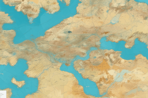
What is the primary type of visualization used in a World Map Core visualization?
What is the primary type of visualization used in a World Map Core visualization?
- Line graph
- Bar chart
- Pie chart
- Choropleth map (correct)
In a world map chart, what do different colors typically represent?
In a world map chart, what do different colors typically represent?
- Data points
- Temperature levels
- Values of different countries (correct)
- Life expectancy
Which type of data is NOT commonly visualized using world map charts?
Which type of data is NOT commonly visualized using world map charts?
- Political data
- Economic data
- Educational data (correct)
- Climate data
What can a world map chart of GDP per capita help identify?
What can a world map chart of GDP per capita help identify?
How can users explore the data in more detail in a world map chart?
How can users explore the data in more detail in a world map chart?
What is a key tip for creating effective world map charts?
What is a key tip for creating effective world map charts?
In a world map chart, what can symbols be used for?
In a world map chart, what can symbols be used for?
What type of data is commonly visualized using world map charts?
What type of data is commonly visualized using world map charts?
World map charts can only display economic data accurately.
World map charts can only display economic data accurately.
Symbols are never used to represent data in a world map chart.
Symbols are never used to represent data in a world map chart.
Life expectancy is an example of demographic data that can be visualized on a world map chart.
Life expectancy is an example of demographic data that can be visualized on a world map chart.
Consistent color schemes are not necessary when creating world map charts.
Consistent color schemes are not necessary when creating world map charts.
Political data, such as election results, cannot be visualized using world map charts.
Political data, such as election results, cannot be visualized using world map charts.
Annotations or labels are not recommended to enhance key findings in a world map chart.
Annotations or labels are not recommended to enhance key findings in a world map chart.
World map charts are not suitable for users without prior knowledge of the data being displayed.
World map charts are not suitable for users without prior knowledge of the data being displayed.
Interactivity is not a feature that should be incorporated into world map charts.
Interactivity is not a feature that should be incorporated into world map charts.
A world map chart of precipitation levels is an example of climate data visualization.
A world map chart of precipitation levels is an example of climate data visualization.
Economic data like GDP per capita cannot be used to identify global trends using world map charts.
Economic data like GDP per capita cannot be used to identify global trends using world map charts.
Match the following types of data with examples of what can be visualized using world map charts:
Match the following types of data with examples of what can be visualized using world map charts:
Match the following features with tips for creating effective world map charts:
Match the following features with tips for creating effective world map charts:
Match the following statements with their accuracy in relation to world map charts:
Match the following statements with their accuracy in relation to world map charts:
Match the following characteristics with their significance in creating effective world map charts:
Match the following characteristics with their significance in creating effective world map charts:
Flashcards are hidden until you start studying