Podcast
Questions and Answers
What advantage does a histogram provide over a bar chart?
What advantage does a histogram provide over a bar chart?
- It categorizes data into discrete numbers.
- It provides a smoother overview of distribution trends. (correct)
- It shows exact transaction counts.
- It requires less data to create.
What is the primary goal when visualizing customer transaction data?
What is the primary goal when visualizing customer transaction data?
- To compare transaction data across different months
- To identify each customer's transaction history
- To analyze customer satisfaction ratings
- To understand customer transaction frequencies and distributions (correct)
Which statement best describes the use of a bar chart for transaction data?
Which statement best describes the use of a bar chart for transaction data?
- It helps visualize trends over time.
- It organizes data into ungrouped intervals.
- It is less insightful for discrete data.
- It gives a granular view of specific transaction counts. (correct)
Why might one start with a bar chart rather than a histogram when visualizing transaction data?
Why might one start with a bar chart rather than a histogram when visualizing transaction data?
What might be a limitation of using a histogram for customer transaction data?
What might be a limitation of using a histogram for customer transaction data?
What is the primary purpose of grouping data into bins when creating a histogram?
What is the primary purpose of grouping data into bins when creating a histogram?
How are bins in a histogram determined?
How are bins in a histogram determined?
What is meant by 'frequency' in the context of a histogram?
What is meant by 'frequency' in the context of a histogram?
Which of the following statements about histograms is accurate?
Which of the following statements about histograms is accurate?
What is the recommended initial number of bins to start with when creating a histogram?
What is the recommended initial number of bins to start with when creating a histogram?
When adjusting the number of bins in a histogram, what is a potential effect of choosing too many bins?
When adjusting the number of bins in a histogram, what is a potential effect of choosing too many bins?
In the context of a retail analysis histogram, what might a tall bar in the highest sales bin indicate?
In the context of a retail analysis histogram, what might a tall bar in the highest sales bin indicate?
What does a histogram with fewer bins typically reveal?
What does a histogram with fewer bins typically reveal?
Why is it useful to compare histograms based on different bin sizes?
Why is it useful to compare histograms based on different bin sizes?
When analyzing the frequency of daily sales, why might one choose to group by sales ranges rather than individual sales amounts?
When analyzing the frequency of daily sales, why might one choose to group by sales ranges rather than individual sales amounts?
What would be a disadvantage of not using any bins in a histogram?
What would be a disadvantage of not using any bins in a histogram?
What does the x-axis represent in a histogram?
What does the x-axis represent in a histogram?
How does a 20-bin histogram differ from a 5-bin histogram?
How does a 20-bin histogram differ from a 5-bin histogram?
What does the y-axis in a histogram indicate?
What does the y-axis in a histogram indicate?
Why might a data scientist adjust the bin sizes in a histogram?
Why might a data scientist adjust the bin sizes in a histogram?
What is the main benefit of aligning x-ticks with bin edges in a histogram?
What is the main benefit of aligning x-ticks with bin edges in a histogram?
If a bin covers a range of $400-$500 in a histogram, what does it represent?
If a bin covers a range of $400-$500 in a histogram, what does it represent?
What is a common issue when reading histograms that new users face?
What is a common issue when reading histograms that new users face?
In a histogram with a higher frequency value on the y-axis, what does it indicate?
In a histogram with a higher frequency value on the y-axis, what does it indicate?
Which method can be used to represent custom intervals in a histogram?
Which method can be used to represent custom intervals in a histogram?
Why might a data scientist prefer a 5-bin histogram for an initial analysis?
Why might a data scientist prefer a 5-bin histogram for an initial analysis?
What does it indicate if the tallest bar in a histogram is on a lower sales range?
What does it indicate if the tallest bar in a histogram is on a lower sales range?
What general insight can be gained from a histogram showing minor peaks and dips?
What general insight can be gained from a histogram showing minor peaks and dips?
What is typically the first step in analyzing sales data using a histogram?
What is typically the first step in analyzing sales data using a histogram?
How can adjusting bin sizes impact data analysis in a histogram?
How can adjusting bin sizes impact data analysis in a histogram?
Flashcards
Histogram advantage over bar chart
Histogram advantage over bar chart
Histograms provide a smoother overview of distribution trends compared to bar charts, which show specific transaction counts.
Purpose of visualizing customer transaction data
Purpose of visualizing customer transaction data
Understanding customer transaction frequencies and distributions.
Bar chart use for transaction data
Bar chart use for transaction data
Provides a granular view of specific transaction counts.
Starting with bar charts for transaction data
Starting with bar charts for transaction data
Signup and view all the flashcards
Histogram limitation for transaction data
Histogram limitation for transaction data
Signup and view all the flashcards
Grouping data into bins (histogram)
Grouping data into bins (histogram)
Signup and view all the flashcards
Determining histogram bins
Determining histogram bins
Signup and view all the flashcards
Histogram frequency
Histogram frequency
Signup and view all the flashcards
Accurate histogram statement
Accurate histogram statement
Signup and view all the flashcards
Recommended initial histogram bins
Recommended initial histogram bins
Signup and view all the flashcards
Too many histogram bins
Too many histogram bins
Signup and view all the flashcards
Tall bar in highest sales bin (histogram)
Tall bar in highest sales bin (histogram)
Signup and view all the flashcards
Histogram with fewer bins
Histogram with fewer bins
Signup and view all the flashcards
Comparing histograms with different bin sizes
Comparing histograms with different bin sizes
Signup and view all the flashcards
Grouping daily sales by ranges
Grouping daily sales by ranges
Signup and view all the flashcards
Disadvantage of no bins in a histogram
Disadvantage of no bins in a histogram
Signup and view all the flashcards
Histogram x-axis
Histogram x-axis
Signup and view all the flashcards
20-bin vs. 5-bin histogram
20-bin vs. 5-bin histogram
Signup and view all the flashcards
Histogram y-axis
Histogram y-axis
Signup and view all the flashcards
Data scientist adjusts bin sizes
Data scientist adjusts bin sizes
Signup and view all the flashcards
Aligning x-ticks with bin edges
Aligning x-ticks with bin edges
Signup and view all the flashcards
Bin covering $400-$500 in a histogram
Bin covering $400-$500 in a histogram
Signup and view all the flashcards
New user histogram issue
New user histogram issue
Signup and view all the flashcards
Higher frequency value on y-axis
Higher frequency value on y-axis
Signup and view all the flashcards
Representing custom intervals in a histogram
Representing custom intervals in a histogram
Signup and view all the flashcards
5-bin histogram for initial analysis
5-bin histogram for initial analysis
Signup and view all the flashcards
Tallest bar on lower sales range
Tallest bar on lower sales range
Signup and view all the flashcards
Insights from minor peaks and dips in histogram
Insights from minor peaks and dips in histogram
Signup and view all the flashcards
Initial step in analyzing sales data with histogram
Initial step in analyzing sales data with histogram
Signup and view all the flashcards
Adjusting bin sizes' impact on analysis
Adjusting bin sizes' impact on analysis
Signup and view all the flashcards
Study Notes
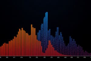
Understanding Histograms
- Histograms are visualizations that show the distribution of continuous data, like daily sales for a store.
- Each bar represents a range of values (bin) and its height reflects the number of data points falling within that range.
- Bins are chosen to make patterns clearer; smaller bins reveal more detail, while larger bins provide an overview.
Reading and Interpreting Histograms
- X-axis: The x-axis represents the range of values, divided into bins.
- Y-axis: The y-axis shows the frequency, the number of data points falling within each bin.
- Tallest bar: Indicates the range with the most frequent value.
- Low bars: Represent ranges with fewer data points, showing less common values.
Customizing Bins
- You can define your own bin intervals to control how data is grouped.
- Setting custom bin edges lets you explore specific value ranges and gain deeper insights.
- By matching x-ticks to bin edges, you ensure alignment and clarity in the histogram.
Using Pandas and Matplotlib for Histograms
- These tools help you create, customize, and interpret histograms.
- You can specify the number of bins or provide custom bin intervals.
- The tools automatically calculate bin edges and frequency counts.
Key Concepts for Histograms
- Frequency: Represents how many data points fall within a specific range.
- Bins: Ranges of values used to group data.
- Distribution: How data is spread across a range of values.
Applying Histograms to Data
- Histograms help understand patterns in data, like identifying common values and outliers.
- They are useful for visualizing sales data, customer behavior, or any continuous numeric data.
Studying That Suits You
Use AI to generate personalized quizzes and flashcards to suit your learning preferences.