Podcast
Questions and Answers
What is the purpose of utilizing different font weights in typography?
What is the purpose of utilizing different font weights in typography?
- To improve readability and distinguish between headings and body copy (correct)
- To change the font family
- To add a variety of colors to the text
- To adjust the spacing between characters
How does color contribute to typography?
How does color contribute to typography?
- To make the text larger
- To adjust the spacing between lines
- To provide contrast for easier reading and convey emotions (correct)
- To change the font family
- To determine the font size based on screen resolution
What is the role of space in typography?
What is the role of space in typography?
- To control line height
- To manipulate font styles
- To adjust font sizes
- To balance text through empty areas and adjust character spacing (correct)
Why is layout important in typography?
Why is layout important in typography?
Flashcards
Typography
Typography
The art of arranging type to make written language legible, appealing, and easy to read, involving fonts, sizes, colors, spacing, and layouts.
Font Families
Font Families
Sets of fonts that share similar characteristics or styles, like sans serif (e.g., Arial) for a modern look or serif (e.g., Times New Roman) for a classic feel.
Type Size
Type Size
The overall height of characters or lines, measured from the baseline to the top ascender or descender, impacting readability.
Space in Typography
Space in Typography
Signup and view all the flashcards
Study Notes
Typography
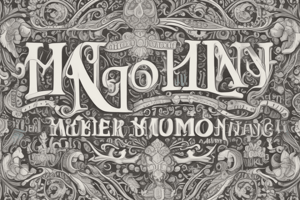
Typography is the art of arranging type to make written language legible, appealing, and easy to read. It involves choosing fonts, sizes, colors, spacing, and layouts to create visually pleasing text. Typography has been used since ancient times, with examples dating back to the Roman Empire, but it was not until the invention of the printing press in the mid-15th century that typography became accessible and commonplace. Today, typography is essential in creating books, websites, advertisements, and other forms of visual communication.
History of Typography
The history of typography can be traced back to the Romans, who created simple stone stamps inscribed with letters to decorate pottery. However, true typography began with the invention of movable type by Johannes Gutenberg in 1448. This innovation allowed for mass production of printed material, which revolutionized information dissemination and helped spread literacy throughout Europe. Over time, various innovations were made, such as drop caps, italic and boldface type, and even color printing.
In the modern era, typography evolved alongside technology. With the advent of digital typesetting and font libraries like Adobe's PostScript, designers could create complex designs with ease. In recent years, web typography has become increasingly important due to the rise of the internet and mobile devices. Responsive design has necessitated new approaches to typography, with designers focusing on readability across different screen sizes and resolutions.
Elements of Typography
Several elements contribute to effective typography:
Font Family
Font families refer to sets of fonts that share similar characteristics or styles. For example, sans serif fonts like Arial and Helvetica are often used for modern, clean aesthetics, while serif fonts like Times New Roman and Georgia lend a classic feel. Different font weights (e.g., light, regular, medium, bold) can also be employed to distinguish between headings and body copy, or to highlight key phrases within the text.
Type Size
Type size refers to the overall height of characters or lines, measured from the baseline to the top ascender or descender. Type size can range from extra small (xs) to large (xl), depending on the context and desired impact. Properly scaling font sizes ensures that all readers can easily comprehend the message intended.
Color
Color plays a crucial role in typography, both for contrast and to convey meaning. High contrast color combinations, where one color stands out clearly against another, are generally easier to read, while low contrast combinations may strain the reader's eyes. Additionally, certain colors can evoke specific emotions or feelings, making them useful for conveying tone or mood.
Space
Space refers to the empty areas surrounding the characters and lines of text. White space, or negative space, provides balance and helps break up dense blocks of text into manageable sections. Kerning, the adjustment of character spacing, can also affect legibility and visual harmony.
Layout
Layout pertains to how the text is arranged on the page or screen. Centered, left-aligned, right-aligned, and justified alignment options exist, each with their own purpose. Justified alignments allow for more text per line and can enhance visual appeal when dealing with columns of text.
Best Practices for Typography
To ensure optimal readability and comprehension, several best practices should be followed:
- Choose appropriate font families and weights based on the content and target audience.
- Maintain consistent scale relationships between font sizes to establish hierarchies.
- Ensure high contrast between text color and background.
- Utilize a mix of uppercase and lowercase letters to maintain rhythm while enhancing legibility.
- Consider using a grid system to organize text and improve consistency.
By adhering to these principles, designers can craft visually appealing and effective typographic compositions that effectively communicate information.
Studying That Suits You
Use AI to generate personalized quizzes and flashcards to suit your learning preferences.