Podcast
Questions and Answers
What is the middle value in a dataset when it is arranged in order?
What is the middle value in a dataset when it is arranged in order?
- Mean
- Mode
- Range
- Median (correct)
What is the most frequently occurring value in a dataset?
What is the most frequently occurring value in a dataset?
- Median
- Mode (correct)
- Standard Deviation
- Mean
What type of graph is used to display the distribution of a continuous variable?
What type of graph is used to display the distribution of a continuous variable?
- Pie chart
- Scatter plot
- Bar chart
- Histogram (correct)
What is the purpose of a frequency table?
What is the purpose of a frequency table?
What is the x-axis typically labeled as in a histogram?
What is the x-axis typically labeled as in a histogram?
What is the average value of a dataset that is sensitive to extreme values?
What is the average value of a dataset that is sensitive to extreme values?
Which type of graph is used to display the distribution of a categorical variable?
Which type of graph is used to display the distribution of a categorical variable?
What is the advantage of using the median over the mean in a dataset with outliers?
What is the advantage of using the median over the mean in a dataset with outliers?
What is the purpose of a histogram in data analysis?
What is the purpose of a histogram in data analysis?
What is the difference between a bar chart and a histogram?
What is the difference between a bar chart and a histogram?
Flashcards are hidden until you start studying
Study Notes
Measures of Central Tendency
- The mean is a type of average that is calculated by adding up all the numbers and dividing by how many numbers there are
- The median is the middle value in a set of data when it is arranged in order; if there are an odd number of values, the median is the middle one, and if there are an even number, the median is the average of the two middle ones
- The mode is the value that appears most frequently in a set of data
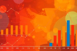
Graphs and Charts
- Bar charts are used to compare categorical data across different groups
- Histograms are used to display continuous data, divided into intervals, to show the distribution of the data
- Line graphs are used to display how a variable changes over time or in response to another variable
- Scatter plots are used to show the relationship between two continuous variables
Histograms
- Histograms are used to display continuous data, divided into intervals, to show the distribution of the data
- The x-axis represents the different intervals of the data, and the y-axis represents the frequency or density of the data in each interval
- The shape of the histogram can be symmetrical, skewed, or bimodal, indicating the distribution of the data
Questions
- What is the difference between the mean, median, and mode?
- When would you use a bar chart instead of a histogram?
- What type of graph would you use to display the relationship between two continuous variables?
- How do you calculate the mean of a set of data?
- What is the mode of a set of data, and how do you find it?
Measures of Central Tendency
- Mean (Arithmetic Mean): The sum of all values divided by the number of values, symbolized by μ (mu) for population mean and x̄ (x-bar) for sample mean.
- Median: The middle value in an ordered dataset, where half the values are above and half are below; used to describe the middle of a dataset.
- Mode: The value that appears most frequently in a dataset; a dataset can have multiple modes or no modes at all.
Graphs and Charts
- Types of Graphs:
- Bar Graphs: Comparing categorical data using bars of different heights.
- Histograms: Visualizing continuous data by dividing into intervals (bins) and showing frequency or density.
- Scatter Plots: Showing relationships between two continuous variables.
- Line Graphs: Displaying trends or patterns over time or continuous variables.
Histograms
- Histogram Properties:
- Divided into continuous intervals (bins) of equal width.
- The height of each bar represents the frequency or density of values in that interval.
- The area of each bar is proportional to the frequency or density.
Questions
- What is the formula for calculating the mean of a dataset?
- How do you calculate the median of an even-sized dataset?
- What is the difference between the mode and the median of a dataset?
- Identify and describe the different types of graphs used to visualize data.
- What is the purpose of dividing continuous data into intervals (bins) in a histogram?
Studying That Suits You
Use AI to generate personalized quizzes and flashcards to suit your learning preferences.