Podcast
Questions and Answers
What type of data involves countable values?
What type of data involves countable values?
- Continuous data
- Raw data
- Discrete data (correct)
- Grouped data
Grouped data refers to data that is presented in raw form without any summarization.
Grouped data refers to data that is presented in raw form without any summarization.
False (B)
Define relative frequency.
Define relative frequency.
Relative frequency is the proportion of total observations that are in a given category.
In a frequency distribution, each class interval is associated with its corresponding __________.
In a frequency distribution, each class interval is associated with its corresponding __________.
Match the following types of data with their definitions:
Match the following types of data with their definitions:
Which function in Excel could you use to count occurrences within specific bins?
Which function in Excel could you use to count occurrences within specific bins?
A histogram is a type of graph that represents frequency distributions.
A histogram is a type of graph that represents frequency distributions.
What is a frequency distribution?
What is a frequency distribution?
What is the primary purpose of a frequency histogram?
What is the primary purpose of a frequency histogram?
The number of classes in a grouped data frequency distribution should be between 2 and 10.
The number of classes in a grouped data frequency distribution should be between 2 and 10.
What is the difference between a frequency distribution and a cumulative frequency distribution?
What is the difference between a frequency distribution and a cumulative frequency distribution?
The minimum class width is determined by dividing the ______ of the data by the number of classes, and then rounding off to the nearest whole number.
The minimum class width is determined by dividing the ______ of the data by the number of classes, and then rounding off to the nearest whole number.
Match the following types of charts with their descriptions:
Match the following types of charts with their descriptions:
What is the purpose of the 2k rule in determining the number of classes in a grouped data frequency distribution?
What is the purpose of the 2k rule in determining the number of classes in a grouped data frequency distribution?
A pie chart is suitable for displaying a large number of categories.
A pie chart is suitable for displaying a large number of categories.
What is the difference between a bar chart and a histogram?
What is the difference between a bar chart and a histogram?
The Python module used to draw charts is _______________.
The Python module used to draw charts is _______________.
What is the purpose of the plt.hist() function in Python?
What is the purpose of the plt.hist() function in Python?
What is the ideal rule of thumb for the number of classes when creating grouped data?
What is the ideal rule of thumb for the number of classes when creating grouped data?
Classes in a frequency distribution should be overlapping to accommodate all values.
Classes in a frequency distribution should be overlapping to accommodate all values.
What is cumulative frequency distribution?
What is cumulative frequency distribution?
Data classified into classes that do not overlap and contain all possible values are defined as __________.
Data classified into classes that do not overlap and contain all possible values are defined as __________.
Match the following types of data with their characteristics:
Match the following types of data with their characteristics:
What is the maximum number of classes recommended based on the 2k rule where k is a class?
What is the maximum number of classes recommended based on the 2k rule where k is a class?
A frequency histogram represents frequency distributions with gaps between the bars.
A frequency histogram represents frequency distributions with gaps between the bars.
In the context of grouped data, what does a relative frequency histogram display?
In the context of grouped data, what does a relative frequency histogram display?
To draw charts in Python, the module you need to import is __________.
To draw charts in Python, the module you need to import is __________.
What type of chart is ideal for showing the relationship between two variables?
What type of chart is ideal for showing the relationship between two variables?
What does a frequency distribution primarily summarize?
What does a frequency distribution primarily summarize?
Continuous data can only take on a countable number of possible values.
Continuous data can only take on a countable number of possible values.
Define the term 'relative frequency'.
Define the term 'relative frequency'.
The data that has not been summarized in any way is referred to as __________ data.
The data that has not been summarized in any way is referred to as __________ data.
Match the following types of data with their examples:
Match the following types of data with their examples:
Which of the following functions can be used in Excel to create a frequency distribution?
Which of the following functions can be used in Excel to create a frequency distribution?
In Excel, the Data Analysis tool can be used to create a histogram.
In Excel, the Data Analysis tool can be used to create a histogram.
Name one example of discrete data.
Name one example of discrete data.
Flashcards are hidden until you start studying
Study Notes
Frequency Distributions
- A frequency distribution summarizes data by showing the number of observations in each category or class.
- It can be presented in list or table format, detailing variable values and their corresponding frequencies.
Types of Data
- Ungrouped data (raw data) has not been summarized; grouped data is organized into frequency distributions.
- Discrete data can take on countable values, such as:
- Student ages
- Product categories on Amazon
- Number of late deliveries or goals scored
- Continuous data can take uncountable values within an interval, e.g., weight, length, or time.
Relative Frequency
- Relative frequency is the proportion of total observations within a specific category.
Excel Frequency Analysis
- Frequency function: Utilize the Data Analysis tool, select histogram, input data and bin ranges, and specify output location.
- Countif function: Create a table with bins and use =COUNTIF(data range, bin reference) for frequencies.
- Pivot tables: Insert a Pivot Table to organize data dynamically.
Grouped Data Considerations
- Continuous data needs to be summarized into grouped frequency distributions with clearly defined classes.
- Class criteria:
- Classes must be mutually exclusive and all-inclusive.
- Aim for equal-width classes to avoid misleading distributions.
- Avoid empty classes to ensure clarity.
Classes in Grouped Data
- Optimal number of classes typically lies between 5 and 20, defined by the rule ( 2^k \geq n ), where ( n ) is the number of data values.
- Example of creating classes from raw data includes sorting data, calculating range, determining class width, and counting values in each class.
Cumulative Frequency
- Cumulative frequency distribution shows the number of observations with values less than or equal to class upper limits.
- Cumulative relative frequency distribution displays the proportion of observations up to those limits.
Visualization with Python
- Use the
matplotlib.pyplotlibrary to create graphs. - Example for histogram visualization:
plt.hist(data, bins=XX, color='red'), followed by appropriate label settings and saving options.
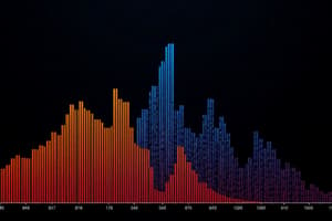
Frequency Histograms
- Histograms graph frequency distributions, with classes on the horizontal axis and frequencies on the vertical axis.
- For equal class widths, the rectangle height equals the frequency of each class.
Relative Frequency Histogram and Ogive
- To create a relative frequency histogram:
- Convert frequencies into relative terms.
- Plot relative frequencies with corresponding class intervals.
- An ogive graphically represents cumulative relative frequencies, using a connected line at class upper limits.
Summary of Key Concepts
- Frequency refers to the number of occurrences; relative frequency shows frequency as a percentage.
- Cumulative frequency represents running totals.
- Grouped data is categorized with a set number of classes.
- Histogram visually represents frequency distributions with no gaps; an ogive shows cumulative frequency.
- Other visualization types include bar charts, pie charts (for few categories), line graphs (for time series), scatter plots (for variable relationships), along with maps, gauges, and Gantt charts.
Frequency Distributions
- A frequency distribution summarizes data by showing the number of observations in each category or class.
- It can be presented in list or table format, detailing variable values and their corresponding frequencies.
Types of Data
- Ungrouped data (raw data) has not been summarized; grouped data is organized into frequency distributions.
- Discrete data can take on countable values, such as:
- Student ages
- Product categories on Amazon
- Number of late deliveries or goals scored
- Continuous data can take uncountable values within an interval, e.g., weight, length, or time.
Relative Frequency
- Relative frequency is the proportion of total observations within a specific category.
Excel Frequency Analysis
- Frequency function: Utilize the Data Analysis tool, select histogram, input data and bin ranges, and specify output location.
- Countif function: Create a table with bins and use =COUNTIF(data range, bin reference) for frequencies.
- Pivot tables: Insert a Pivot Table to organize data dynamically.
Grouped Data Considerations
- Continuous data needs to be summarized into grouped frequency distributions with clearly defined classes.
- Class criteria:
- Classes must be mutually exclusive and all-inclusive.
- Aim for equal-width classes to avoid misleading distributions.
- Avoid empty classes to ensure clarity.
Classes in Grouped Data
- Optimal number of classes typically lies between 5 and 20, defined by the rule ( 2^k \geq n ), where ( n ) is the number of data values.
- Example of creating classes from raw data includes sorting data, calculating range, determining class width, and counting values in each class.
Cumulative Frequency
- Cumulative frequency distribution shows the number of observations with values less than or equal to class upper limits.
- Cumulative relative frequency distribution displays the proportion of observations up to those limits.
Visualization with Python
- Use the
matplotlib.pyplotlibrary to create graphs. - Example for histogram visualization:
plt.hist(data, bins=XX, color='red'), followed by appropriate label settings and saving options.
Frequency Histograms
- Histograms graph frequency distributions, with classes on the horizontal axis and frequencies on the vertical axis.
- For equal class widths, the rectangle height equals the frequency of each class.
Relative Frequency Histogram and Ogive
- To create a relative frequency histogram:
- Convert frequencies into relative terms.
- Plot relative frequencies with corresponding class intervals.
- An ogive graphically represents cumulative relative frequencies, using a connected line at class upper limits.
Summary of Key Concepts
- Frequency refers to the number of occurrences; relative frequency shows frequency as a percentage.
- Cumulative frequency represents running totals.
- Grouped data is categorized with a set number of classes.
- Histogram visually represents frequency distributions with no gaps; an ogive shows cumulative frequency.
- Other visualization types include bar charts, pie charts (for few categories), line graphs (for time series), scatter plots (for variable relationships), along with maps, gauges, and Gantt charts.
Studying That Suits You
Use AI to generate personalized quizzes and flashcards to suit your learning preferences.