Podcast
Questions and Answers
What is a good practice when choosing fonts for a project?
What is a good practice when choosing fonts for a project?
- Combine fonts from the same category only
- Limit to one or two fonts per project (correct)
- Always choose decorative fonts
- Use as many fonts as possible to show creativity
Hierarchy in design helps guide the reader's eye to important elements.
Hierarchy in design helps guide the reader's eye to important elements.
True (A)
What is leading in typography?
What is leading in typography?
The space between lines of text
Tracking refers to the overall space between __________.
Tracking refers to the overall space between __________.
Which of the following combinations of font styles can be effective?
Which of the following combinations of font styles can be effective?
Using fonts with bad kerning can improve the overall design.
Using fonts with bad kerning can improve the overall design.
What should you do if your design requires more contrast in fonts?
What should you do if your design requires more contrast in fonts?
What is typography primarily concerned with?
What is typography primarily concerned with?
Serif fonts are characterized by having a clean and modern look.
Serif fonts are characterized by having a clean and modern look.
What is the main advantage of sans serif fonts?
What is the main advantage of sans serif fonts?
Comic Sans and Papyrus are generally considered _____ to avoid.
Comic Sans and Papyrus are generally considered _____ to avoid.
Which type of font is best for small amounts of text like titles and headers?
Which type of font is best for small amounts of text like titles and headers?
Typography can only be found in printed materials.
Typography can only be found in printed materials.
What does the term 'sans' in sans serif fonts mean?
What does the term 'sans' in sans serif fonts mean?
Which of the following is a characteristic of serif fonts?
Which of the following is a characteristic of serif fonts?
Flashcards are hidden until you start studying
Study Notes
Typography Overview
- Typography is the appearance and style of text, integral to books, websites, signage, and packaging.
- It encompasses both the aesthetic and the practical aspects of text presentation.
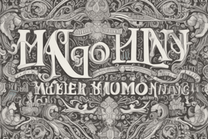
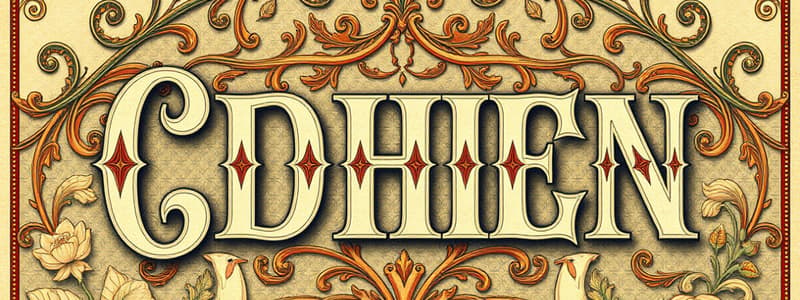
Common Font Types
- Serif Fonts: Feature small strokes (serifs) on letters; suitable for traditional projects and commonly used in print.
- Sans Serif Fonts: Lacks serifs; considered modern and clean, easier to read on screens.
- Display Fonts: Decorative and varied; used primarily for headings and titles, not ideal for longer text.
Choosing Fonts
- Fonts convey moods and messages; selecting the right one is crucial for effective communication.
- Avoid outdated fonts like Comic Sans, Curlz, and Papyrus to maintain a professional image.
Font Combination Strategies
- Stick to one or two fonts to prevent clutter; alternate sizes, weights, or styles for contrast.
- Mixing different font styles can enhance design, as long as they complement each other.
Key Typography Terms
- Hierarchy: Directs the reader's attention through visual emphasis; larger or bolder items are usually prioritized.
- Leading: Refers to line spacing; a comfortable balance maintains readability.
- Tracking: Overall character spacing; may need adjustment for design purposes or to correct poorly spaced fonts.
- Kerning: The space between specific characters; proper kerning enhances visual cohesion in text.
Importance of Typography
- Thoughtfully crafted typography elevates designs from ordinary to extraordinary.
- An awareness of typography principles enhances one’s ability to create compelling visual communications.
Studying That Suits You
Use AI to generate personalized quizzes and flashcards to suit your learning preferences.