Podcast
Questions and Answers
What unique characteristic defines slab serif typefaces?
What unique characteristic defines slab serif typefaces?
- Decorative script elements
- Thin, elongated strokes
- Curvature on the serifs
- Lack of curvature on the serifs (correct)
Who is credited with creating the first sans serif typeface?
Who is credited with creating the first sans serif typeface?
- Max Miedinger
- Frederic Goudy
- William Caslon IV (correct)
- Hermann Zapf
Which of the following typefaces was designed by Max Miedinger?
Which of the following typefaces was designed by Max Miedinger?
- Futura
- Copperplate Gothic
- Optima
- Helvetica (correct)
What was the first digital typeface designed?
What was the first digital typeface designed?
What is the main advantage of Outline (Vector) Fonts over bitmapped fonts?
What is the main advantage of Outline (Vector) Fonts over bitmapped fonts?
Which type of font allowed compatibility between Mac and PC platforms?
Which type of font allowed compatibility between Mac and PC platforms?
What technological advancement allows multiple colors within a single glyph?
What technological advancement allows multiple colors within a single glyph?
Which of the following trends in typography emerged due to web fonts?
Which of the following trends in typography emerged due to web fonts?
What is a significant benefit of variable fonts?
What is a significant benefit of variable fonts?
Which of the following statements about early digital fonts is true?
Which of the following statements about early digital fonts is true?
Which inventor is associated with the creation of the first printing press using durable letter blocks?
Which inventor is associated with the creation of the first printing press using durable letter blocks?
What innovation did Nicolas Jenson introduce in 1470 that influenced modern fonts?
What innovation did Nicolas Jenson introduce in 1470 that influenced modern fonts?
What was the primary reason for the development of the first italic typeface by Aldus Manutius and Francesco Griffo?
What was the primary reason for the development of the first italic typeface by Aldus Manutius and Francesco Griffo?
Which typeface style, created by William Caslon, is known for enhancing readability through more stroke contrast?
Which typeface style, created by William Caslon, is known for enhancing readability through more stroke contrast?
What was the fate of John Baskerville's transitional typefaces upon their introduction in 1757?
What was the fate of John Baskerville's transitional typefaces upon their introduction in 1757?
Which characteristic is true of Firmin Didot's modern serif typeface developed in the 1780s?
Which characteristic is true of Firmin Didot's modern serif typeface developed in the 1780s?
What differentiates Giambattista Bodoni's typefaces from Firmin Didot's design?
What differentiates Giambattista Bodoni's typefaces from Firmin Didot's design?
What was the significance of Vincent Figgins' 'Antique' typeface introduced in 1815?
What was the significance of Vincent Figgins' 'Antique' typeface introduced in 1815?
What aspect made Bodoni's typefaces less suitable for certain applications?
What aspect made Bodoni's typefaces less suitable for certain applications?
Which innovation is attributed to the Italics developed by Aldus Manutius and Francesco Griffo?
Which innovation is attributed to the Italics developed by Aldus Manutius and Francesco Griffo?
What was the primary design objective of Nicolas Jenson's Roman typeface?
What was the primary design objective of Nicolas Jenson's Roman typeface?
What was a notable consequence of the use of Italics developed by Aldus Manutius and Francesco Griffo?
What was a notable consequence of the use of Italics developed by Aldus Manutius and Francesco Griffo?
Which of the following statements accurately describes William Caslon's 'Old Style' typefaces?
Which of the following statements accurately describes William Caslon's 'Old Style' typefaces?
What was a criticism of John Baskerville's typefaces when first introduced?
What was a criticism of John Baskerville's typefaces when first introduced?
What differentiates Firmin Didot's modern serif typeface from traditional serif types?
What differentiates Firmin Didot's modern serif typeface from traditional serif types?
Which feature of Giambattista Bodoni's typefaces makes them less ideal for smaller text sizes?
Which feature of Giambattista Bodoni's typefaces makes them less ideal for smaller text sizes?
What notable design aspect is characteristic of the 'Antique' typeface created by Vincent Figgins?
What notable design aspect is characteristic of the 'Antique' typeface created by Vincent Figgins?
Which aspect of the Roman typeface designed by Nicolas Jenson sets it apart from Blackletter styles?
Which aspect of the Roman typeface designed by Nicolas Jenson sets it apart from Blackletter styles?
What primary influence shaped the design of sans serif typefaces?
What primary influence shaped the design of sans serif typefaces?
Which typeface is known for its geometric shapes and minimalist design?
Which typeface is known for its geometric shapes and minimalist design?
Which innovation improved readability and file sizes in digital typography?
Which innovation improved readability and file sizes in digital typography?
What key feature was introduced by OpenType Fonts in 1997?
What key feature was introduced by OpenType Fonts in 1997?
What significant feature do variable fonts offer within a single font file?
What significant feature do variable fonts offer within a single font file?
Which development in typography occurred after the introduction of TrueType Fonts?
Which development in typography occurred after the introduction of TrueType Fonts?
What was the effect of the 2009 development of Web Open Font Format (WOFF)?
What was the effect of the 2009 development of Web Open Font Format (WOFF)?
What is a growing trend in typography that targets a broader audience?
What is a growing trend in typography that targets a broader audience?
What was a major characteristic of Blackletter calligraphy that influenced book length?
What was a major characteristic of Blackletter calligraphy that influenced book length?
What innovative aspect did Nicolas Jenson's Roman typeface introduce?
What innovative aspect did Nicolas Jenson's Roman typeface introduce?
What compromise was initially made with the development of italic typefaces by Aldus Manutius and Francesco Griffo?
What compromise was initially made with the development of italic typefaces by Aldus Manutius and Francesco Griffo?
What defining feature characterizes William Caslon's 'Old Style' typefaces?
What defining feature characterizes William Caslon's 'Old Style' typefaces?
What was a criticism of John Baskerville's typefaces upon their release in 1757?
What was a criticism of John Baskerville's typefaces upon their release in 1757?
What is a distinguishing characteristic of modern serif typefaces like those created by Firmin Didot?
What is a distinguishing characteristic of modern serif typefaces like those created by Firmin Didot?
What notable feature distinguishes Giambattista Bodoni's typefaces compared to other modern serifs?
What notable feature distinguishes Giambattista Bodoni's typefaces compared to other modern serifs?
What was significant about Vincent Figgins' 'Antique' typeface introduced in 1815?
What was significant about Vincent Figgins' 'Antique' typeface introduced in 1815?
Which typeface was developed by Paul Renner and is known for its geometric shapes?
Which typeface was developed by Paul Renner and is known for its geometric shapes?
What was the significance of the introduction of TrueType Fonts in the late 1980s?
What was the significance of the introduction of TrueType Fonts in the late 1980s?
What important advancement in typography was introduced with variable fonts added to the OpenType standard in 2016?
What important advancement in typography was introduced with variable fonts added to the OpenType standard in 2016?
Which typeface is acknowledged as the first digital typeface designed by Rudolf Hell in 1968?
Which typeface is acknowledged as the first digital typeface designed by Rudolf Hell in 1968?
Which feature was incorporated in 1997 to enhance web typography support?
Which feature was incorporated in 1997 to enhance web typography support?
What technology emerged from the OpenType-SVG format to allow multiple colors in glyphs?
What technology emerged from the OpenType-SVG format to allow multiple colors in glyphs?
What was a major limitation of early digital fonts that were bitmap-based?
What was a major limitation of early digital fonts that were bitmap-based?
What was a key feature of the 2009 development of the Web Open Font Format (WOFF)?
What was a key feature of the 2009 development of the Web Open Font Format (WOFF)?
What is one of the expected future trends in typography?
What is one of the expected future trends in typography?
What characteristic is common to slab serif typefaces?
What characteristic is common to slab serif typefaces?
Who was the first full-time type designer in history?
Who was the first full-time type designer in history?
What advantage do TrueType Fonts offer?
What advantage do TrueType Fonts offer?
What does the acronym WOFF stand for in typography?
What does the acronym WOFF stand for in typography?
What describes the function of variable fonts?
What describes the function of variable fonts?
Which typeface was developed by Hermann Zapf?
Which typeface was developed by Hermann Zapf?
What was the primary focus of the web fonts evolution after 2011?
What was the primary focus of the web fonts evolution after 2011?
What does the OpenType-SVG format allow in typography?
What does the OpenType-SVG format allow in typography?
What was a significant effect of Gutenberg's use of Blackletter calligraphy in printed books?
What was a significant effect of Gutenberg's use of Blackletter calligraphy in printed books?
Which primary advantage did Jenson's Roman typeface provide compared to earlier styles?
Which primary advantage did Jenson's Roman typeface provide compared to earlier styles?
What major trade-off was associated with the introduction of italic typefaces by Aldus Manutius and Francesco Griffo?
What major trade-off was associated with the introduction of italic typefaces by Aldus Manutius and Francesco Griffo?
What characteristic of William Caslon's 'Old Style' typeface enhanced its readability?
What characteristic of William Caslon's 'Old Style' typeface enhanced its readability?
What unique trait distinguished Firmin Didot's modern serif typeface developed in the 1780s?
What unique trait distinguished Firmin Didot's modern serif typeface developed in the 1780s?
Which notable feature sets Giambattista Bodoni's typefaces apart from others in the modern serif category?
Which notable feature sets Giambattista Bodoni's typefaces apart from others in the modern serif category?
What was the primary distinction of Vincent Figgins' 'Antique' typeface released in 1815?
What was the primary distinction of Vincent Figgins' 'Antique' typeface released in 1815?
Which statement best describes the early reception of John Baskerville's transitional typefaces?
Which statement best describes the early reception of John Baskerville's transitional typefaces?
What was a significant consequence of the introduction of Digi Grotesk in 1968?
What was a significant consequence of the introduction of Digi Grotesk in 1968?
Which characteristic of TrueType Fonts introduced in the late 1980s improved user experience?
Which characteristic of TrueType Fonts introduced in the late 1980s improved user experience?
What was a notable feature of Futura, designed by Paul Renner?
What was a notable feature of Futura, designed by Paul Renner?
Which typeface created by Nicolas Jenson is known for its typographic principles rather than manuscript models?
Which typeface created by Nicolas Jenson is known for its typographic principles rather than manuscript models?
What was a key characteristic of the italic typeface developed by Aldus Manutius and Francesco Griffo in 1501?
What was a key characteristic of the italic typeface developed by Aldus Manutius and Francesco Griffo in 1501?
What was a primary advantage of the web fonts that emerged following the development of WOFF in 2009?
What was a primary advantage of the web fonts that emerged following the development of WOFF in 2009?
Which characteristic distinguishes William Caslon's Old Style typeface from earlier styles?
Which characteristic distinguishes William Caslon's Old Style typeface from earlier styles?
Which aspect of Web Open Font Format (WOFF) contributed to its widespread adoption by 2011?
Which aspect of Web Open Font Format (WOFF) contributed to its widespread adoption by 2011?
How did the development of color fonts within the OpenType-SVG format influence typography?
How did the development of color fonts within the OpenType-SVG format influence typography?
What was the commercial outcome of John Baskerville's transitional typefaces upon their initial release?
What was the commercial outcome of John Baskerville's transitional typefaces upon their initial release?
Which distinguishing feature is associated with Firmin Didot's modern serif typeface?
Which distinguishing feature is associated with Firmin Didot's modern serif typeface?
What was a significant impact of variable fonts on web typography?
What was a significant impact of variable fonts on web typography?
What notable feature differentiates Giambattista Bodoni's typefaces from those of Firmin Didot?
What notable feature differentiates Giambattista Bodoni's typefaces from those of Firmin Didot?
What was the essential goal behind the creation of typefaces that target global language support?
What was the essential goal behind the creation of typefaces that target global language support?
What was the main innovation introduced by Vincent Figgins with the 'Antique' typeface?
What was the main innovation introduced by Vincent Figgins with the 'Antique' typeface?
What was the impact of Blackletter calligraphy on the publication of books during Gutenberg's time?
What was the impact of Blackletter calligraphy on the publication of books during Gutenberg's time?
What significant change did Johannes Gutenberg's printing press bring to book production?
What significant change did Johannes Gutenberg's printing press bring to book production?
Which font type is inspired by Blackletter calligraphy and was the first ever crafted?
Which font type is inspired by Blackletter calligraphy and was the first ever crafted?
What was the main advantage of Nicolas Jenson's font design introduced in 1470?
What was the main advantage of Nicolas Jenson's font design introduced in 1470?
What was distinctive about the italic typeform pioneered by Aldus Manutius and Francesco Griffo?
What was distinctive about the italic typeform pioneered by Aldus Manutius and Francesco Griffo?
Which feature defines serif fonts compared to sans-serif fonts?
Which feature defines serif fonts compared to sans-serif fonts?
What was the primary influence on William Caslon IV's design of 'Caslon Egyptian' in 1816?
What was the primary influence on William Caslon IV's design of 'Caslon Egyptian' in 1816?
What significant feature was included in the Johnston100 font to align with modern communication trends?
What significant feature was included in the Johnston100 font to align with modern communication trends?
What aspect contributed to the unorthodox appearance of John Baskerville's typefaces?
What aspect contributed to the unorthodox appearance of John Baskerville's typefaces?
Which font type became a household name after its introduction in 1957?
Which font type became a household name after its introduction in 1957?
What was a notable change made to the Johnston font in 1970?
What was a notable change made to the Johnston font in 1970?
Who was responsible for the original design of Johnston Sans in 1916?
Who was responsible for the original design of Johnston Sans in 1916?
What technological advancement emerged with TrueType fonts in the late 1980s?
What technological advancement emerged with TrueType fonts in the late 1980s?
How does Johnston100 maintain the original typography's essence?
How does Johnston100 maintain the original typography's essence?
What significant change did Microsoft implement in 2023 concerning its Office apps?
What significant change did Microsoft implement in 2023 concerning its Office apps?
What visual characteristic differentiates slab serif fonts from regular serif fonts?
What visual characteristic differentiates slab serif fonts from regular serif fonts?
Which feature of variable fonts enhances their efficiency?
Which feature of variable fonts enhances their efficiency?
What does Jon Hunter indicate is vital for the new font's relevance?
What does Jon Hunter indicate is vital for the new font's relevance?
What name was originally given to the font eventually known as Aptos?
What name was originally given to the font eventually known as Aptos?
What aspect of the Johnston100 font reflects the historical journey of London Underground fonts?
What aspect of the Johnston100 font reflects the historical journey of London Underground fonts?
What is likely the intended lifespan of the Johnston100 font according to TfL's forecast?
What is likely the intended lifespan of the Johnston100 font according to TfL's forecast?
What aspect of the London Underground's font was retained during the transformation to Johnston100?
What aspect of the London Underground's font was retained during the transformation to Johnston100?
What is one way Johnston100 differs from Johnston's original work?
What is one way Johnston100 differs from Johnston's original work?
What is one of the ongoing challenges in modern typography mentioned in the content?
What is one of the ongoing challenges in modern typography mentioned in the content?
What year did the Web Open Font Format (WOFF) get introduced?
What year did the Web Open Font Format (WOFF) get introduced?
What was a key reason behind Microsoft's decision to transition from Calibri to Aptos?
What was a key reason behind Microsoft's decision to transition from Calibri to Aptos?
What type of font did Microsoft approach Steve Matteson to design in 2019?
What type of font did Microsoft approach Steve Matteson to design in 2019?
What notable feature does the OpenType SVG format allow that enhances creative typography?
What notable feature does the OpenType SVG format allow that enhances creative typography?
How did Aptos' design focus address the transition from Calibri?
How did Aptos' design focus address the transition from Calibri?
What is the most noticeable external change that could indicate a time leap into the past?
What is the most noticeable external change that could indicate a time leap into the past?
How many years into the past might it take for someone to recognize they are in a different era based on car models?
How many years into the past might it take for someone to recognize they are in a different era based on car models?
What type of nearby evidence could help a person identify they are in the past?
What type of nearby evidence could help a person identify they are in the past?
Which factor is NOT relevant if the weather remains constant during time travel?
Which factor is NOT relevant if the weather remains constant during time travel?
What type of location change might lead someone to notice time travel within a few years?
What type of location change might lead someone to notice time travel within a few years?
Why might someone living in a rural area have difficulty realizing time travel occurred?
Why might someone living in a rural area have difficulty realizing time travel occurred?
What might be the primary indicator for someone to deduce they’ve time traveled into the past?
What might be the primary indicator for someone to deduce they’ve time traveled into the past?
What aspect of homes might NOT be an immediate give-away of time travel?
What aspect of homes might NOT be an immediate give-away of time travel?
Flashcards
Slab Serif
Slab Serif
A typeface characterized by its thick and thin strokes, contributing to its distinct aesthetic and improved readability compared to previous styles, especially in large displays or advertisements.
Modern Serif
Modern Serif
A typeface that features a distinctive contrast between its thick and thin strokes, often in a more exaggerated way than traditional serif fonts. These fonts tend to be more formal and elegant.
Bodoni Serif
Bodoni Serif
A type of font that is not designed to be used in advertising and smaller sizes because it prioritizes aesthetic appeal over readability, especially in smaller sizes.
Baskerville Transitional Type
Baskerville Transitional Type
Signup and view all the flashcards
Caslon's Old Style
Caslon's Old Style
Signup and view all the flashcards
Sans Serif
Sans Serif
Signup and view all the flashcards
Antique Slab Serif
Antique Slab Serif
Signup and view all the flashcards
Two Lines English Egyptian
Two Lines English Egyptian
Signup and view all the flashcards
Frederic Goudy
Frederic Goudy
Signup and view all the flashcards
Helvetica
Helvetica
Signup and view all the flashcards
Futura
Futura
Signup and view all the flashcards
Optima
Optima
Signup and view all the flashcards
Digi Grotesk
Digi Grotesk
Signup and view all the flashcards
Bitmap Fonts
Bitmap Fonts
Signup and view all the flashcards
Outline (Vector) Fonts
Outline (Vector) Fonts
Signup and view all the flashcards
TrueType Fonts
TrueType Fonts
Signup and view all the flashcards
OpenType Fonts
OpenType Fonts
Signup and view all the flashcards
Web Open Font Format (WOFF)
Web Open Font Format (WOFF)
Signup and view all the flashcards
Microsoft Font Change
Microsoft Font Change
Signup and view all the flashcards
London Underground Font Update
London Underground Font Update
Signup and view all the flashcards
Typographic Relevance in Public Communication
Typographic Relevance in Public Communication
Signup and view all the flashcards
Jenson's Roman Type
Jenson's Roman Type
Signup and view all the flashcards
Italic Typeface
Italic Typeface
Signup and view all the flashcards
Gutenberg's Blackletter
Gutenberg's Blackletter
Signup and view all the flashcards
Big Typography
Big Typography
Signup and view all the flashcards
Transitional Type
Transitional Type
Signup and view all the flashcards
Variable Fonts
Variable Fonts
Signup and view all the flashcards
Color Fonts
Color Fonts
Signup and view all the flashcards
Support for Global Languages
Support for Global Languages
Signup and view all the flashcards
Continued Evolution of Typography
Continued Evolution of Typography
Signup and view all the flashcards
Study Notes
Gutenberg's Blackletter
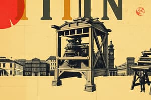
- Johannes Gutenberg invented the first printing press using durable letter blocks based on Blackletter calligraphy, which was the dominant handwriting style of the time.
- Blackletter's design required significant space on pages, resulting in longer books and text density.
Jenson's Roman Type
- Nicolas Jenson created the first Roman typeface in 1470, which simplified letterforms to accommodate more text on a single page.
- His work was innovative as it was based on typographic principles rather than traditional manuscript models, influencing modern fonts like Centaur and Adobe Jenson.
Italics for Space-Saving
- Aldus Manutius and Francesco Griffo developed the first italic typeface in 1501, designed to save space on printed pages.
- Although italics allowed for more text, they initially reduced readability due to their slanted nature.
Caslon's Old Style
- William Caslon introduced “Old Style” type in 1734, which featured greater contrast between strokes, improving readability and allowing for more distinguishable letterforms.
Baskerville's Transitional Type
- John Baskerville’s transitional typefaces, created in 1757, boasted distinct letterforms and advancements in type, ink, and printing techniques.
- Despite initial criticism for thickness, his typeface gained appreciation over time for its quality and aesthetic.
Modern Serifs
- Firmin Didot developed a modern serif typeface in the 1780s characterized by extreme contrast between thick and thin strokes, with unique features such as the uppercase J resting on the baseline.
- Giambattista Bodoni created a similar modern serif type, where the uppercase J extends below the baseline, showcasing excellent craftsmanship but with diminished readability at smaller sizes.
Slab Serif Typeface
- Vincent Figgins designed “Antique,” the first commercially available slab serif typeface, in 1815, which is noted for its straight serifs lacking curvature, commonly used in advertising and larger displays.
Sans Serif Typeface
- William Caslon IV introduced the first sans serif typeface known as “Two Lines English Egyptian” in 1816, influenced by classical block lettering.
- Sans serif types gained popularity in early 19th-century advertisements due to their minimalist appearance.
Early 20th Century Modern Typeface History
- Frederic Goudy, the first full-time type designer in the 1920s, created notable fonts like Copperplate Gothic and Goudy Old Style.
Mid-20th Century
- Max Miedinger designed Helvetica in 1957, a highly influential and widely used typeface of the 20th century.
- Paul Renner's Futura is noted for its geometric shapes and minimalist design, while Hermann Zapf created Optima, adding a humanist touch to minimalist types.
Digital Typography
- Rudolf Hell's Digi Grotesk, released in 1968, marked the creation of the first digital typeface.
- Early digital fonts relied on bitmaps, complicating readability, prompting the development of outline (vector) fonts in 1974 for better quality and smaller file sizes.
Late 20th Century
- TrueType fonts emerged in the late 1980s, allowing the same file to serve both computer displays and printers.
- OpenType fonts, invented in 1997, facilitated compatibility between Mac and PC platforms with a single font file.
Web Fonts Evolution
- The Web Open Font Format (WOFF) was developed in 2009 and widely adopted by major browsers by 2011, enhancing web typography options.
- These advancements have influenced trends like big typography and outline fonts.
Future Trends in Typography
- There is an increasing demand for typefaces that support a wider array of global languages, including Greek and Cyrillic characters.
- Color fonts, utilizing the OpenType-SVG format, allow multiple colors within a single glyph but are yet to achieve widespread adoption.
Continued Evolution
- Typography continues to evolve, responding to designers' needs as demonstrated by innovations like web and variable fonts that have transformed digital design landscapes.
Gutenberg's Blackletter
- Johannes Gutenberg invented the first printing press using durable letter blocks based on Blackletter calligraphy, which was the dominant handwriting style of the time.
- Blackletter's design required significant space on pages, resulting in longer books and text density.
Jenson's Roman Type
- Nicolas Jenson created the first Roman typeface in 1470, which simplified letterforms to accommodate more text on a single page.
- His work was innovative as it was based on typographic principles rather than traditional manuscript models, influencing modern fonts like Centaur and Adobe Jenson.
Italics for Space-Saving
- Aldus Manutius and Francesco Griffo developed the first italic typeface in 1501, designed to save space on printed pages.
- Although italics allowed for more text, they initially reduced readability due to their slanted nature.
Caslon's Old Style
- William Caslon introduced “Old Style” type in 1734, which featured greater contrast between strokes, improving readability and allowing for more distinguishable letterforms.
Baskerville's Transitional Type
- John Baskerville’s transitional typefaces, created in 1757, boasted distinct letterforms and advancements in type, ink, and printing techniques.
- Despite initial criticism for thickness, his typeface gained appreciation over time for its quality and aesthetic.
Modern Serifs
- Firmin Didot developed a modern serif typeface in the 1780s characterized by extreme contrast between thick and thin strokes, with unique features such as the uppercase J resting on the baseline.
- Giambattista Bodoni created a similar modern serif type, where the uppercase J extends below the baseline, showcasing excellent craftsmanship but with diminished readability at smaller sizes.
Slab Serif Typeface
- Vincent Figgins designed “Antique,” the first commercially available slab serif typeface, in 1815, which is noted for its straight serifs lacking curvature, commonly used in advertising and larger displays.
Sans Serif Typeface
- William Caslon IV introduced the first sans serif typeface known as “Two Lines English Egyptian” in 1816, influenced by classical block lettering.
- Sans serif types gained popularity in early 19th-century advertisements due to their minimalist appearance.
Early 20th Century Modern Typeface History
- Frederic Goudy, the first full-time type designer in the 1920s, created notable fonts like Copperplate Gothic and Goudy Old Style.
Mid-20th Century
- Max Miedinger designed Helvetica in 1957, a highly influential and widely used typeface of the 20th century.
- Paul Renner's Futura is noted for its geometric shapes and minimalist design, while Hermann Zapf created Optima, adding a humanist touch to minimalist types.
Digital Typography
- Rudolf Hell's Digi Grotesk, released in 1968, marked the creation of the first digital typeface.
- Early digital fonts relied on bitmaps, complicating readability, prompting the development of outline (vector) fonts in 1974 for better quality and smaller file sizes.
Late 20th Century
- TrueType fonts emerged in the late 1980s, allowing the same file to serve both computer displays and printers.
- OpenType fonts, invented in 1997, facilitated compatibility between Mac and PC platforms with a single font file.
Web Fonts Evolution
- The Web Open Font Format (WOFF) was developed in 2009 and widely adopted by major browsers by 2011, enhancing web typography options.
- These advancements have influenced trends like big typography and outline fonts.
Future Trends in Typography
- There is an increasing demand for typefaces that support a wider array of global languages, including Greek and Cyrillic characters.
- Color fonts, utilizing the OpenType-SVG format, allow multiple colors within a single glyph but are yet to achieve widespread adoption.
Continued Evolution
- Typography continues to evolve, responding to designers' needs as demonstrated by innovations like web and variable fonts that have transformed digital design landscapes.
Time Travel Awareness
- Realization of time travel varies based on the setting; significant indicators include changes in vehicles and architecture.
- Cars can reveal time discrepancies quickly; notable car model changes over just a few years are identifiable.
- Local historical markers, such as bus station establishments or specific features on properties, help gauge temporal changes.
- Minimal differences in design and typographic styles can signal shifts of 20 years or more.
Development of Typography
- Gutenberg's printing press revolutionized book production in the 15th century, making literature accessible to a wider audience.
- He produced the first-ever font based on Blackletter calligraphy, marking a significant advancement in typography.
- In 1470, Nicolas Jenson created a more efficient font, allowing for denser text per page.
- Early type design included various styles, with Aldus Manutius and Francesco Griffo innovating with italic type in 1501.
Font Evolution and Styles
- William Caslon introduced the Old Style font in 1734, improving letter distinguishability and readability.
- John Baskerville developed Transitional typefaces, although his designs faced initial criticism but later gained popularity.
- The late 18th century saw the rise of serif fonts, with Firmin Didot and Giambattista Bodoni leading this trend.
- Vincent Figgins introduced the first slab serif font named "Antique" in 1815.
Modern Typography and Technology
- In the 20th century, Fredric Goudy became a notable font developer, contributing iconic designs like Copperplate Gothic.
- The 1957 birth of Helvetica revolutionized type design, making it a widely recognized font.
- The digital age introduced new font technologies such as TrueType fonts, enhancing cross-compatibility for digital use.
- The launch of the Web Open Font Format in 2009 expanded web typography usage.
Microsoft Font Changes
- Microsoft transitioned from Calibri to Aptos as the default font following thorough testing and public feedback.
- Aptos, initially named Bierstadt, was named after a location in Santa Cruz and aimed to modernize Office aesthetics.
- The font was designed considering various languages and symbols to improve clarity and readability.
- The shift to Aptos was seen as significant for Microsoft, especially under new CEO Satya Nadella.
The London Underground Font Update
- Edward Johnston's original font for the London Underground was updated to Johnston100 in 2016 with subtle changes.
- The new design maintains the original's essence while addressing contemporary communication needs, incorporating symbols like # and @.
- The evolution illustrates the balance between heritage and modernization, aiming for longevity similar to previous designs.
- Historical context highlights the continued importance of typographic relevance in public communication.
Studying That Suits You
Use AI to generate personalized quizzes and flashcards to suit your learning preferences.