Podcast
Questions and Answers
What is the primary distinction between legibility and readability in typography?
What is the primary distinction between legibility and readability in typography?
- Legibility evaluates emotional connections, while readability assesses cultural relevance.
- Legibility refers to clarity of individual letters, while readability concerns overall text flow. (correct)
- Legibility includes font color, whereas readability considers the number of fonts used.
- Legibility is determined by font size, while readability depends on text alignment.
Which factor is NOT essential for making a typeface legible?
Which factor is NOT essential for making a typeface legible?
- Font color contrast (correct)
- Technical adjustments to character shapes
- Familiarity with character shapes
- Large counters and open apertures
What is considered an ineffective choice for improving legibility in typography?
What is considered an ineffective choice for improving legibility in typography?
- Using all-caps text extensively (correct)
- Adjusting technical characteristics of fonts
- Incorporating familiar character shapes
- Ensuring proper measurements and proportions
Which element contributes to the emotional and cultural connections regarding typeface selection?
Which element contributes to the emotional and cultural connections regarding typeface selection?
When designing for a general audience, which tone of voice is often preferred?
When designing for a general audience, which tone of voice is often preferred?
What is one characteristic of widely used typefaces that enhances readability?
What is one characteristic of widely used typefaces that enhances readability?
Which element of type anatomy refers to the height of lowercase letters?
Which element of type anatomy refers to the height of lowercase letters?
What is the purpose of optical sizes in typefaces?
What is the purpose of optical sizes in typefaces?
What does the term 'ink traps' refer to in typography?
What does the term 'ink traps' refer to in typography?
What is the recommended balance to maintain in typography for optimal legibility?
What is the recommended balance to maintain in typography for optimal legibility?
Which of the following factors does NOT contribute to the legibility of text?
Which of the following factors does NOT contribute to the legibility of text?
Which adjustment helps letters remain legible and defined in smaller sizes?
Which adjustment helps letters remain legible and defined in smaller sizes?
What does the M-Formula focus on in type design?
What does the M-Formula focus on in type design?
What was the primary reason for the transition from Carolingian minuscule to Blackletter?
What was the primary reason for the transition from Carolingian minuscule to Blackletter?
Which of the following innovations is attributed to Johannes Gutenberg?
Which of the following innovations is attributed to Johannes Gutenberg?
What is the 'Picket Fence Effect' in typography?
What is the 'Picket Fence Effect' in typography?
Which statement is true regarding the components of the metal type used by Gutenberg?
Which statement is true regarding the components of the metal type used by Gutenberg?
What defines the humanist letter style used by Nicolas Jenson?
What defines the humanist letter style used by Nicolas Jenson?
Which disadvantage is associated with block printing in China?
Which disadvantage is associated with block printing in China?
Which of the following describes the advantages of metal movable type over other types?
Which of the following describes the advantages of metal movable type over other types?
Francesco Griffo is known for which accomplishment?
Francesco Griffo is known for which accomplishment?
What did the 'Civilité type' mainly focus on?
What did the 'Civilité type' mainly focus on?
The 42-Line Bible, produced between 1452 and 1455, is characterized by which type style?
The 42-Line Bible, produced between 1452 and 1455, is characterized by which type style?
Flashcards
Legibility
Legibility
The ability to distinguish one letterform from another.
Readability
Readability
How easy is it to read the text.
Fixations
Fixations
The pauses your eyes make when reading a word.
Saccades
Saccades
Signup and view all the flashcards
Ascenders and Descenders
Ascenders and Descenders
Signup and view all the flashcards
Body
Body
Signup and view all the flashcards
x-height
x-height
Signup and view all the flashcards
Descender
Descender
Signup and view all the flashcards
Ascender
Ascender
Signup and view all the flashcards
kp-height
kp-height
Signup and view all the flashcards
Linespacing
Linespacing
Signup and view all the flashcards
Leading
Leading
Signup and view all the flashcards
Carolingian Minuscule
Carolingian Minuscule
Signup and view all the flashcards
Blackletter
Blackletter
Signup and view all the flashcards
Picket Fence Effect
Picket Fence Effect
Signup and view all the flashcards
Ligatures
Ligatures
Signup and view all the flashcards
Block Printing
Block Printing
Signup and view all the flashcards
Punch
Punch
Signup and view all the flashcards
Counterpunch
Counterpunch
Signup and view all the flashcards
Matrix
Matrix
Signup and view all the flashcards
Textura Typeface
Textura Typeface
Signup and view all the flashcards
Humanist Letter
Humanist Letter
Signup and view all the flashcards
Study Notes
How Do Scripts Originate?
- Scripts evolve from tokens to pictograms, then ideograms and phonograms, ultimately becoming letters or syllables.
- Tokens are small objects representing something larger.
- Pictograms are simplified images of objects.
- Ideograms expand the meaning of objects.
- Phonograms represent the sound of words.
- Letters and syllables reduce words to components.
Understand Evolution
Cuneiform
- Originated in Mesopotamia during the 31st century BC to the 2nd century AD.
- Used wedge-shaped strokes on clay with a reed stylus.
- Developed to record and store economic information, then later evolved to include religious and narrative texts.
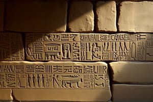
Hieroglyphs
- Originated in Egypt during the 31st century BC to the 4th century AD.
- Are pictorial symbols and pictographs.
- Characteristics include a linear order (top to bottom), rhythm and repetition of signs, and consistent size regardless of the proportion.
Concepts & Definitions
- Hieroglyphs are illustrative and ornamental.
- Hieratic is a cursive script for faster writing using pen and ink on papyrus.
- Demotic is a simplified script derived from hieratic and hieroglyphic to replace them.
Deciphering Scripts
- Rebus principle: images together represent a word based on similar pronunciation.
- Determinative: an ideogram that specifies the semantic group of an associated word.
- Evolution: from image to stylization and abstraction, similar patterns in global script evolution
The Birth of Alphabets
- Proto-Sinaitic Script, developed by miners in Canaan, was the earliest evidence of an alphabetic script.
- It is the ancestor of ancient South Arabian and Phoenician alphabets.
- Acrophony: the name of characters represents the initial sounds of the word.
Origins of the Latin Alphabet
- Phoenician script used each symbol to represent a sound.
- It was innovative as few symbols needed to be learned.
- Written from right to left, then left to right (boustrophedon).
- Letters can be mirrored when switching directions.
Greek Alphabet
- Introduced vowels to the alphabet.
- Introduced word separation.
Evolution of the Latin Alphabet
- Writing direction: transitioned to left-to-right.
- Invented some new letters and reintroduced lost ones.
- Adopted spacing techniques for words and sentences.
- Evolved from sans-serif to serif styles.
Capitalis Quadrata
- Square capitals were modeled on the proportions of the O.
- Romans named letters on monuments (engraved texts).
- Origin of serifs.
Roman Script Evolution
- Cursiva Romana Moderna differed from previous styles with its placement between lines and extended letters.
- Bilinear scheme and quadrilinear scheme defined the positioning of letters.
Papyrus vs. Parchment
- Papyrus was more widely distributed and produced relatively quickly; it was susceptible to humidity and could only be written on one side.
- Parchment offered a smoother, more durable surface, better preservation, and the ability to write on both sides.
Early Christian Scripts
- After the Roman Empire fell, language and script diversified in different regions.
- Development of unique regional styles emerged.
Carolingian Minuscule
- Standardizing script across Charlemagne's empire.
- Based on Merovingian and antique semi-uncial scripts.
- Rules decreed by Charlemagne for writing, including styles for capitals, headings, and body text, and spacing between lines.
Advantages of Blackletter
- Narrower and reduced line spacing.
- Simplified letterforms.
- Increased text capacity for books.
- Faster and cheaper production of books.
The 5 Typographic Revolutions
- 1450: Johannes Gutenberg
- 1870: Industrial Revolution
- 1950: Photo composition.
- 1973: Digital era
- 2016: Variable fonts
The Origins of Printing
Block Printing (China)
- Downsides: correcting single characters was difficult and time-consuming.
Porcelain Movable Type (China)
- Downsides: watery ink did not adhere well, uneven surfaces.
Metal Movable Type (Korea)
- Advantage: durable and reusable
Innovations by Gutenberg
- Method for mass-producing movable type.
- New alloys for durable type.
- Oil-based ink for consistent printing.
- Invention of a wooden printing press.
Concepts and Definitions (Printing)
- Punch: metal tool for creating letterforms.
- Counterpunch: tool refining letterforms.
- Matrix: negative mould made from soft metal.
- Lead: cheap, liquefies at low temperatures, and spreads poorly.
- Tin: renders metal more fluid, fills matrices better, shrinks much when cooling.
- Bismuth and antimony: expand when cooling, less shrinkage, and greater hardness.
Nicolas Jenson
- Year: 1471
- Type style: humanist, clear and legible, subtle curves and thick/thin strokes.
- Inspiration: Italian humanist handwriting, Carolingian minuscule, and Roman capitals.
The First Printed Cursives
- Based on informal humanist handwriting.
- Narrow, smooth, and elegant.
- Reduced page count (cheaper production)
Key Designers
- Francesco Griffo: first pocket-sized book in italic type, created first italic type.
- Ludovico degli Arrighi: created first printed cursive type, inspired by chancery script.
- Robert Granjon: developed slanted capitals for italics and known for Civilité and italic designs.
Typographic Terminology
- Typeface/Type family: A stylistically coherent collection of alphanumeric characters.
- Font: The display mechanism of a typeface; a single style or weight.
- Super family: A type family with many weights, widths, and styles.
- Type System: A set of related type families categorized by serifs, sans-serif, and slab serif.
Historical Classification Systems
Francis Thibaudeau (1921)
- Based on serif shapes/construction.
- Examples: Romain Elzévir (triangular serifs).
- Romain Didot (very fine serifs), and Égyptienne (slab serifs).
Maximilien Vox (1954)
- Method for dividing typefaces into humanist, Garalde, Transitional, Didone, Mechanistic, Linear, and other categories.
Contemporary Classification Systems
- Letters have four components: Skeleton, Flesh, Skin, and Tags.
- Skeleton: Basic structure and form.
- Flesh: Attributes like contrast, serifs.
- Skin: Refinements of shapes.
- Tags: Purpose/meaning associated with the typeface
From Humanistic to Rational
- Claude Garamond (1540): An independent type cutter.
- William Caslon I (1725): First British type founder, but not a trendsetter.
- Romain du Roi (1692-1745): A typographic milestone.
- Pierre Simon Fournier: Invented the typographic measurement (a point.)
- John Baskerville (1757): Innovations with sharp images and intense black printing inks.
The Industrial Revolution
- Increased demand for print led to innovations in type design (Wood Type, Chromatic Types, Fat Face).
French Antique
- Developed for bold commercial fonts.
- Unique styles with exaggeratedly wide serifs.
- Still associated with the Wild West.
- Robust features for high-volume printing, and combined Didones’ fine serifs & Egyptians’ sturdy design.
Sans-Serif Types in the 20th Century
- Morris Fuller Benton (USA): invented the concept of 'type family'.
- Edward Johnston: designed sans-serif typefaces for London's Underground.
- Eric Gill: Inspired by German geometric sans types.
- Geometric sans serifs (Germany): by designers like Jakob Erbar, Rudolf Koch, and Herbert Bayer
Microtypography
- Selecting a typeface criteria.
- Criteria for text: Anatomy of the letter, Font quality, Character set (language support), Figure sets, Symbols & Icons, Cultural connections.
- Legibility vs. Readability: Ability to distinguish one letter from another, ease of reading the text.
How We Read
- Fixations: pausing to process word shapes.
- Saccades: Moving from one fixation point to the next.
- Ascenders & descenders: defining word silhouette
- All-caps text being less legible than those with mixed cases.
Studying That Suits You
Use AI to generate personalized quizzes and flashcards to suit your learning preferences.