Podcast
Questions and Answers
What is the main idea behind the principle of proportional ink?
What is the main idea behind the principle of proportional ink?
- Avoiding line drawings in figures
- Making the axis labels larger for better readability
- Using shaded regions to represent numerical values, where the area is directly proportional to the value (correct)
- Using 3D visualizations to represent data
Why should you avoid 3D visualizations in data representation?
Why should you avoid 3D visualizations in data representation?
- Because they are not suitable for multi-panel figures
- Because they can be misleading and make it harder to compare data (correct)
- Because they are not interactive
- Because they are difficult to create
What is a common pitfall to avoid when using color in figures?
What is a common pitfall to avoid when using color in figures?
- Using colors that are too bright
- Using too many colors
- Using colors that are not redundant
- Using colors that are not accessible to colorblind individuals (correct)
What is the purpose of using larger axis labels in figures?
What is the purpose of using larger axis labels in figures?
What is an advantage of using multi-panel figures?
What is an advantage of using multi-panel figures?
Why is it important to balance the data and context in a figure?
Why is it important to balance the data and context in a figure?
What is redundant coding in the context of data visualization?
What is redundant coding in the context of data visualization?
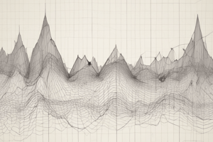
Why is it recommended to avoid line drawings in figures?
Why is it recommended to avoid line drawings in figures?
What is the purpose of using titles, captions, and tables in figures?
What is the purpose of using titles, captions, and tables in figures?
How should you handle overlapping points in a figure?
How should you handle overlapping points in a figure?
Flashcards are hidden until you start studying
Study Notes
Data Visualization
- Use bars or shaded areas to show differences between conditions, making it explicit which differences are being shown.
- Logarithmic scales: data values are not linearly spaced along the axis.
- Visualizing large datasets: simple x-y scatterplots may not work well due to overlapping points.
Handling Overlapping Points
- Density plots can be integrated into the margins of a scatterplot to handle overlapping points.
- In small datasets, multiple observations may have the same numeric values due to low precision or rounding.
Multi-Panel Figures
- Create multi-panel figures to show large and complex datasets, which may contain more information than can be shown in a single figure panel.
- Compound figures: separate figure panels assembled in an arbitrary arrangement, which may or may not be grid-based.
- Small multiples: plots consisting of multiple panels arranged in a regular grid, each showing a different subset of the data, but all using the same type of visualization.
Principles of Figure Design
- The principle of proportional ink: the area of a shaded region should be directly proportional to the corresponding value.
- Avoid common pitfalls of color use, redundant coding, and line drawings.
- Use larger axis labels and avoid 3D visualizations.
- Balance the data and the context, and use titles, captions, and tables effectively.
Studying That Suits You
Use AI to generate personalized quizzes and flashcards to suit your learning preferences.