Podcast
Play an AI-generated podcast conversation about this lesson
Download our mobile app to listen on the go
Get App
Questions and Answers
What is the primary purpose of a histogram?
What is the primary purpose of a histogram?
- To depict the frequencies of values within intervals (correct)
- To display individual data points across a range
- To show the relationship between two nominal variables
- To organize raw scores into categories
Which of the following describes a positive skew in a distribution?
Which of the following describes a positive skew in a distribution?
- A distribution where scores are evenly spread around the mean
- A situation where scores are confined within a narrow range
- A tail that extends to the right in a positive direction (correct)
- A tail that is pulled away from the center to the left
What type of data do bar graphs typically represent?
What type of data do bar graphs typically represent?
- Nominal data (correct)
- Ordinal data
- Continuous data
- Interval data
What is the main difference between a bar graph and a histogram?
What is the main difference between a bar graph and a histogram?
Signup and view all the answers
What is meant by an extreme score in a dataset?
What is meant by an extreme score in a dataset?
Signup and view all the answers
In the context of data visualization, what does a dot graph depict?
In the context of data visualization, what does a dot graph depict?
Signup and view all the answers
What does a negative skew indicate in a distribution?
What does a negative skew indicate in a distribution?
Signup and view all the answers
What is a grouped frequency distribution?
What is a grouped frequency distribution?
Signup and view all the answers
Flashcards are hidden until you start studying
Study Notes
Raw Scores and Data Organization
- Raw scores are unprocessed data waiting for analysis.
- Organized raw scores can be transformed into visual representations for easier interpretation.
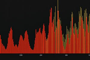
Frequency Distribution
- A frequency distribution summarizes data by showing counts or proportions of each possible value.
- It visually depicts how often each score occurs, such as average hours spent on social media.
Data Visualization
- Grouped frequency displays and histograms are common methods to showcase organized data.
- Histograms report frequencies within specific intervals rather than for individual values.
Extreme Scores
- Extreme scores are significantly high or low compared to the rest of the sample, impacting the data interpretation.
- Distinct characteristics of skewness can emerge in distributions based on extreme scores.
Types of Graphs
- Bar graphs compare nominal data relative to a continuous variable (e.g., height vs. age groups).
- Histograms show frequencies for continuous variables (e.g., student grades in a course).
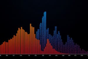
Distribution Shapes
- Normal distribution is characterized by a bell curve where scores cluster around the mean.
- Positive skew occurs when the right tail of the distribution extends, often due to constraints on lower values.
- Negative skew features a leftward tail, resulting from constraints that limit upper values.
Dot Plots
- Dot plots display each data point individually with a range of scores along the x-axis.
- They provide a clearer representation of data shape compared to histograms and allow direct reading of counts without needing a y-axis reference.
- Suitable for smaller quantities of observations, making interpretation more straightforward.
Studying That Suits You
Use AI to generate personalized quizzes and flashcards to suit your learning preferences.