Podcast
Play an AI-generated podcast conversation about this lesson
Download our mobile app to listen on the go
Get App
Questions and Answers
What is the highest temperature recorded on the graph in degrees Celsius?
What is the highest temperature recorded on the graph in degrees Celsius?
- 38 °C (correct)
- 40 °C
- 39 °C
- 36 °C
How does the blue line graph behave in relation to the red line?
How does the blue line graph behave in relation to the red line?
- It remains below the red line.
- It stays consistently above the red line.
- It approaches the red line only at the end.
- It fluctuates around the red line. (correct)
What is the value of the y-axis at the lowest point of the blue line graph?
What is the value of the y-axis at the lowest point of the blue line graph?
- 37 °C
- 35 °C
- 38 °C
- 36 °C (correct)
What does the red line represent on the graph?
What does the red line represent on the graph?
Signup and view all the answers
What are the increments of the x-axis labeled in days?
What are the increments of the x-axis labeled in days?
Signup and view all the answers
Flashcards are hidden until you start studying
Study Notes
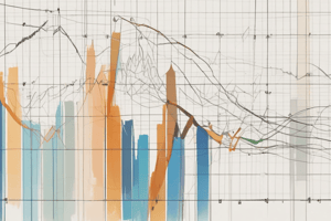
Graph Overview
- The y-axis represents temperature in degrees Celsius (°C), ranging from 36 to 40 °C.
- The x-axis tracks time in days, ranging from 0 to 18 days, with increments of 5 days.
Line Representations
- A red line is positioned at a constant temperature of 37 °C, serving as a reference point.
- A fluctuating blue line indicates varying temperatures, oscillating both above and below the red line.
Temperature Insights
- The graph suggests temperature changes over the 18-day period, highlighting the dynamics of the observed variable.
- Fluctuations above the red line indicate periods of higher temperature, while dips below signify cooler temperatures compared to the baseline.
Data Interpretation
- The overall trends of the blue line can indicate patterns such as temperature spikes or drops over time, which may reflect external factors or influences.
Studying That Suits You
Use AI to generate personalized quizzes and flashcards to suit your learning preferences.