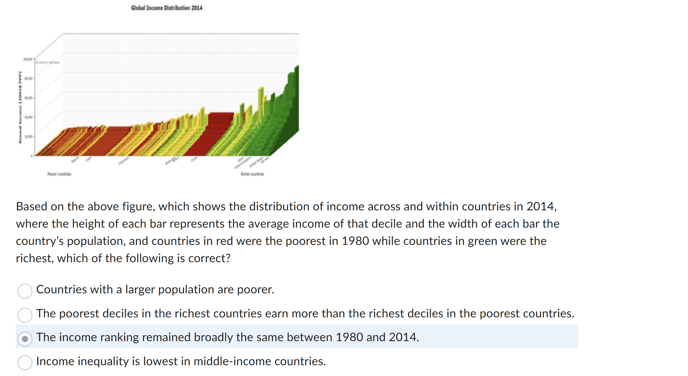
Based on the above figure, which shows the distribution of income across and within countries in 2014, where the height of each bar represents the average income of that decile and... Based on the above figure, which shows the distribution of income across and within countries in 2014, where the height of each bar represents the average income of that decile and the width of each bar the country’s population, and countries in red were the poorest in 1980 while countries in green were the richest, which of the following is correct?

Understand the Problem
The question asks for an interpretation of a figure depicting global income distribution in 2014, looking for the correct statement regarding income ranking and distribution over time.
Answer
The income ranking remained broadly the same between 1980 and 2014.
The income ranking remained broadly the same between 1980 and 2014.
Answer for screen readers
The income ranking remained broadly the same between 1980 and 2014.
More Information
The graph indicates a consistency in income rankings between 1980 and 2014, as suggested by the alignment of colors representing richest and poorest countries over time.
Tips
A common mistake could be assuming changes in income within countries affect their overall ranking, rather than cross-country comparison. Ensure you interpret the correct color coding.
Sources
AI-generated content may contain errors. Please verify critical information